HOME | DD
 bojanglez — Da Phonix Preview Version
Published: 2001-07-06 07:57:38 +0000 UTC; Views: 423; Favourites: 2; Downloads: 90
Redirect to original
Description
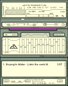
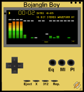
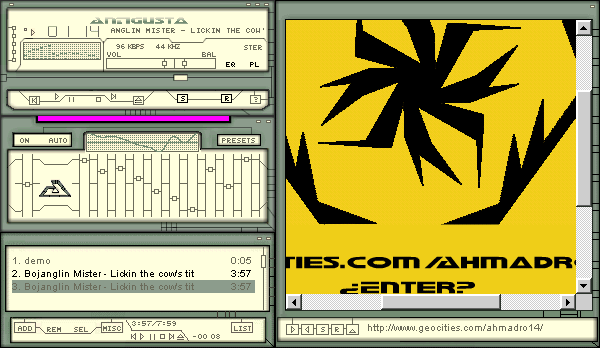
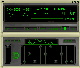
Sorry If I'm not supposed to do this, but I sent in a preview testable version of my future skin so I can get some feedback and see whether people like it or not. I will delete it off the site when I release the final version.Look a real screenshot this time.
Anyway can you please leave a comment if you scroll by this? Even if you don't download it, look at the screenshot and leave a comment, grade ti I don't care. I just need t know if this one is worth finishing.
Related content
Comments: 6

Yah I Dunno...I'd say change the borders all together, they're an eyesore against the rest of the skin, go with the green and black theme, take the borders out...
[To Err Is Human]
[To 10010100110101 Is Computers]
👍: 0 ⏩: 0

jstigma, your right, something that looks the same was uploaded here a couple of weeks ago, but was originally released about a year ago on winamp.com
👍: 0 ⏩: 0

Very plain and unoriginal, in fact, I'm sure I've seen this done elsewhere better.
Aside from that, I'd get rid of the "D" on the EQ.
Happiness
-We're all in it together
Http://I.am/jstigma
👍: 0 ⏩: 0

i'm not too crazy about the borders. perhaps incorporate them into the skin.
what i mean is like make them the same color or a similar shade so that they are part of the skin. they sort of make the skin feel like it's in a frame the way they are now. it's definetly worth finishing.
well, that's my two cents
peace.
👍: 0 ⏩: 0

a bit unoriginal, nice borders though, i like them, best thing about the skin.. and it needs more too it..
[Angles DO Excist]
👍: 0 ⏩: 0

looks a bit plain.
ahhhhhhhhhhhhh
The Lamb of God
👍: 0 ⏩: 0

