HOME | DD
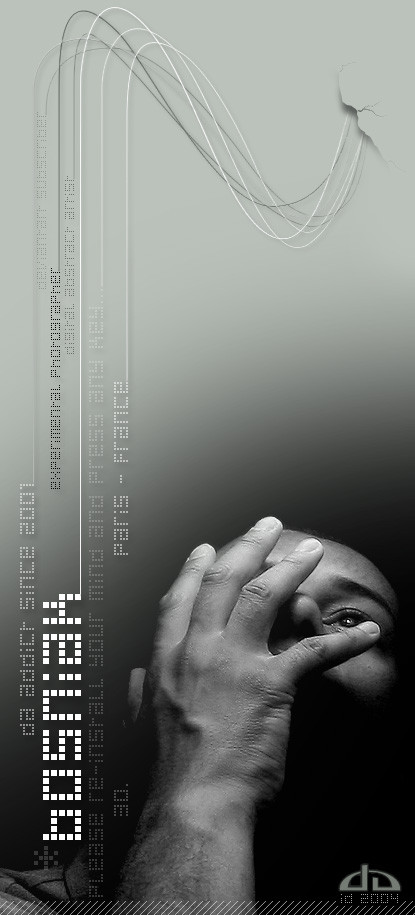
 bosniak — .selfportrait.devID.2004.
Published: 2004-04-29 08:27:48 +0000 UTC; Views: 5233; Favourites: 63; Downloads: 1890
Redirect to original
Description
. The dark side of the ... *bosniak. ... now you know me 8)
. new avatar
. new devID
[08.2004.edit: DAv4 colors ajustment]
. hope you like them
___________________________
. old capture (last year)
. model: me
. photographer: me
. under the kitchen lamp
. Canon IXUS 2s Self-timer iso50
. PS7 postwork
Related content


Comments: 212

that;s a pretty kewl id
i really like the idea
great work
👍: 0 ⏩: 0

I love it. I like the gradient background. Very professional looking ID.
👍: 0 ⏩: 0

Dark, intelectual, mysterious, dreamy.........quite fitting. Perfect indeed
👍: 0 ⏩: 0


Pas mal du tout  (Smile)")
👍: 0 ⏩: 0


Very cool ID, always tought it was a cool concept
👍: 0 ⏩: 0

je viens de voir que tu étais francais
c'est de la balle ^^
So your ID simply rocks the concept is awesome it's very very cool !!
👍: 0 ⏩: 0


nice work dude. tho the "crack" could look better compared to the whole image

👍: 0 ⏩: 1


Coooooooooooooooooooooooooooool. It rocks. Just a minor prob the font on the upper side is unreadable u'll have to fix the color to suit both the upper and bottom color  (Wink)")
👍: 0 ⏩: 1


Very nice, love the way you utilized the background and gradient. Nice design 
👍: 0 ⏩: 0

Just... Amazing!!! Great ID!! I like it very much!! 
👍: 0 ⏩: 0


this is the pimpest DA ID i've ever seen EVER! omg
👍: 0 ⏩: 0

I've seen this self-portrait and ID of yours many times, sorry it took so long to actually get to it.
I understand you do both photography and digital design, and this is a very special piece in that respect; this is basically a photomanipulation of your own, a hybrid of photo and design, and it's quite impressive. The photograph is, of course, amazingly expressive; it's as though you're screaming silently or crying, and yet I get the feeling that you're just holding your hand over your face. That in itself is a good effect: it partially hides your face, which adds an element of mystery; it gives the impression of weeping or of despair in general, which brings strong emotion into it; and the lighting really finishes all of this off, the source must be somewhere above your head, and it gives an impression of humility, while bestowing a good dramatic atmosphere. The way you've created this gradient is brilliant; it starts with the darkness at the bottom, and doesn't go up towards any distinct light tone like white or grey; it becomes transparent, and deviantART's own colour scheme does the rest! ")
The 'wire'-style here is really interesting, a very imaginative solution! The idea of information about you coming out of a hole in a wall like that is quite interesting psychologically, as it suggests that all that info is buried deep inside your psyche and that it needs to burst out violently to be observed. The wires also give the impression of complexity, like some machine or something, which again psychologically refers to your mind and philosophically to your Self, which is a complex matter. But the composition of the original photo makes this kind of information presentation simply perfect, because there is a natural empty space all around you, and the image is a vertical rectangle. Apart from being stylish, the vertical text means that the viewer needs to look closer and harder to se the text properly; so you have a kind of in-built attention-grabber in your own piece, which almost guarantess that people will lok closer at the piece!
Anyway, this is without a doubt one of the most sylish IDs I've ever seen, and one that fits you impeccably. Amazing job!
👍: 0 ⏩: 1

i just read this comment..... i'm impressed - the best constructive comment i receive ! thanks a lot : really appreciated
👍: 0 ⏩: 1

👍: 0 ⏩: 0


so.... wan to make my id?
other than that its simply gorgeous, i love the way it just flows...
")
👍: 0 ⏩: 0

this ID is really nice, best piece of work ive seen from you.
👍: 0 ⏩: 0

just great and obviously your pictures take me to itself and there is near my zone
👍: 0 ⏩: 0

looks very professional!
i especially are impressed by the spit in the background (right-above),...
👍: 0 ⏩: 0

wow...ur seriously seriously talented!!!! ive never seen such cool computer art and things..ur ID is amazing..haha im truely stunned..so good!!

👍: 0 ⏩: 0

dude.. bos.. that's one of the coolest devIDs i've ever soon, lol
nice work bro
👍: 0 ⏩: 0


yeah man!!! You've a very nice black noze...Wonderful artist: again and again! Sweetly...the nickysan's wife
👍: 0 ⏩: 0


great idea. Its nice to see an ID that shows of
You've inspired me to make a new 1 now
👍: 0 ⏩: 0

damn thats cool i love the 3d effect on the cracked bit and the way the text is lead down using the lines. Has a really nice weighting to it...
👍: 0 ⏩: 0


Génial ! Tout simplement génial (qui tient donc du génie) ton ID est simplement magnifique
👍: 0 ⏩: 0


damn .. thats tight
👍: 0 ⏩: 0

Awesome job on this ID... it just reeks with style.
- A
👍: 0 ⏩: 0


stlish and good looking !
much more skilled than my one
cool
 (Cool)")
👍: 0 ⏩: 0


very cool
love the shadow, the effects, and the typography
all in all a great ID
👍: 0 ⏩: 0
| Next =>