HOME | DD
 brayk — Reposition

Published: 2003-11-02 23:28:36 +0000 UTC; Views: 485; Favourites: 9; Downloads: 159
Redirect to original
Description
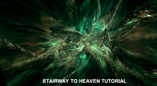
A peice I made for the Evoked pack3 and also a promo for my new website Ammune . Go check it out.Related content


Comments: 20

Very nice, as always! ")
👍: 0 ⏩: 0
Very nice, as always!
👍: 0 ⏩: 0

very nice, i love the colour choice and the darkness. great job
👍: 0 ⏩: 0


its like... wow.. if this image could be turned into a sound. im sure it would be somethin like ...... BzZZUZUZUZUZUZUZUZUZZZZZOOOOZZZZ
👍: 0 ⏩: 0

looks very very cool man, love the colors and the great deept!

👍: 0 ⏩: 0

loving the flow in this one... great brush and lightningwork... one of your best from the pack
👍: 0 ⏩: 0

A little bit chaotic but in a good way. Terrific flow with a great design. The renders are nice and the typo really adds to the the piece. I would have to say that this my friend is a
👍: 0 ⏩: 0

probably one of my favs of your in the pack, love the composition and yah did a real nice job of the brush
 (Wink)")
👍: 0 ⏩: 0


hmm.. its great, maby a bit too chaotic.. And i agree with Monolite here, it does has something from monoxism's style..
Nice!
👍: 0 ⏩: 0

it's pretty cool
reminds me a bit of monoxism's style
nice colors
👍: 0 ⏩: 0

nice job!!! o and visit the ammune website this afternoon, good job!
o and i tried to register @ evoked i got an error .... contact on aim for details.
👍: 0 ⏩: 0

the darkness is very cool and the greenness is just awesome! very nice
👍: 0 ⏩: 0

awesome perspective. the brushing and colors are pro.

👍: 0 ⏩: 0

IT's like... harmony spawning from chaos. Cool janx.
👍: 0 ⏩: 0

A bit chaotic, but chaotic is always cool in my mind. I like the fact that you didn't use much 2d, and the colour is nice and dark.
👍: 0 ⏩: 0

cool render(s)
a bit more lighting would be ncie..
👍: 0 ⏩: 0

whoa this is kewl! reminds me of the lifestream from final fantasy 7...its very good!
👍: 0 ⏩: 0