HOME | DD
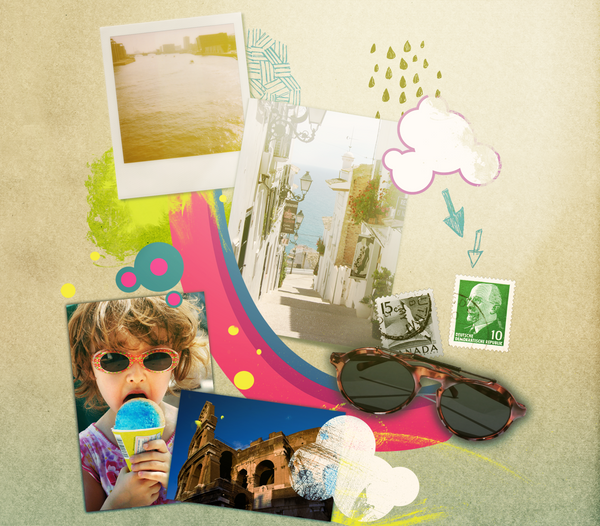
 brokenlink — Summer Expression
Published: 2009-07-23 15:18:29 +0000 UTC; Views: 1214; Favourites: 23; Downloads: 58
Redirect to original
Description
A collage I did for the front cover of a magazine I'm currently working for as a summer job.It's not amazing but it's something slightly different from my usual disasters I guess.
Related content


Comments: 4

Overall


Vision
Originality
Technique
Impact
First of all, I really would like to have such a cool Summerjob as she does D: Being able to do something like that is so nice >.<
I think its a rather lovely collage brokenlink present us here. The theme was "Summer Expression", and I defenitely think it's a breeze of summer you feel when you look at it.
It's a good idea how she combinied pictures/drawings/postcards. They seem different yet all connected by the same theme.
I think it's also a nice composition of colors. At first the rather dull background seems a bit plain. But with the colors she used for the little drawings overall, it gives a warm feeling of harmony.
A good thing about this collage is also, it doesn't look too overcrowded. It has lovely little details everywhere, but it's not too much. Actually it's quite nice how it is, it's not too empty either.
About how I rated this deviation. Well I think it's not that easy to rate something. Especially because I'm not that sure how some of these catogories are meant. So you shouldn't give too much about the rating!
Vision:
I think she expressed the theme "Summer Expressions" rather well. Even though it's all connected the collage looks a bit chaotic. When a person who looks at this, he/she doesn't really know where to look at. I think here it would have been good to work with Focus-Points.
Originality:
Well it's not like there aren't other collages like this on dA at all. But I think brokenlink made something special out of it which other people couldn't do.
Technique:
I like it how she used different techniques to make this collage unique. Like she doesn't simply made strips and points for the background, but chose different things. So it looks now more than lively e.deviantart.net/emoticons/s/s… " width="15" height="15" alt="
 (Smile)")
Impact:
It's actually kinda the same thing I wrote at Vision. The eyes can't exactly decide where to look at. So it's hard to have a "woah"-occurence when you first look at it. Nonetheless it's really a lovely work!
I hope I could help! e.deviantart.net/emoticons/h/h… " width="15" height="13" alt="

👍: 0 ⏩: 0

it looks great. love all the different types of media. very bold and colourful. ")
--
Their is nothing either good or bad but thinking makes it so - William Shakespeare
my gallery’s here [link] 

👍: 0 ⏩: 0

everytime you make a digital upload i cry inside about how bad i am with digital art. you bastard.
👍: 0 ⏩: 0
