HOME | DD
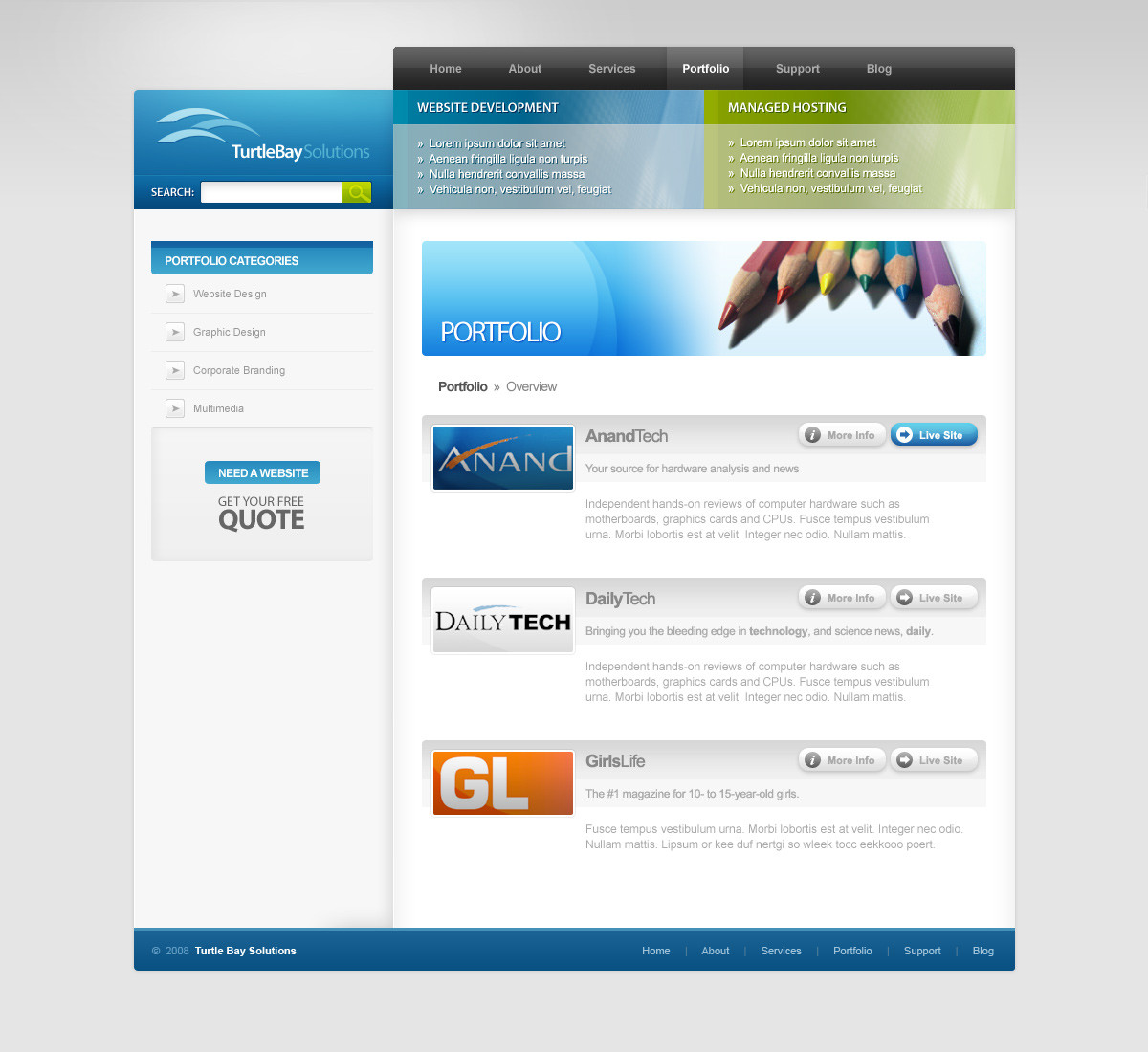
 Bugx0r — - Website : Blue Style

Published: 2007-12-18 11:25:08 +0000 UTC; Views: 799; Favourites: 2; Downloads: 0
Redirect to original
Description
Really REALLY disappointed with how this design come out... I couldn't find the right blues/colours for the text and numerous other things made me hesitate.Also not liking the big grey banner advertisement thingy - anyone with suggestions for that, please do tell me!
All in all, I don't think this design is at all finished, but I'm stumped as to what to do with it...
Related content


Comments: 3


Though you are disappointed, i still think this is a great looking design
Some elements can be changed, i think if you used a lighter colour for the text (close to a white-y/blue) it might look a bit better.
Another thing is maybe make the footer less tall, to me it feels a bit big.  (Smile)")
")
👍: 0 ⏩: 0

not so bad!
try to increase header's width and put the navigation bar a little in transparency over the header, not using big blue buttons...
then make the "grey thing in the middle" large as the rest of pages elements.
I used a similar palette in [link]
A different solution but with same color!
This colors are best for technical stuff and web services...
go on!
👍: 0 ⏩: 0