HOME | DD
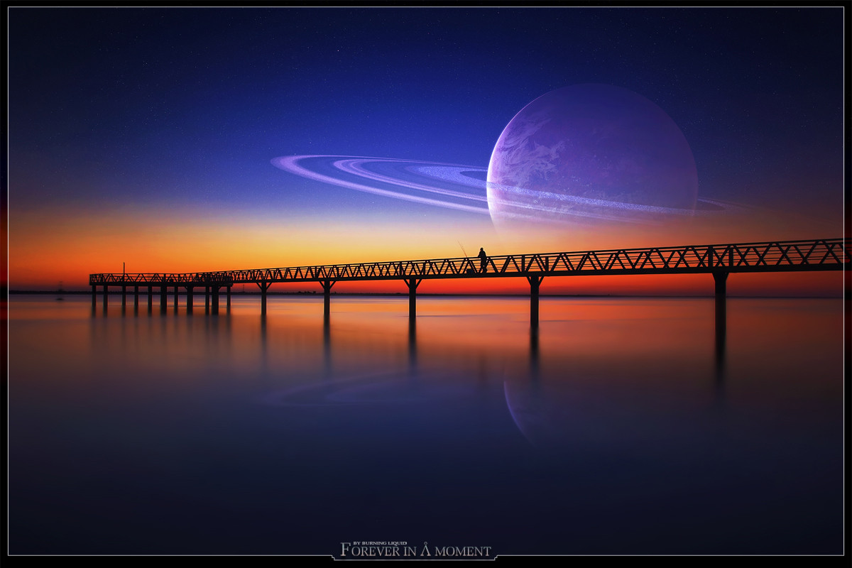
 Burning-Liquid — Forever in a Moment
Published: 2006-05-07 16:50:47 +0000 UTC; Views: 29825; Favourites: 377; Downloads: 8292
Redirect to original
Description
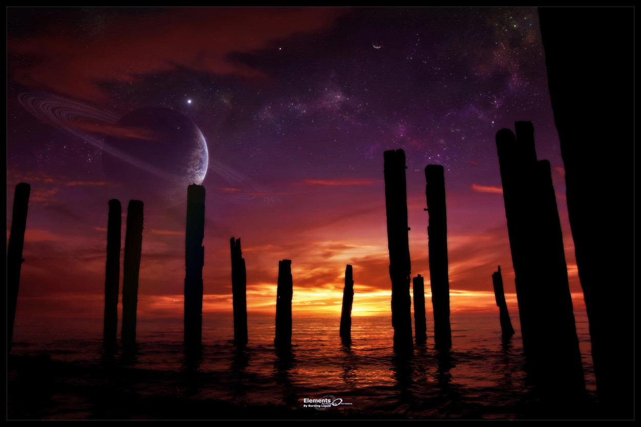
Sometimes simple works best...Enjoy
 (Smile)")
 For wallpapers, just click on the - download to desktop - button.
Related content


Comments: 95

wow.. i like your wall very very much! can you make another version without the planet!
Thankyou so so much!
👍: 0 ⏩: 0

nice... is this taken with long exposure or u blurred the water later on your self in photoshop?
👍: 0 ⏩: 0


The colors contrast so nicely in this piece. Very nice job framing the red with the bridge. Also, great reflection in the water...just enough but not overdone.
👍: 0 ⏩: 0

So cool...
It'd be nice if I really could see saturn from there
👍: 0 ⏩: 0


")

Unfortunately no waves... ")

👍: 0 ⏩: 0


looks good bl, but if i may suggest one thing regarding the piecure itself. It looks like the lens has some serious vignetting. And you get the sphere look from the center towards the edge. But hell, its a cracking good piece man, lovely work on those colors
👍: 0 ⏩: 0

Super awesome work!!!! I love it. That is so cool. Keep up the great work.
👍: 0 ⏩: 0


I really like it... It's so really but still a dreampicture...
👍: 0 ⏩: 0

Love the semi simplicity here. *sigh*
Only thing I'd personally have liked more, is if you hadn't let the art continue in the framing, but that's just preference I guess
I adore your color use x.x
👍: 0 ⏩: 0


Very much enjoy the warm colours in this. The man fishing adds that little bit of life to the piece. Great work.
👍: 0 ⏩: 0

A nice alternative to the various tree shots seen about the place. Very nice use of the pier.
I don't know if you used it deliberately, but if memory serves, the Stargate font you used for the title can produce an A that fits with other letters but lacks the circle above. You simply change the case of the letter (to lower, I think).
In any case, a simplistic but attractive image. I like the balance you've reached between having too much detail, and not enough. Struck well, in my opinion.
👍: 0 ⏩: 0

Excellent work, as usual. I really do like how you juxtapose an earthly scene with a very different sky/space -scape.
👍: 0 ⏩: 0


Since this scene is about a moment I'll go with the 'smooth' of it all. ^_^
Water reminds me of some some sort of soft cream-ice-snow.
Sunsets are always a grand thing anyways. Coll stuff.
👍: 0 ⏩: 0


what a great shot! [if ya took it  (Wink)")
i love the reflection it adds alot of reaslim
great coolors too.. feels like a moon rising.. but a planet
excellent work
👍: 0 ⏩: 0


aww.. 
Hypnotic...
Something like a movie set..on another planet!
👍: 0 ⏩: 0


Awesome image. Love the colors, and the balance the planet and the dock give to them.
👍: 0 ⏩: 0


this one looks lovely a really nice place
just one thing i don't like and thats the rings around the planet
👍: 0 ⏩: 0


how amazing it would be if such scenes we could see in oue skies!!!
ps releived that finally after a hiatus of months, some space art is featured on front page
👍: 0 ⏩: 0


| Next =>