HOME | DD
 burstnibbler — Assimilated
Published: 2002-01-22 13:34:32 +0000 UTC; Views: 2025; Favourites: 3; Downloads: 1144
Redirect to original
Description
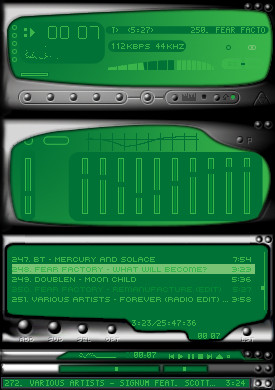
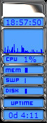
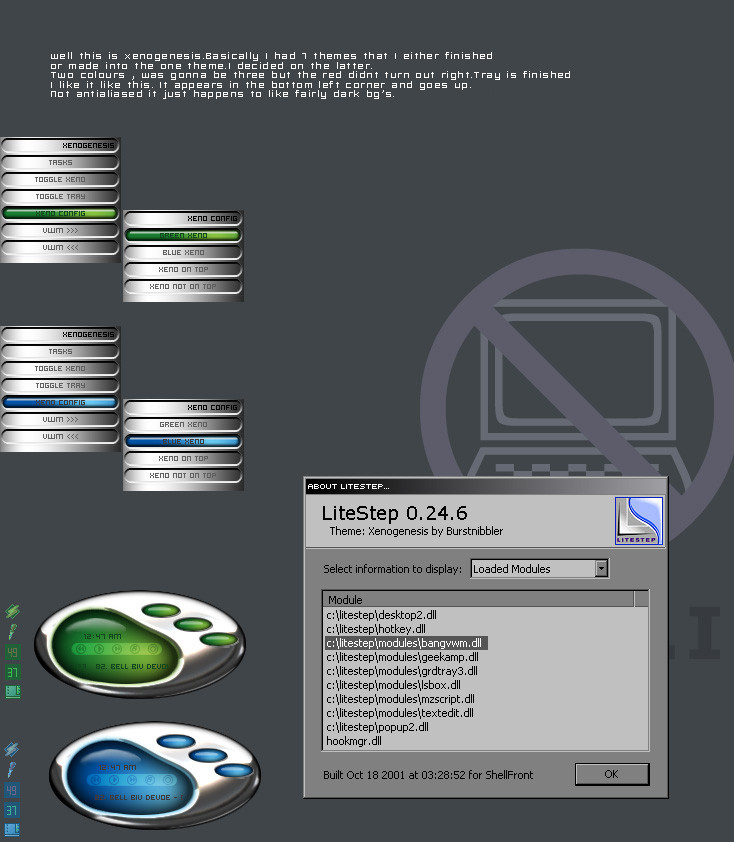
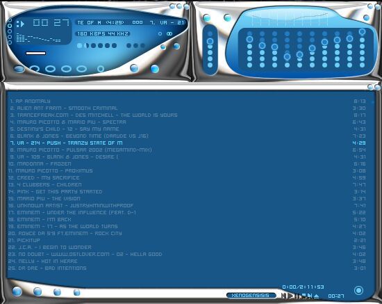
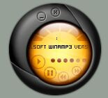
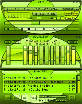
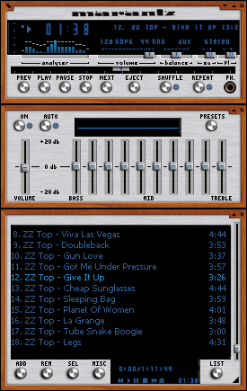
Was designed for a suite that ran into some problems so this is being released as a stand alone. The font used is included as well as a crappy avs that goes with it. ( I run for the hills when I see the words cos,sin and tan ) Install the font and then drop the font size down to 8 and you are good to go.Firs t amp skin that I am actually proud of!Related content


Comments: 26

Very good, looks basic, but then again you won't find a better skin than this
👍: 0 ⏩: 0


Your stuff is phatt !!!!!!!!!!!
Your stuff ROCKS...............
Where's the buttons..... LOL
Keep up the great work!!!!!!!!
👍: 0 ⏩: 0

beautiful
-----
___++delicious>>__ _
((alteredperception.org__ _
I support the dailyphotograph; https://www.deviantart.com/bugs/details.p hp?id=831
👍: 0 ⏩: 0


Great Skin, I like it, just one problem. There is a glitch in the title bar when it isn't highlighted. Fix it and it will be great.
👍: 0 ⏩: 0

Yes, you should be proud of this. This is a very slick skin with a nice clean feel about it.
I feel like it's missing something in the titlebar of the Main Window ... but that's just prolly me
Great skin
👍: 0 ⏩: 0

Really good. Love the text. The design rocks!
Breaking The Cycle is easy, all you need is a sledgehammer.
👍: 0 ⏩: 0


nice and smooth, good job!
-Tsp
A fetish in the hand is worth two in the bush.
👍: 0 ⏩: 0

I think you should use more of a silver instead of the dark black. Still good work.
===-----idvah-----===
👍: 0 ⏩: 0

Been doing some research into the Collective?
Nice and Borgish, the way it's supposed to be. The Borg Queen would certainly approve.
👍: 0 ⏩: 0

This is really great, the only thing as far as visual spiffiness goes is that the playlist editor LCD edges aren't as smooth as the rest of the skin. Still a great skin though, going to do any other colors? How bout orange?
~evilrice
::you may only know me as I exist upon this plane::
👍: 0 ⏩: 0

i could download this just for the font. but i already got it. but i downloaded anyways. schweet skin mann--slleek
----------------
adjö och goddag
goddag och adjö
👍: 0 ⏩: 0


Yes, very nice. Now I start my chant: Windowblinds/NextSTART, Windowblinds/NextSTART, Windowblinds/NextSTART, Windowblinds/NextSTART, Windowblinds/NextSTART, Windowblinds/NextSTART.
:~)
👍: 0 ⏩: 0

The pl titlebar has a bug... make sure you check it out.
My site: http://mspano.hypermart.net
CSA: http://crazysunart.narod.ru
Drunken Masters: http://drunkenmasters.hypermart.net
👍: 0 ⏩: 0

hey ! a really good one ! congrats.
---------------------
L-courni loves you all.
👍: 0 ⏩: 0

Intresting!!!
This is very different and damn good. The edges are too dark though. Maybe DS material...
Kool! !
.:THK:.
[:When one has learnt love, he has succeeded in life no matter how he has failed otherwise:]
👍: 0 ⏩: 0

wow very interesting design!
looks like "melted" metal... the colors fit quite well!
*download*
👍: 0 ⏩: 0

very nice. although I dont like the beveled gradient style, its very well done. shape of screens is cool
👍: 0 ⏩: 0


its green *marks up a point for it*
its shiny *marks another point*
its still green?? LOL nice skin man i really like it
CyA PeAcE
-=: My One True Friend, Mazziestarr :=-
-=: https://mazziestarr.deviantart.com :=-
-=: The Rift :=-
-=: http://www.tricache.dot.nu :=-
👍: 0 ⏩: 0

This has a really nice feel bout it! Im really likeing this one! Ace man, ace!
-Sesquipedalophobia: Fear of long words.-
👍: 0 ⏩: 0

gee... what sorts of problems didja have? this is one sweet skin! i wouldn't mind a suite like this...
JellyBeanSoup
JellyMedia Inc.
Yummy Wobbly Sticky Delicious Designing
#jellymedia @ ircdotthirty4dotcom
👍: 0 ⏩: 0