HOME | DD
 butterific — fuzzy layout one

Published: 2003-05-10 08:09:28 +0000 UTC; Views: 1116; Favourites: 3; Downloads: 193
Redirect to original
Description
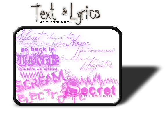
fuzzy layout of v2 of my portfolio.should i go for it? or head back to the drawing board?
comments would really be helpful.
thanks in advance.
Related content


Comments: 8


wow, I love this design. great concept and negative space. keep up the good work...
👍: 0 ⏩: 0


 (Smile)")

")

Perfect for those freaks that can't decide what they're doing there in the first place. Pretty. Petty. I'm listening to Willy Nelson.
👍: 0 ⏩: 0

I like it, it looks rough and unpolished, yet I can tell you did quite a bit to it. Most of it looks great, in fact I cant think of anything specifically all that wrong.
👍: 0 ⏩: 0

Yay! Really cool use of the exit sign. The concept even is a bit melancholic (or am I just being like that today?...). Well-thought over design I think, because the X always keeps coming back, which is really great.
And I always like replacements for those ugly scrollbars (on the right)
👍: 0 ⏩: 0

I really like te design. The way you used the sign is really visually impactful. I'm not sure get "exit/stay" concept though.
👍: 0 ⏩: 0