HOME | DD
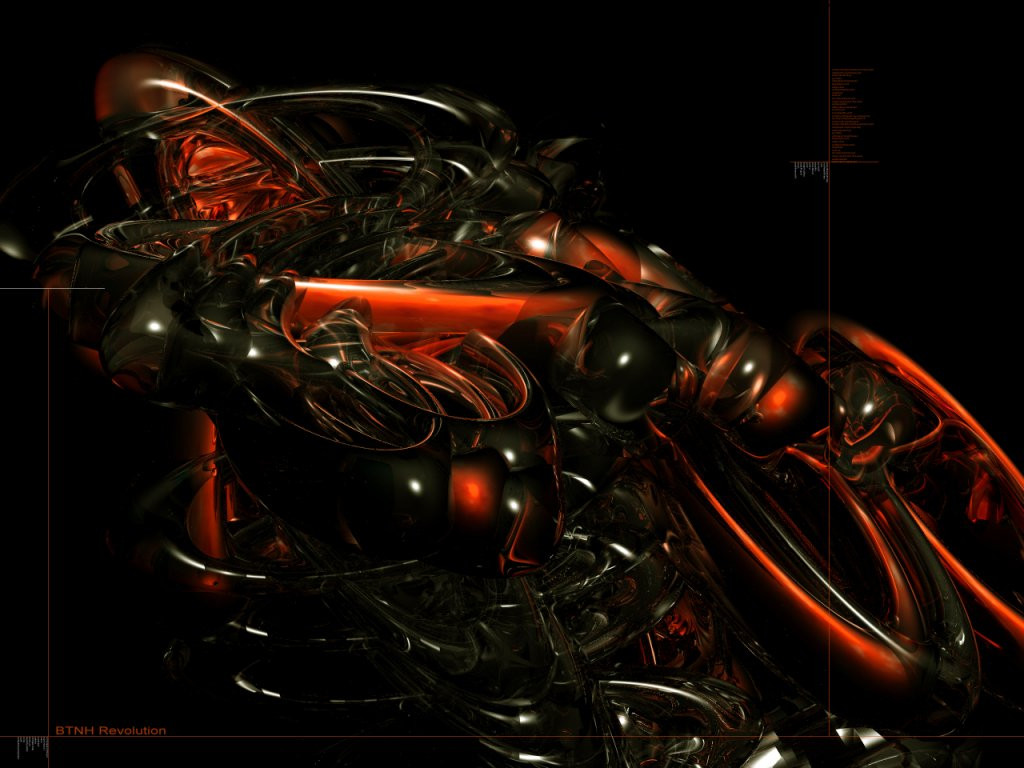
 c-dawg — Transparency In Motion v2
Published: 2002-03-12 17:01:14 +0000 UTC; Views: 889; Favourites: 3; Downloads: 54
Redirect to original
Description
Ok here it is, no typo what so ever. Done in Bryce and touched with some love from photoshop. EnjoyRelated content


Comments: 16


Amazing. This is an outstanding piece. Wonderful job.
-----
Two roads diverged in a wood, and I-
I took the one less traveled by,
And that has made all the difference.
👍: 0 ⏩: 0


Nice. Reminds me of shower curtain rings. Good job.
-----
- psyfect
👍: 0 ⏩: 0

very nice, liquid as shit man. great job.
bowldogg.deviantart.com
👍: 0 ⏩: 0

If there was a vote that said "In love with deviation" I wouldnt choose it...cause that's a little extreme. But i'd choose the best one anyways. This is amazing.
👍: 0 ⏩: 0


oh I like this....clean and simple yet classy stuff. Great piece
~It's all fun and games until someone breaks a crayon~
👍: 0 ⏩: 0


Gorgeous. It looks like crystal glasses. Wonderful design.
-----
The generation of random numbers is too important to be left to chance.
Robert R. Coveyou
👍: 0 ⏩: 0


if that is a glass render in bryce i bet it took a while....very light and warm....looks good without typo
-----
::::::::::::::::::::::::::::::::::
::::::----....fokus....----::::::
::::::::::::::::::::::::::::::::::
👍: 0 ⏩: 0

I think that if you colored some parts it would make it interesting. Its too easy to create things like that in 3dsmax. I mean its wonderfull but still needs something "special"...
👍: 0 ⏩: 0

yea man likes alot better sometimes, some peices don't need any typo on it so. nice job
👍: 0 ⏩: 0

ohh yeah i like this one better ... no typo and all ... sometimes typo is a huge plus .. but not in this case ... the glass still kicks! ... i really like how the (what are they dougnuts or trefoils) cross in the center to create those shadows and the darkness ...
^_^
-----
👍: 0 ⏩: 0