HOME | DD
 c-specter — Reviver
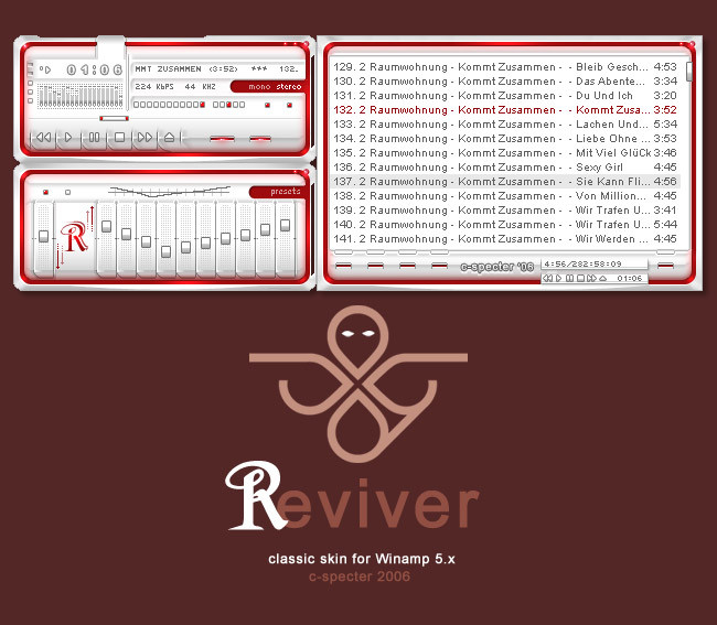
Published: 2006-08-14 16:34:53 +0000 UTC; Views: 4319; Favourites: 24; Downloads: 751
Redirect to original
Description
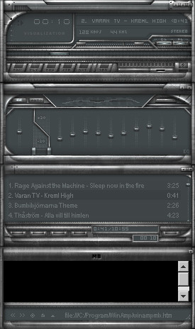
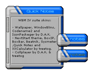
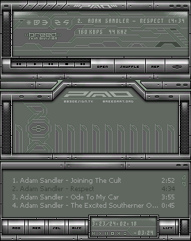
i needed a skin to match my desktop.a clean, red/white classic skin. enjoy!
 (Smile)")
fullview recommended
Related content


Comments: 24

I wish I could make de cPro version of this one... Would you let me give it a try?
👍: 0 ⏩: 0


'shrink' or 'minimize' button at the top right of the media library gives me the creeps ")
👍: 0 ⏩: 0

needs a blue, green, white/light and black/dark version of the LCDs and make it a pack! Great skin!
👍: 0 ⏩: 0


Oh, this is nice. Maybe not my fav skin of yours, but still very nice and different! I really like that volume and balance sliders!

👍: 0 ⏩: 0

very simple and not really clean, I expect more from u
👍: 0 ⏩: 0

coool, very good skin you put up here, me likes the simplicity very much, playlist is easy to manage, buttons are stunning good ta see.
The white space mentioned earlier isn't troubling me at all. All I see, what seems worth saying is that the main & eq borders are rounded and the playlist's are not.
Dope-a-licious work bro! ^^
👍: 0 ⏩: 0

this was something really new, something really cool! good job man! nice to se a new fresh winamp2 skin

👍: 0 ⏩: 0

nice skin! the white bar could be dropped, but except for that, it's really really nice. and one more thing: the edges on the main and eq could be square, just like the pl..
maybe add some color-themes for it l8r?
+fav!
👍: 0 ⏩: 0


This is hot. I actually like the white bar, for some reason.
We definitely need to collab some time.
")
👍: 0 ⏩: 0

I gotta agree with that lot 

👍: 0 ⏩: 0


yay, not bad, the effects are nice, even if they could be more contrastful in some areas ;]. Very Clean and slick skin xDD. Colorthemes would be nice  (Wink)")
👍: 0 ⏩: 0


Looks good mate, I agree with the previous comment though, that white bar in the top main window looks weird, throws off the flow of everything else. Other than that looks pretty good. I'm not a big fan of rounded corners on skins, but some people like it.
👍: 0 ⏩: 0
I like it! Nice colors, easy to use. I like the way you make the transparent region.
I like the red zone at the main (monoster) and eq (preset) windows. I wish it were at the playlist, maybe at List button.
👍: 0 ⏩: 0

This is one nice skin.
A couple of things:
That open space at the top of the main window seems a bit out of place.
And if you ask me, you should've made the "transparent" areas on the sides dark, like in the preview. It's kinda distracting right now.
👍: 0 ⏩: 0