HOME | DD
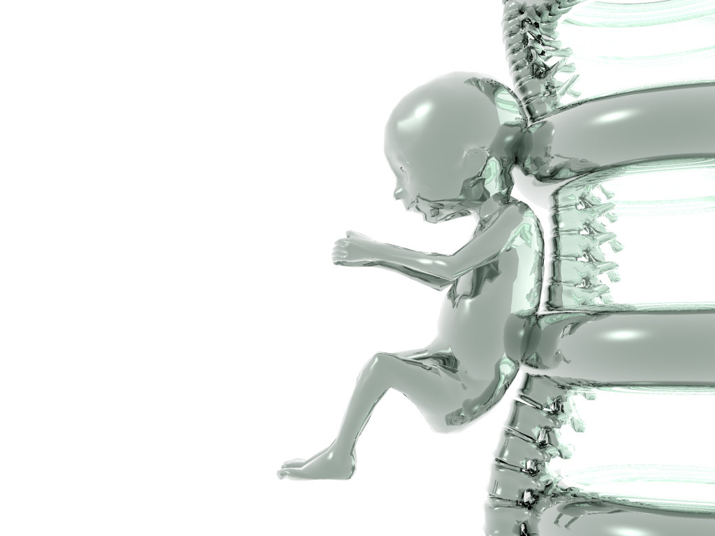
 c3d — Core Spawn Beta
Published: 2002-01-24 23:23:22 +0000 UTC; Views: 613; Favourites: 1; Downloads: 151
Redirect to original
Description
I made this render a long time ago and couldn't think of anything else to add to it, So thats why I'm calling it beta. I'm open to suggestions as alwaysRelated content


Comments: 10

There is definetely some matrix inspiration going on here. I must say that i thought it looked very well done. But in the full view i agree with polycast it needs more polys, but then what do i know about 3D take a look at my lame...haha 3d piece (i did it in 3D Max). As well i think make the whole structure take up less of the screen, in other words try shrinking it a bit and this will make it look closer to the left...
Good idea, needs more work becuase it could be better!
-----
- ULTIM8TOR
::2002, Glorious Deviantart::
👍: 0 ⏩: 0

That's very well done.
And deviously green.
Remind me of "Matrix" for some reason.
I know what you are thinking
👍: 0 ⏩: 0


slick man very slick
mac users unite .... or something like that
👍: 0 ⏩: 0

That's wicked ...I think it looks fine just the way it is. But for an idea/suggestion, this popped in my head though..lol....
How about moving the fetus/baby inside the rib cage instead...Give it a frontal view...and maybe putting the baby inside a transparent ball image of some sort(make it look like it's filled with water)...but making the baby look like it's trying to puncture the ball with it's fists...Oh, and maybe with a black background instead...(shrugs) LMAO, just don't ask me how to do it 'coz I have no freakin' clue ..I hope that helped a little though...
~Use your smile as un umbrella so you do not get rained on~
👍: 0 ⏩: 0

maybe add another one, upside down, on the left? i dont know it might look cool.
(`·.¸.·{ Andrew Gulmi }·.¸.·`)
(`·.¸.·{ Website http://www.snapworks.com/andrewgulmi }·.¸.·`)
👍: 0 ⏩: 0

Awesome idea and render...
It looks good just like that, but if you add to it, should turn out nice.
(brinx)
👍: 0 ⏩: 0

If you can add more polygons, (hehe I said poly) and up the resolution. that would make it look nice. now creatively what u wanna do is up 2 u. oh btw what did u use to model/render this.
👍: 0 ⏩: 0

very cool
i like the idea
but add more to it
it's a little boring right now
but it really has potential
-jc
_____________________
Grayscale Coalition
👍: 0 ⏩: 0

Wow, very cool render and idea. I really love the metallicy scheme you have. Maybe add some text in the left to give us some insight of what this image means?
-amphex(dan)
If your thinking of sending me a note of thanks for my comment, do something 10 times more helpful, comment on one of my own! Thanx0rz
👍: 0 ⏩: 0