HOME | DD
 c55inator — Steel Preferences
by-nc-sa
c55inator — Steel Preferences
by-nc-sa

Published: 2010-09-02 00:02:39 +0000 UTC; Views: 7132; Favourites: 33; Downloads: 1929
Redirect to original
Description
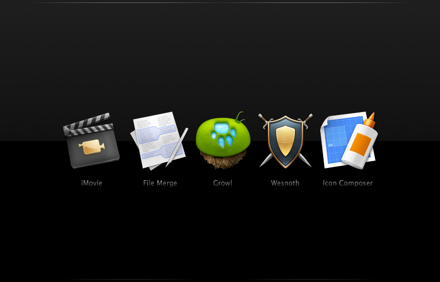
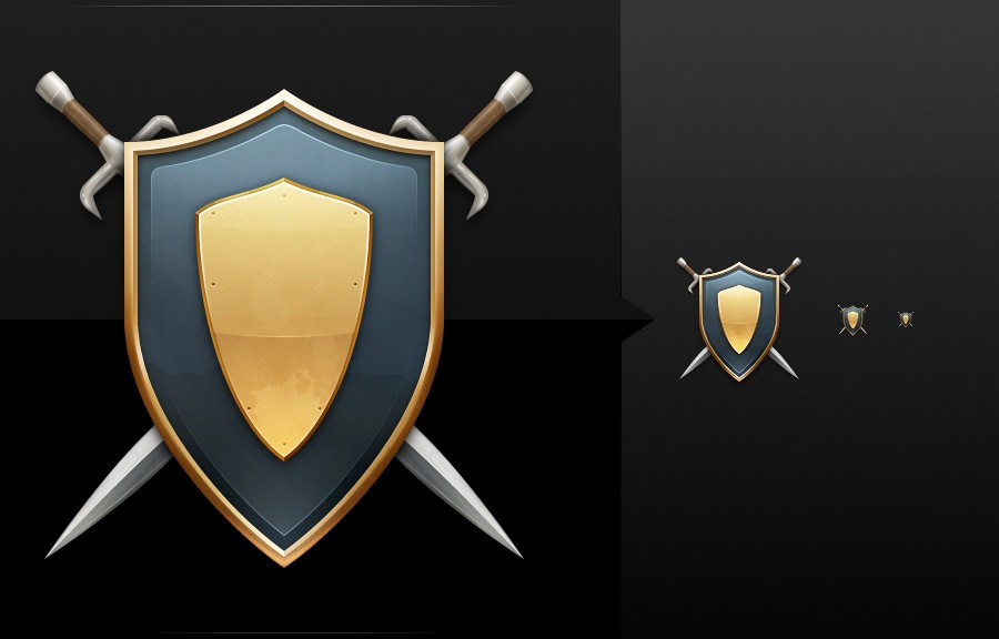
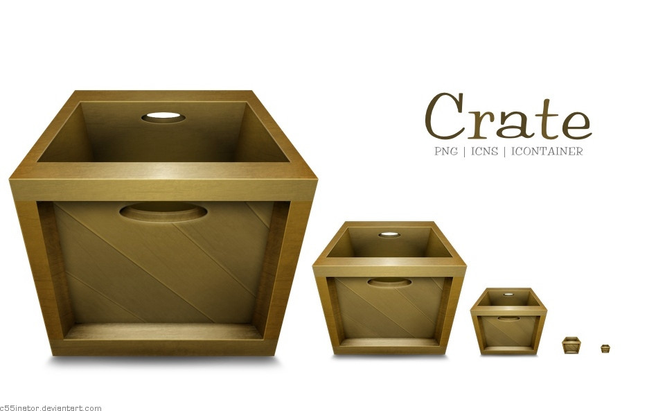
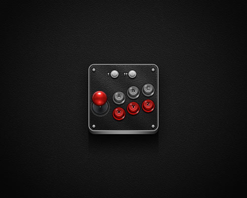
Just an experiment into lighting & metallics on Icons. At this point it looks nice but doesn't work that well in the Dock.Say what you will about the strange layout.
As always, critique is appreciated as my work is still amateurish!
Related content


Comments: 3


Actually it's a little wide for the height, so looks really small in my dock :/ Make it taller or thinner?
👍: 0 ⏩: 0
 (Smile)")