HOME | DD
 Cactus-Canine — ToF page 3 - Arrival
Published: 2008-01-02 15:20:27 +0000 UTC; Views: 2132; Favourites: 29; Downloads: 42
Redirect to original
Description
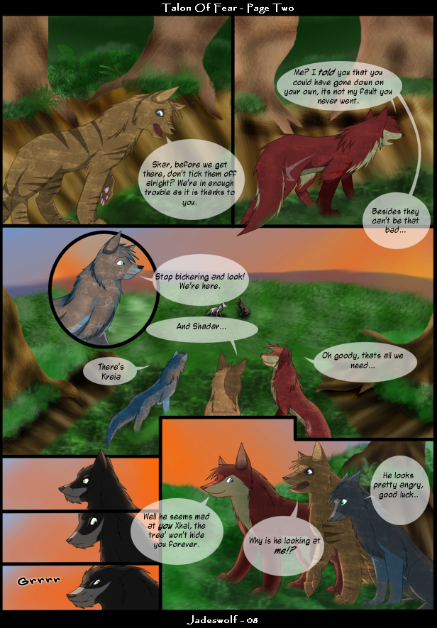
 finally my PC didn't die long enough for me to complete this :3 hurrhurr
Its way different to the first page which is why i'm going to have to make some tweaks to it
 i'e the shading
  (Smile)")
Please leave a comment if your reading - Thanks!

ToF & Characters belong to Jadeswolf :3
Trades are still open if your interested :3
Related content


Comments: 75

holy shit I wrote this long time ago, did ya forget about me? lol
👍: 0 ⏩: 1

Haha I haven't been on Devart for about a year but I came back today so I replied to all my comments

👍: 0 ⏩: 1
daaaaaaamn. must have been busy. ^_^
👍: 0 ⏩: 0

Thank you! He's one of my favourites even though he's so mean.

👍: 0 ⏩: 0


I love all the colors and textures! Very well done!
👍: 0 ⏩: 1
Thank you very much Sheep! <3
👍: 0 ⏩: 0

oooh I like this page! but what do you use for the speech bubbles?
👍: 0 ⏩: 1
Thank you! <3
Use...? Oh! I do them on PS CS2 and I use the Wand Tool (or 'walking ants' (Wink)")
👍: 0 ⏩: 0

I like very much bravo and your decorate are bravo very well made
👍: 0 ⏩: 1

Box 1: Well I think Xhal's back leg is a little twisted, it looks uncomfortable.
Box 2: No crit<3
Box(well...circle) 3: None, except I'd still like to see their mouths open when they speak. :3
Box 4: None.
Box 5/6/7: None really, except for 7, I say that his mouth curves up too much. It looks like he's being all evil and sinister, rather than angry.
Box 8: And I need to see those teeth in Xhal's mouth. Otherwise tis awesome.
👍: 0 ⏩: 1
Cheers Anjiru! <3 yeah another thing on the 4th panel is I need to put an eye in on Skarkaxe ")

👍: 0 ⏩: 1
D8 ohmai.
I thought it was dramatic effect. xD
👍: 0 ⏩: 0

Inteersting textures used - it gives the pages a new feeling ")
👍: 0 ⏩: 1
Thank you Okami!
👍: 0 ⏩: 1

No problem Jade! 

👍: 0 ⏩: 1
Oh i'm doing fine thanks x3 Yourself? 
👍: 0 ⏩: 1
Thank you! ^_^ I'm doin just fine!
👍: 0 ⏩: 0

Ah, these comic pages and their overall panel layouts are starting to look fabulous and professional. Definitely makes it easy to read and more fun! <3
Very lovely and beautiful appeal overall. The lighting is fantastic and the use of shadow on the characters, especially under the trees with the speckled look, is brilliantly done. The expressions are wonderful and uplifting and the diologue is profoundly interesting and captures your attention.
Though, in some bubbles it looks like the transparencies of bubbles are a bit too see-through. I'm not too big of a fan of these, but it looks very nice in your pages and fits well, so I'm not saying to change them. But at parts when it's too transparent the text can be a bit difficult to read. Mostly it's only when the text runs over the panel borders.
Also, on the subject of text, sometimes it looks like the text could be arranged a bit more in the center of the bubbles or evened out more. Text is the most difficult part in comics for me so I can't really give too good of tips on how to fix them
As far as imagery goes, the characters look wonderful to me, your anatomy is improving and the characters no longer look identical to each other but rather individual and quite full of character. Though in panel 2 and panel 3/4 (unsure there) the red furred character's head is supposed to be angled away but it has no eye. Though when the head is turned the eye becomes less visible, unless a chunk of fur or ear is in the way, part of the eye should still be visible. Without it, it looks like the character is... eyeless.
But yes, yes, am absolutely adoring this comic thus far. The plot lines are getting very intrigueing and the feel overall is coming together nicely. I'm no comic whiz, but it's looking pretty DANG good! <3
👍: 0 ⏩: 1
Thank you Filly! 
👍: 0 ⏩: 0

this looks great and your anatomy is inproving. ^^ Remember that little details can really make a difference. Adding teeth can add more realism XD right now they look like old dogs. lol
Nice layout though. Nicely done.
👍: 0 ⏩: 1
Thanks!
👍: 0 ⏩: 1

i really like the side slah/strip on the red wolf!! its soo cools!!
👍: 0 ⏩: 1

WONDEFUL!!!!! even better then the last ^^ the poses and the bgs are awsome!!
so i can practice poses, get better at bgs and differant perspectives... and the big one of making markings to make them have expresions rather then eyebrows 
👍: 0 ⏩: 1
Thank you Fender!
👍: 0 ⏩: 0


WHOA!! Th...th...this is BEAUTIFUL!!! Seriously, this is awesome! I'm so JEALOUS!! How do you get it to look so good...?
👍: 0 ⏩: 1
Thank you Travel's! <3 just practise i guess :3 and a lot of downloaded bush brushes xD
👍: 0 ⏩: 1
Nwa! *hugs* It's so cool...how do you shade here?
👍: 0 ⏩: 1
The magic of the Pen Tool :3
👍: 0 ⏩: 1
XD Har, har, same here, but that's not entirly what I meant. I mean...like, do you use grey on a seperate layer, and put it to multiply? If so, what color grey? ...*stupid vague questions*
👍: 0 ⏩: 1
Oh sorry! I use black to start then i go to the layer window and reduce the Opacity until its not too dark or too light :3 its usually around 40-50
👍: 0 ⏩: 0

Nice comic page you have here. The lighting and shading is amazing, and so far I am interested in how the comic is going to be. Yeah, I got a lot of catching up to do, I don't want to sound like some know-it-all, but might I suggest you put some thin lines on the tree to show bark or something like that. It is hard to explan
and maybe some clouds in the sky, I am not saying you HAVE to. Just suggesting.
But other than that, I like this page can't wait to see more from you soon.
👍: 0 ⏩: 1
Thank you! :3 of course, I wouldn't mind trying something different on the tree's, a few line's will do it good 
👍: 0 ⏩: 0

Skar so reminds me of swiftkill from BBA, but then again, so does every red wolf I see XD looks very nice. Your layout is very unique

👍: 0 ⏩: 1
Thank you!
👍: 0 ⏩: 0

ooo...very nice.I love the shading in this one.so pretty.^w^
I wish I could get my comic going but I have no plllooott....
👍: 0 ⏩: 1
| Next =>