HOME | DD

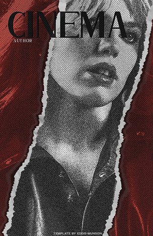
CescaLR — Venerance Reaction Icon Style.

#photomanipulation #fanwork #graphicdesign #photoshop
Published: 2023-11-22 23:51:16 +0000 UTC; Views: 654; Favourites: 10; Downloads: 0
Redirect to original
Description As a member of the rpc in the current culture, of course i have reaction icons for my muses for when they're needed. I like to use them; i like aesthetics, even when I can't really see them; this works for me at Big size, but most rpc icons are like sub 90px these days. Oft, sub 70px. Not great! Especially when they're gifs; you lose so much info with the gif compression anyway, and then you go and make it smaller than my little fingernail? why?! Argh. If something's pretty, damnit, let it be pretty. show it off. There were quite a few variations on this idea before I settled on a style of thread icons I'd be happy with for the whole blog, as Venerance is a SPN multimuse acc - it needed to fit the theme without being too specific. Show-aesthetic rather than character-aesthetic, you know? For venerance, i went with a very, grey, red, white, black, kinda thing. You can see it in action here Not So Holy. (tumblr.com)  but note it's unfinished and outdated, as I never got around to fixing up what I wanted before the js ban. (The themes octomoosey makes are great, though if i could figure out how to disable the title blur i would; it hurts my eyes.) The bkg is extremely outdated and low res, please forgive it. I didn't have access to my usual creative suite at the time, I made it in a baseline paint.net, no plugins, with low-res screenshots. First thing I'd fix if i could would be the bkg. The blog isn't my best work, and needs quite the revamp. Ah well. 
Related content
Comments: 1

CescaLR [2023-11-22 23:53:11 +0000 UTC]

👍: 0 ⏩: 0