HOME | DD
 chameleon2k1 —
visual animosity
chameleon2k1 —
visual animosity
Published: 2001-07-10 11:04:23 +0000 UTC; Views: 9371; Favourites: 36; Downloads: 2153
Redirect to original
Description
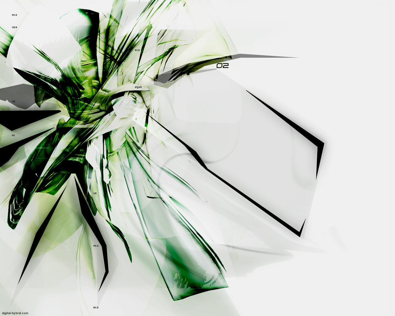
i just got back from vacation a while ago, and thought i would use my time here playin in photoshop. This is also my first deviation.-peace out
ps. zip contains 1280x1024, and 1024x768
----------------------
[link]
Related content


Comments: 65

i like it.
i like the colors.
i like the random strings of text.
i like the fact that your first dev got DD... congrats!
👍: 0 ⏩: 0

I couldn't agree with Itirep more. This is so trendy it's not even funny. Sorry man, orginality counts for something.
Mathias
http://www.brazengraphics.com BrazenGraphics.com
👍: 0 ⏩: 0

excellent, it's on my desktop... green is nice, a good refreshing change to all the millions of blue wallpapers around...
i dont think it's missing anything. and a white background. me like
keep it up!
louie.
👍: 0 ⏩: 0

Damn, nice work chameleon. A DD for your first submission, am i envious In my opinion it isnt lacking anything, people are always saying that when there is a white space, but really it looks fine. The greens are a welcome change as well, u have worked them in nicely. I officially love this wp, and i can't find anything to critique. oh wait, that 'splotchy' type effect near the bottom isnt that fantastic, and maybe could be changed, but otherwise, great effort, and congrats on the DD
::no offense shalt go unchastised::
👍: 0 ⏩: 0

Wow, awesome man. The greens look really great. I love how all the shapes look and mix with eachother. Cant wait to see what else you have to come.
::Visions are deeper then Sight:::
👍: 0 ⏩: 0

huh...i'm not trying to be insulting-but i don't like it...it looks like a hundred other wallpapers all with pointy layered messes on a white background...sorry
why use your mind when your genitals will serve you just as well anyways?
👍: 0 ⏩: 0

reminds me of a palm tree or the inside of a flower....but it looks spectacular. nice work. cant wait to see your future deviations!
[doobybrain]
👍: 0 ⏩: 0

Damit, i wait around like all day trying to get the ffirst comment for the new DD, and i go out for like 30 minutes, and come back and here we are!
O ya, the DD. It looks awesome man
I love the designs and the open space. The only thing i'd change is the colors.
Maybe All those shapes and stuff could be a blue, and the white backround to a darker shade of blue.
but thats me, other than that, it looks fantastik
º°¨¨°º©!STYLEZ!©º°¨¨°º
👍: 0 ⏩: 0

Thank you so much for making a light wallpaper! Looks really nice, hope to see more from you...
DaGuy | http://www.daguysdomain.cjb.net
👍: 0 ⏩: 0
guesshimself [2001-07-11 03:56:23 +0000 UTC]
wow, your first deviation and your first DD all at once. good start huh? i like the greens of this piece. it just looks really great. dangit...i need photoshop. but again, great work and congrats!
=GUESShimself=
my most frequently asked question: who let you in here?
👍: 0 ⏩: 0

wellp fer starters i like, i agree it lacks a little something, but then again im all about messages - which is what i think this lacks, but ITS A WALLPAPER! AND A DAMNED GOOD ONE! i love the technique, great style, good colors.
keep up the good job
and welcome to devart
drowning is fun.
👍: 0 ⏩: 0

Eh, forgot to grade, I do think it's lacking... something... not sure what though
👍: 0 ⏩: 0
Hmm.. interesting.. woah, a DD with only one prior comment
👍: 0 ⏩: 0

Hey buddy where ya been? Nice piece but I think its lacking something. Hrmm. I like it maybe if it was blue i would use it .
Designed Strife - http://www.flagrun.net/strife/
👍: 0 ⏩: 0