HOME | DD
 chaninja — ChaNinja Style RC4 BLUE

Published: 2002-07-15 00:46:10 +0000 UTC; Views: 30785; Favourites: 28; Downloads: 17834
Redirect to original
Description
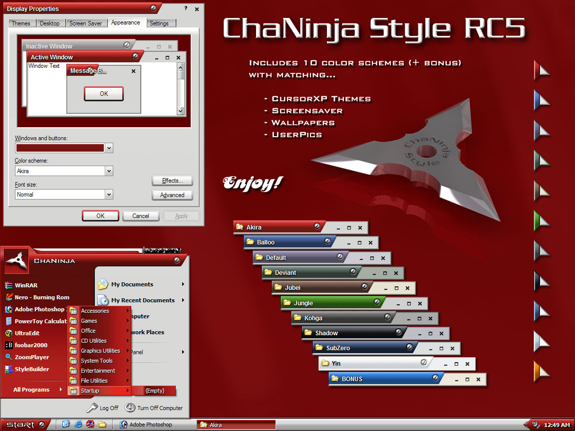
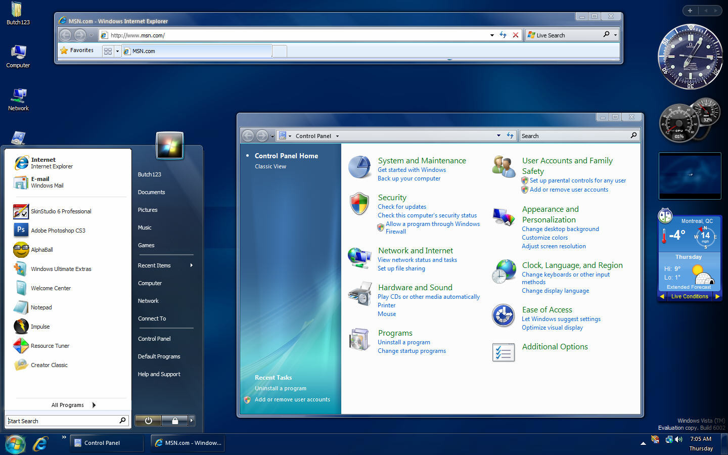
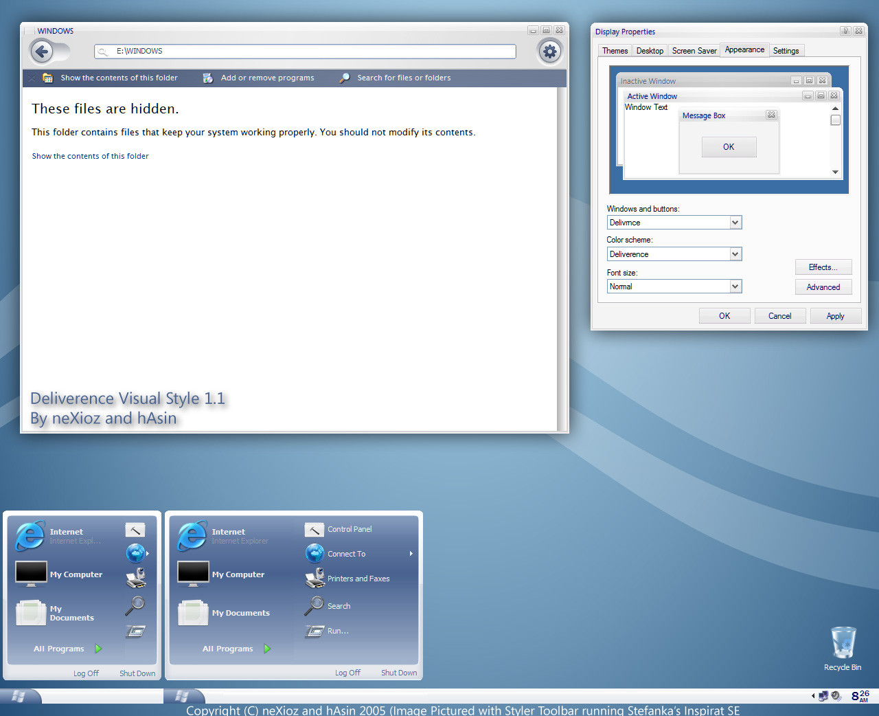
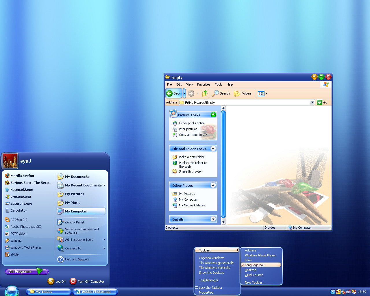
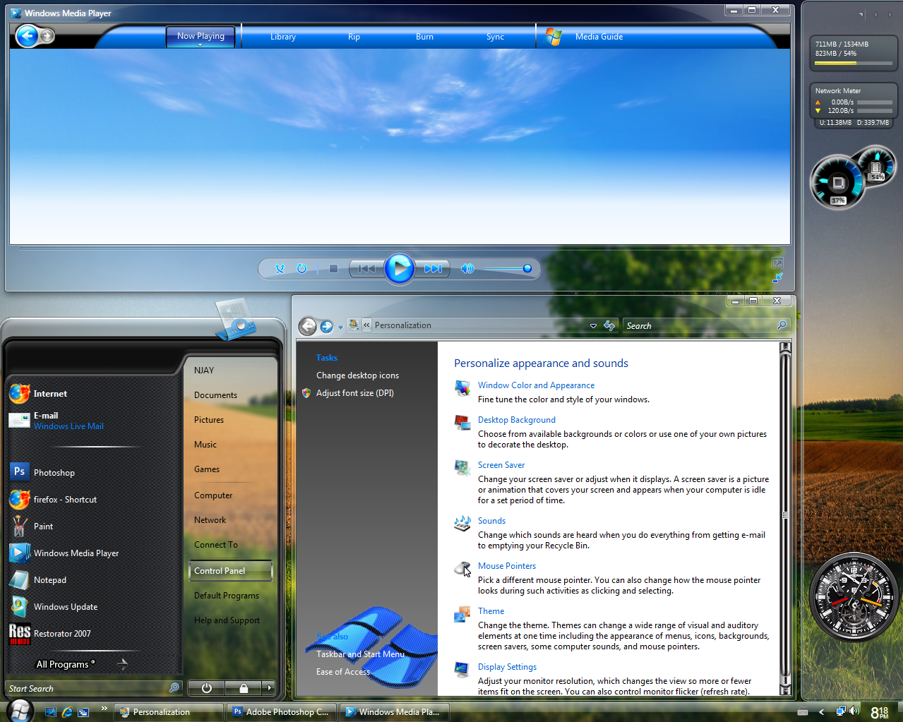
This is a preview of ChaNinja Style RC4 (Blue scheme).INCLUDED
- UserPic (star & blank)
- Plain textured wallpaper.
- Font : Bank Gothic Medium BT
COMMENT
Its been a while hasn't it? Don't ask.
Its not much but I hope you like it. Don't forget to install the font and please leave your comments/ suggestions.
Related content


Comments: 14


This blue is so cool! Another awesome theme!
Your colours are amazing!!
Thanks again!!
👍: 0 ⏩: 0


This is, by far, the BEST. Thanks for your work. You are a master! I was wondering if you can do this in a shiny Black/Grey.
There is a small "glitch" in my start menu - on the middle divider, by "my documents". Is it because of the size of my icons? Here's a screenie:
[link]
👍: 0 ⏩: 0

This is the best visual style I have ever seen for Windows XP. I was a big fan of the first Chaninja theme, but it was a bit too gray for me.
If I may offer a little constructive criticism. The font in the window title bar sucks if you dont use cleartype, it looks blocky and spoilts the overall look. I also preferred the "start" font used in the first chaninja theme.
All it needs is a couple of smallish tweaks, but either way its impressive stuff indeed.
👍: 0 ⏩: 0

coo its in blue now.. your other stlyes are great man
👍: 0 ⏩: 0

hmm, looks kewl, but i liked the grey one better, are we gonna see more of the grey one ?
👍: 0 ⏩: 0


love the style ... althought those white windows I could do without.... it's still one of my favs..glad to see a new version!
👍: 0 ⏩: 0

i hav to say dat dis is a very nice peice well done m8
👍: 0 ⏩: 0

I hope you kept the grey theme with this - be a shame to miss that
Standard response - will there be a loginui recoloured as well
👍: 0 ⏩: 0


once again youve done it chaninja, see down at neowin. +favs
👍: 0 ⏩: 0