HOME | DD
 chaos61988 — Scesmoon: Reference sheet WIP

Published: 2007-03-03 09:51:29 +0000 UTC; Views: 954; Favourites: 18; Downloads: 27
Redirect to original
Description
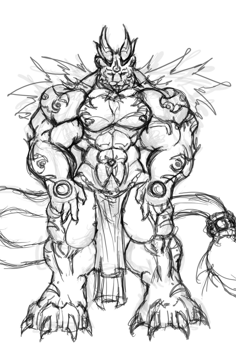
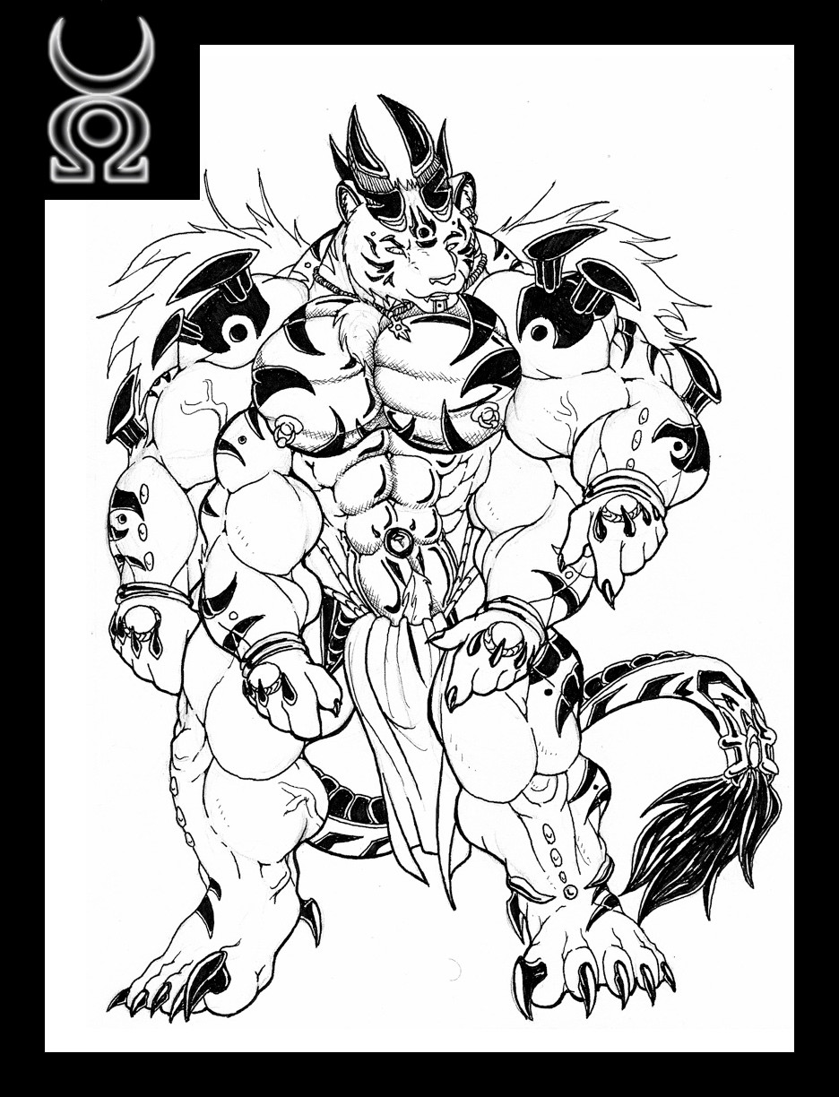
the main thing i was pushing here was contrast, so my inks didnt look so dullRelated content


Comments: 7


The constrast doesn't look too bad, it's bold, but good. Your right though it does bring out your inks more. Wonderful job on the anatomy and the poses, everytime I look at it I still want to hold up one of those little black boxes on your rear. XD
👍: 0 ⏩: 0

Well, the constrast is definitely good. Poses are pretty dynamic as well.
👍: 0 ⏩: 0

>w< You really did push the contrast; I just love the contours of his muscles; such a great shape
👍: 0 ⏩: 0


Those contrasting patterns will really, really help me draw them for the fanart I have to finish. Woo.
👍: 0 ⏩: 0