HOME | DD
 ChazyChaz — Harry Potter PrisonerOfAzkaban
Published: 2005-01-20 18:29:02 +0000 UTC; Views: 9324; Favourites: 187; Downloads: 296
Redirect to original
Description
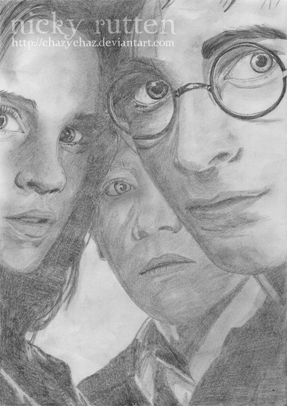
Harry Potter and the Prisoner of Azkaban posterRelated content


Comments: 129


if imake a colour drawing i only use colour pencils so i have to start over again
")
👍: 0 ⏩: 0

")
👍: 0 ⏩: 0

aaaaaah! we love Harry Potter! (the 
loveely, loveely!
👍: 0 ⏩: 1
 (Smile)")

looks so good , great drawing skills you have .
👍: 0 ⏩: 1

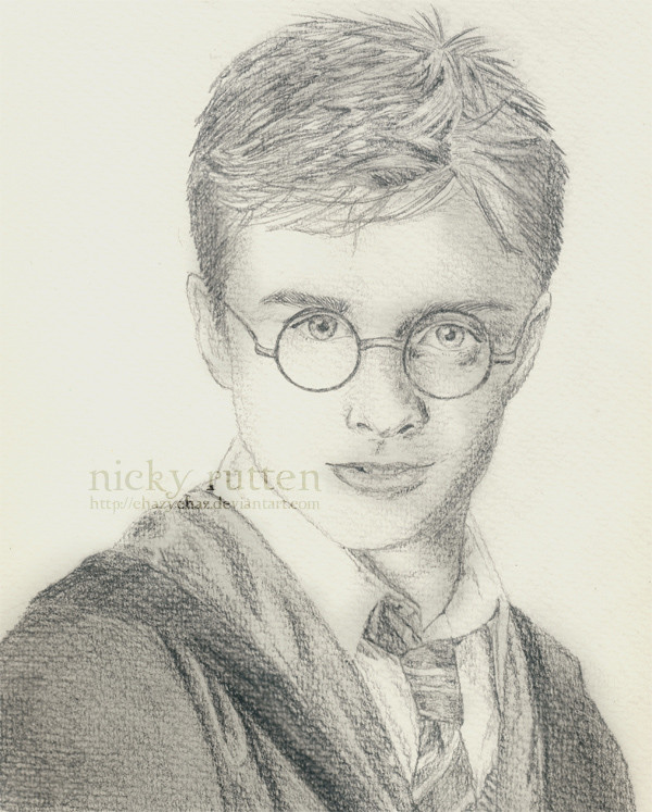
now then. I think something that you should work on, is trying not to outline things. I notice around the eyes mainly, that you've left the guidelines intact, which is a no-no *hates that saying* when you're going for realism. It is mainly Harry that I see the most fault with. The right eye (his left) is slightly too big and needs to have the top eyelid covering it a little more. If you cover everything else with your hand, it looks like he's seen a ghost or something.
The piece between the lips and the nose *doesn't know how to describe it* ok, just go here to see what I mean:  click here
yup. other than that, i'll say good job! coz it is! you got Hermione bang on!

👍: 0 ⏩: 1


wow amazing artwork
Iam not a big Harry Potter fan but this is an amazing artwork and I really love your style of drawing

👍: 0 ⏩: 1

Like some have said, the drawing needs more contrast.. the darker areas need to be darker and the brighter, brighter
But I other than that nice job! I stumbled across this and noticed it was harry potter right away, which means the characters are very alike
👍: 0 ⏩: 1
i couldnt get the dark areas darker
👍: 0 ⏩: 0


great job!! i freaking LOVE harry potter to death. fave for sure.
👍: 0 ⏩: 1

i love you work!!!!
it is apsolutly mesmerizing!!!!
yeah Harry Potter!!!!!!!!!!!!
👍: 0 ⏩: 1
i love you work!!!!
it is apsolutly mesmerizing!!!!
yeah Harry Potter!!!!!!!!!!!!
👍: 0 ⏩: 0
i love you work!!!!
it is apsolutly mesmerizing!!!!
yeah Harry Potter!!!!!!!!!!!!
👍: 0 ⏩: 0

Your right this one looks so much better. It really good!
👍: 0 ⏩: 0

It's not a very subtle difference at first, but I do like this one a lot better. >.< I'll favourite it, it looks awesome! Woot!
👍: 0 ⏩: 1


u draw noses really well i like how u can c harry's shadow from his glasses ^^ very nice detail n shading
👍: 0 ⏩: 0


I feel that there's not enough contrast in this. But other than that, very well done!
👍: 0 ⏩: 2
I reccomend using a bit of charcoal then
 (Wink)")
👍: 0 ⏩: 0
you generally don't find a portrait (that hasn't been digitally edited) with "enough" contrast, due to the fact that the pencils are not as dark as we would like them to be. I know that even with an 8B, you still are unable to get enough darkness against everything else, without pushing hard and ruining the paper. Yay for digital editing?!
👍: 0 ⏩: 0

Hrm,
On each one of these characters you've overemphasised certain features, namely the nose and the jaw. Harry's upper lip is also distorted, being pulled to far to the left. the way you've used the pencil gives the appearance of lumpy skin. Otherwise, well done. You've done really well capturing the intensity of teir eye's focus along with th light falling on the front two figures. The composition is alsovery good, but I assume that wasn't your doing.
Keep up the good work.
👍: 0 ⏩: 0

This is not intended as a slight against you, but I was getting tired of seeing Harry Potter and Amidala drawings (All of which were excellent drawings in their own right..) for awhile. But, for some reason, I decided to come look at yours. I was actually pleasantly surprised...
I give you points for attempting three perople at once. That does take a lot of effort.
A couple of minor critiques....
The shading is a tad uneven...it could be smoother, less grainy with more contrast.
Also, on Ron...the bridge of his nose looks awkward.
This is an excellent rendering. You've captured the likeness of the three young stars quite well. A nice sense of depth and proportion also. Very good work overall.
👍: 0 ⏩: 1


OMFG!!! OMG!! OMG, I'm using Internet phrases like "OMG"?? Nevermind...
You are amazing!!
👍: 0 ⏩: 0


goshers, ur good at this. x] gorgeous, its rlly gorgeous.
NIIICE.
👍: 0 ⏩: 1

Very nice! I like the depth and the way you have captured the expressions!
Did you have an image you looked at as you drew it? If you did, can I have a link to the image, i'd like to do something like it.
👍: 0 ⏩: 2
i cant find the link.. can i email it to you? i have it on my computer
👍: 0 ⏩: 1
Yep, course you can, just hit "email" on my deviantart page.
👍: 0 ⏩: 0
wait ill search for the link..
👍: 0 ⏩: 0

heee ik had lekker de primeur van die^^ ik vind m echt super mooi!! RON<333333! xx
👍: 0 ⏩: 1

| Next =>