HOME | DD
 cheeks-74 — Extra Extra Colored

Published: 2004-09-15 18:20:48 +0000 UTC; Views: 27704; Favourites: 551; Downloads: 7888
Redirect to original
Description
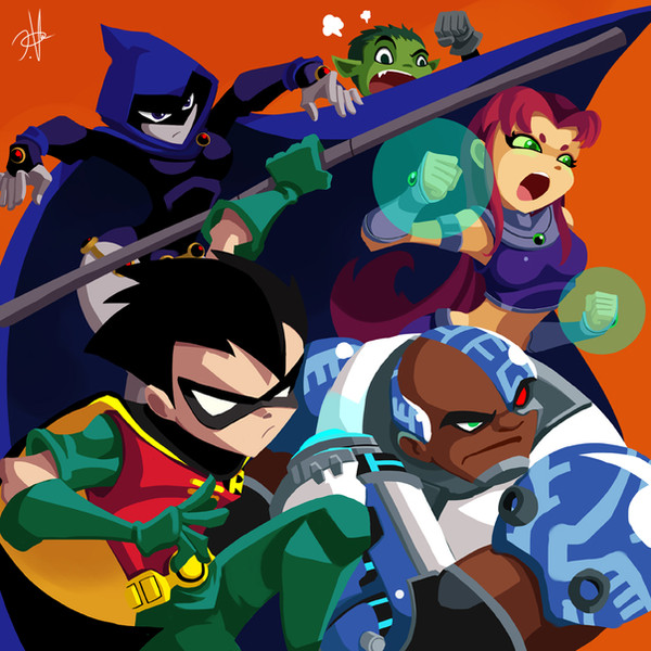
*** Sorry for the repost, gang. I just wasn't feeling Starfire's hands, so I went back and defined it a bit more.***I was going for a simple background. I wanted the focus to stay on the action...
Hope ya'll digs the final product....
Art: Sean "Cheeks" Galloway
Related content


Comments: 205

dope to the tenth power...i got much respect for your art. i do dig.
peace...
👍: 0 ⏩: 0

awesome man.....i love how you drew robin.....do ya mind if i use that style for a few fanarts?.....ill give you creds
👍: 0 ⏩: 0

the background does look a little unfinished, but i suppose it's okay.
that turtle is SO cool.
👍: 0 ⏩: 0


Amazing broo ! this is perfect ! ...the idea of a simple BG is brilliant (actually is what i like most)... anywayz, thx 2 share it. 
👍: 0 ⏩: 0


very nice dude,
ya see now that's what they should be doing instead of fighting crime. heh.
")
👍: 0 ⏩: 1

thanx, dan! and they should be shouldn't they? haha
👍: 0 ⏩: 0

fantastic! so playful and fun!! I don't know if they're doing a teen titans comic due to my being out of the loop for a couple years, but i'll be damned if you aren't the man for the job!
👍: 0 ⏩: 0

Cheeks dude, you seem to smoke a lot of pot.  (Smile)")
👍: 0 ⏩: 0

Argh! You add so much life and creativity to these characters! I can't help but feel that if this job were in anyone elses hands you would just see some generic action scene with un-dynamic colours... But with people like you in the comics scene the medium of comics is really achieving its potential. Thank you for making so much more than just another comic related xerox.
BTW, love your colours, as usual.
👍: 0 ⏩: 0

Dude! This is way tripped out! I love how everything just seems so soft and seems to flow in this. The simple lines and the muted colors really help create a certain mood I think you were trying to go for. To top it off I think that the simple backround really works for this. It brings down more attention to the charaters and what they are doing, and slowly brings your eye from left to right.
Hats off to you my friend. +fav.
👍: 0 ⏩: 0

It's Tight like a pair of cheeks!
👍: 0 ⏩: 0


thats the coolest teen titans fanpic I have ever seen. They should put this on a DVD
I'm not sure how to go about critiquing this, the color definetely goes along with the style (more shades or highlights would make the pic more 'restricted', know what I mean?), the lineart is GREAT, and the background (or lack of it) makes the pic all the more interesting. I would however had made cyborgs hand appear just a little behind the shoulder instead of under his torso because I didnt know what was going on with him and the paper (I thought his arms just extended/he had a grappling hook), I would make the beam more defined (no spray edges), or maybe more transparent, or transparent on the inside, or outside (whichever).
👍: 0 ⏩: 0

makes me believe that I could exist in cartoon world.....and be a real cartoon boy!!
(dances in daze)
👍: 0 ⏩: 0


OMG! Its Starfire, Robin, BB, Cyborg and Raven O.o! The are AWESOME!
👍: 0 ⏩: 0


I saw that episode where Beast Boy was hypnotized by that crazy professor. That was the only episode I saw though. Love all the inside jokes!
👍: 0 ⏩: 0

really nice coloring i really like the color that you use
👍: 0 ⏩: 0


thats awesomer i really like how you made the background simple but i think you could have added some more stuff... but its really good nontheless.
👍: 0 ⏩: 0

Great to see the Tenn Titans in your style ")
👍: 0 ⏩: 0

First off, i've gotta say that's the greatest Raven ever
as to critique...
i'd darken up your dark areas. This seems to be one of the only critiques i give you, but i'm a freakin' dark area WHORE. styalistically, i've noticed you stick to the lighter, softer tones in your stuff and it's awsome. but then here, when you stick those blacks into cyborg, it does wierd things to the composition.. my eye goes straight from starfire (whose surrounded by negative space) to cyborg who's got the deepest blacks in the picture. if you darken the tree in the foreground that could act more like a framing element for the "kids", as well as balance out the bright white on the other side. then, if you add to the darks on raven (just a bit), that could make a sort of visual check point and help to make her stand out as much as the rest of them (you know, other than the fact that she's on a giant turtle  (Wink)")
also, not so much a critique, but... what the hell is the turtle staring at???
but man, the teen titans have never looked more appealing then they do here. i can't STAND what cartoon network's doing with them and the original comic's... funky. awsome stuff man.
 (Cool)")
👍: 0 ⏩: 0

dude, ive been waiting for you to finish this so i could fav it. and you have. so fav
👍: 0 ⏩: 0

That is awesomely cracked. As in like wickedly twisted. Or something. Very abstract. Lovely fence shadowing, and the unconventional design pulls the viewer in. Crap aaaand I love the girl-person-at-front who's-name-i-forgot's expression. X3
👍: 0 ⏩: 0

this is awesome. there was only a slight bit of confusion when viewing this. at first, for whatever reason, i didn't realize that the cart was going around the corner, therefore the papers look like a BG high-rise building or something. and about the minimal BG, I dig it, but i can't help and feel the need for it to extend a little farther on the right side, or maybe extend the shadows of the fence, something, anything to make the last character on the edge coexist in the same space. and one last thing, what is the turtle being hypnotized by??? ok, anyway, this is great.

👍: 0 ⏩: 0

I am a bit confused by the stack of papers. Are they on the cart? They seem to be behind the picket fence. Can ya help me out?
Other than that, I really like the colors and mood.
👍: 0 ⏩: 0

Superb color choices, great spin on the characters, and the simple background works remarkably well in this situation.
The verdict: This piece is t3h h0ttz0r
👍: 0 ⏩: 0

Woah! That's one of the best ever that I have seen from you
👍: 0 ⏩: 0

this is sweet man!! always liking the stuff you put out. awesome concept about them walking into another set... reminds me of... that jadakiss vid!! haha dope shit man your colors blend so well ^_^ and the lighting is hot!
👍: 0 ⏩: 0

great poses and style. The colors are nice and work well with the whole piece. fave!
👍: 0 ⏩: 0

excellent colours, the shadows are very atmospheric and strong, kinda like evening sunshine. The 'throw' pose over on the left hand side is really dynamic. Looks excellent to me.
I know you're going for the simple BG but personally I would've liked to see the BG colour stretch over to the right more, or something with colour on the right to kind of frame the whole composition because it kind of feels to me like they're walking off the page or into nothing. Y'know? It's a small gripe and I can't complain at all about the line-art and colouring, I can't even touch that style no matter how hard I try.
Excellent work, the hypnotised turtle is a personal favourite from this pic 
👍: 0 ⏩: 1
yes!!! i wanted them to feel like they were walking off the page into another set? i didn't want to mention it but it was exactly what i was going for. thanx a bunch for your comment!
👍: 0 ⏩: 1
Ah.... well then.... I rock.
No problem, chief. Keep up the oh so freakin' tight work.
👍: 0 ⏩: 0

amazing and gorgeous colors. the characters and background are both fantastic too. that's a pretty great picture. i 
👍: 0 ⏩: 1

Now that looks a whole lot better. Never doubted your cel shading colors for a moment. What can I say? You da man, supaman!
Yet, I still can't figure out what it is that's hanging on the end of that fishing rod. Maybe if I watched teen titans more often I could figure it out. Hmm.
Anyways keep up the excellent work
👍: 0 ⏩: 1
thank you... it's a lame attempt at a tofu pizza.... lol
👍: 0 ⏩: 2

Any particular reason why you didn't just draw the pizza from the other side to make it more recognizable?
👍: 0 ⏩: 1
No wonder I couldn't figure it out. I've never eaten a tofu pizza before
")
👍: 0 ⏩: 1

OH!!! That's what it is???
👍: 0 ⏩: 0

I certainly do dig. If the cartoon actually looked like this, I might actually be able to watch it.
👍: 0 ⏩: 2

oh dude you are so totally right! CN should put cheeks in charge (C in C! hee!) and everything would rock and each cartoon would be followed by a 'Hope y'all digs...' before the creadits! whoo!
👍: 0 ⏩: 0
<= Prev | | Next =>