HOME | DD
 chicharon — color scheme help

Published: 2006-11-09 04:03:15 +0000 UTC; Views: 3169; Favourites: 43; Downloads: 17
Redirect to original
Description
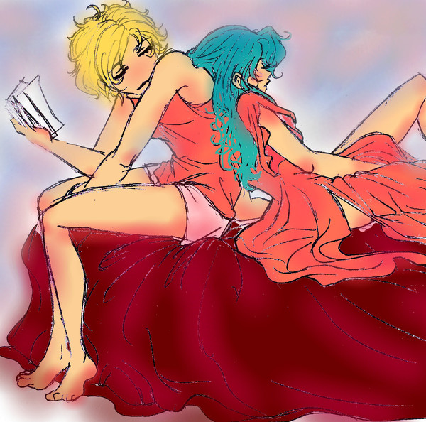
hey, guys! i need your help in deciding on stuff! ^_^yeah love sending out to scraps! since you guys help me a lot in giving constructive comments on line art and coloring.
remember this one? kinda got too exited its suppose to be just simple coloring but it it just got out of hand.

um which coloring scheme is prefferable? the first one is what i originally have and my brother suggested the 2nd one. if you have other coloring schemes that are better please do suggest it! or any other elements here that can be changed like color of the ribbons ect.
again thank you so much!!! *huggles*
heya, ligaya! do you have any specific colors in mind? sorry if it took this long just resigned from work so i have nuff time for this ^_^'
hiya to toji-san and rena!!!! missed you guys!! *glompz*
hows life? attending some con? i might just have enough money to visit lolz!
Related content


Comments: 25


the top one has warming colors that give the picture an overall...higher temperature. XD i'm a fan of the top (no pun intended).
👍: 0 ⏩: 0


the second one is definitely my favorite

👍: 0 ⏩: 0

...Okay now I want the first scheme, basically because it's got Haruka in RED.
Because:
1) She's foxxxy. XD
2) This entire artwork is centered around role reversal. As the femme here, she should be wearing something femme-ish.
3) IRL, my favourite colours are red and gold.
Thanks buta~chan!
")

👍: 0 ⏩: 0

Personally I like the second. The blue looks best on Haruka. She is sky undoubtedly. The red seems almost to girly for her character. Both are done very well though.

👍: 0 ⏩: 0

I like them both! personally I like the first with it's warm yet washed & faded out colors... but the dark blue scheme of Haruka's dress suits her better.
 (Smile)")
👍: 0 ⏩: 0
Bru, because this took blasted forever...
GIMME BOTH!
Don't worry, babayaran kita sa AME Matsuri. v^_^v
Super-SUPER-DUPER THANK YOOOOOOOUUUU!!!
👍: 0 ⏩: 0


Wow, GO DIA YOU COMMENT SO DAMN LATE (and while you're sick too! *stop talking to yourself!*)
Hmm, I think I like the first one more. Even if the bottom has more contrast.. I prefer the first one because the reds suggest a more romantic and uh, 'passionate' mood X3 <3 I'm more for feelings than anything~ Hope I'm not too late to help!
👍: 0 ⏩: 0


I would go with the warmer scheme but without Haruka losing all the "blue-ness" of her clothes.
THIS PAIRING IS :HEART:
btw. hope you got my txt (at your new #)

👍: 0 ⏩: 0


I like the top one
warm color which suits the drawing
👍: 0 ⏩: 0

I like the second one better. After all, Haruka always looks good in blue.
That is Haruka and Michiru from Sailormoon, right? O_o
👍: 0 ⏩: 0

I like the 2nd one.
But that's just me.
It's crisper, clearer.
Ya know?
")
👍: 0 ⏩: 0

I would say the top color scheme for sure X3 the reds blend better with the picture as a whole.
👍: 0 ⏩: 0

the 2nd one has better contrast than the first one. maybe you could just add an orange overlay (or any warm color overlay) on top of it so that the colors will compliment each other a bit more.
👍: 0 ⏩: 0

I liked the 2nd cooler colors more first... but the more i look, the more the 1st one appeals to me more. I think it all works together, as a whole, better than the 2nd. Tho, as someone already mentioned-- the darker colors do make the skin colors and tones stand out more...
I like the bg colors of the first one more than the 2nd (like on the couch), definitely. On the clothing, I'm still kinda in-between...
👍: 0 ⏩: 0

I like the first one. It has a softer tone that appeals to my eyes.
👍: 0 ⏩: 0

I like the second one better. It provides for more of a contrast against Haruka and Michiru's skin. And against the background. It also brings out the details on their clothing. If you keep the rose colours in the background and leave the outfits in the blue colours, then it'll provide for contrast, and they'll stand out against the background more. ^_^ It looks wonderful though.
👍: 0 ⏩: 0

The first one I think is better because it has a more raw look to it that adds to the sensual nature of it.
👍: 0 ⏩: 0