HOME | DD
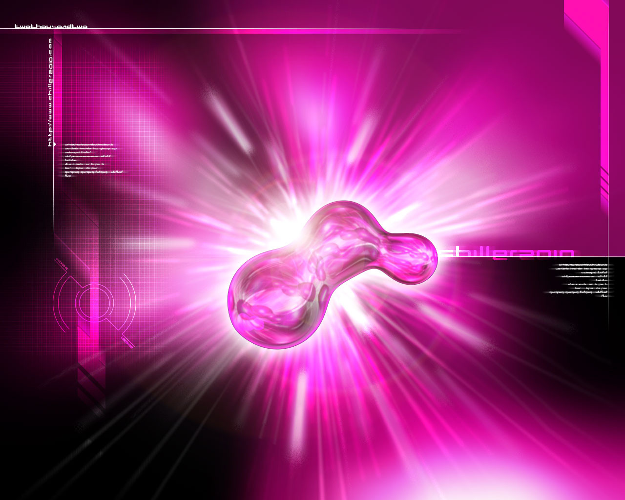
 chiller2010 — BeeBlob
Published: 2002-01-28 14:11:23 +0000 UTC; Views: 1098; Favourites: 6; Downloads: 338
Redirect to original
Description
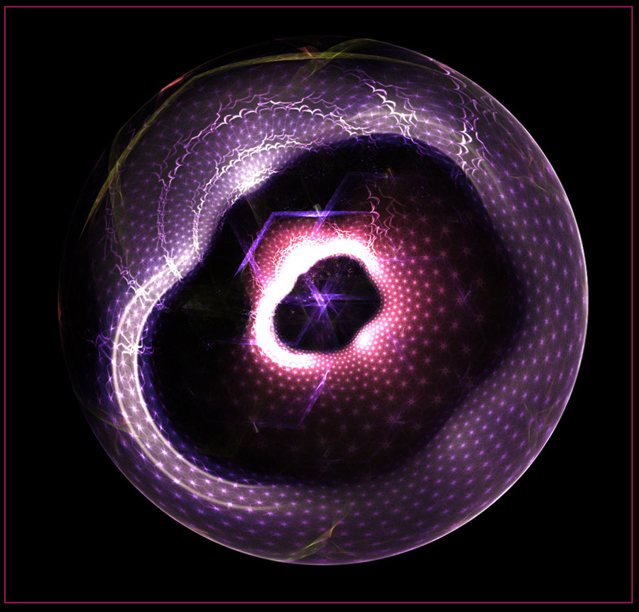
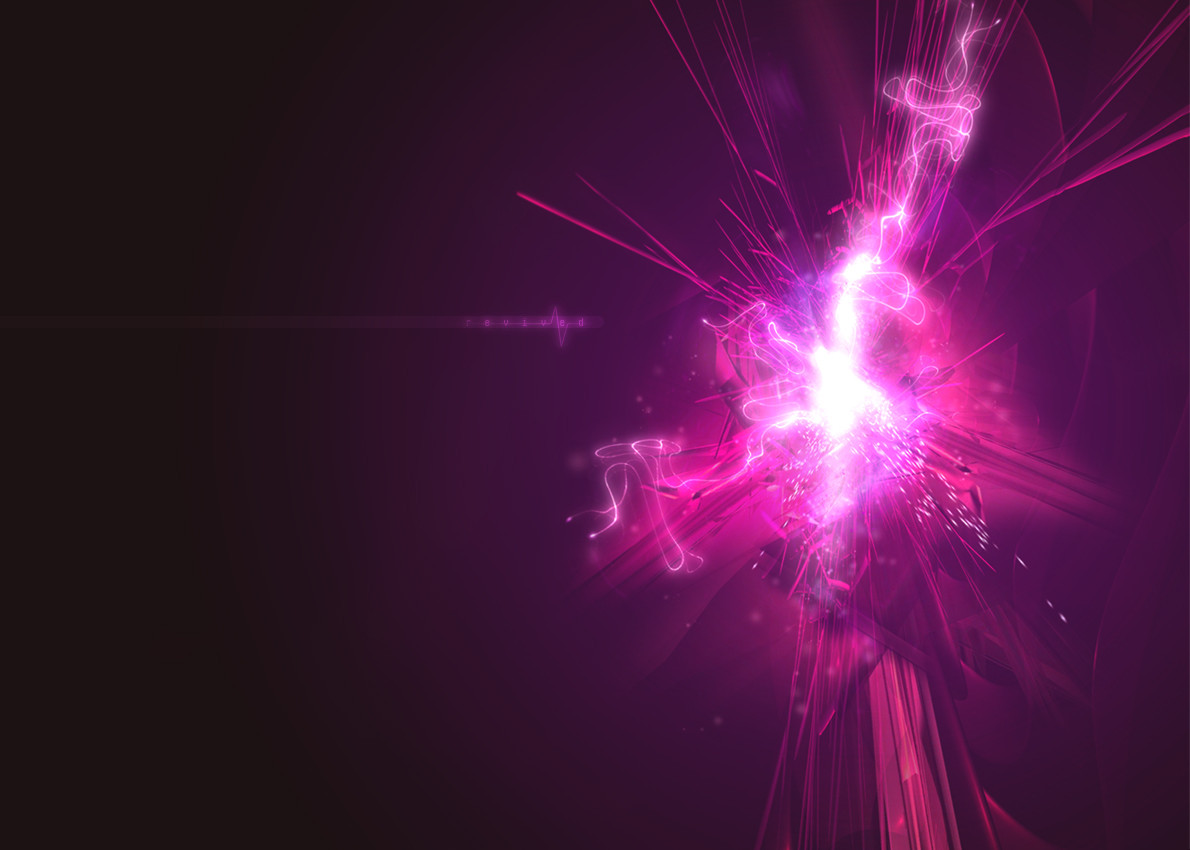
This is my first "real" wallpaper. I was amazed by this style (like the wallpapers on www.chapter3.net ) for a long time but never really mastered it to create something like that by my self. I allways came to a point where i thought "Doh! That's crap." But this time I felt that it was going in the right direction. Ok, this one is really simple, but I think it's a good start, I thinkRelated content


Comments: 13

The text could use some improvement, but the colors you used are great. Nice work all together.
Hell is for children !
👍: 0 ⏩: 0

sweet wall. not a big fan of pink try some other colors but same wall
👍: 0 ⏩: 0


wow, that is a REALLY cool design. i like the blob. but i too amnot a pink fan.
---5t3iggy
:.I decided i want you now i know...i need.:
👍: 0 ⏩: 0

god dammit, you succeeded, i had a convulsion as i saw this. pink...PINK!! ew.
It is one helluva cool design tho, it's very bad ass
--------------------------
👍: 0 ⏩: 0

This is very nice. I love to way you blended the central color and the fonts you used were outstanding. ONE OF THE BEST WORKS IVE SEEN IN A LONG TIME!
me likes. ::adds to favs::
-rubberninja
Thank me for commenting?
https://rubberninja.deviantart.com
👍: 0 ⏩: 0

very nice
||Mousty||
+AlphaProject+
http://www.alphaproject.be
👍: 0 ⏩: 0

Very nice organic feel on the "blob"
I don't like the text tho ... try to edit the opacity.
Nice work nevertheless.
👍: 0 ⏩: 0

the design is wonderful.........the lighting looks great........but the pink has got to go
::::::::::::::::::::::::::::::::::
::::::----....fokus....----::::::
::::::::::::::::::::::::::::::::::
👍: 0 ⏩: 0

oh i just love the color w00t
good design too, i like the way it is put together good job!
click this - http://www.bowmanz.com/rebecca
👍: 0 ⏩: 0

oh wow... this is awesome.
rachel
oi to the punks , oi to the skins
, oi to the world and everybody wins
.
👍: 0 ⏩: 0

Another excellent example of work. So how long does it take to do something like this then??
👍: 0 ⏩: 0

Wow, this is really nice. I love the color scheme. Very well put together.
||||||||||||||||
DigitalCosmos
👍: 0 ⏩: 0