HOME | DD
 chronocube — Power Up Logo Design

Published: 2009-05-10 04:33:41 +0000 UTC; Views: 1478; Favourites: 0; Downloads: 0
Redirect to original
Description
Title: Power UpType: Logos & Logotypes
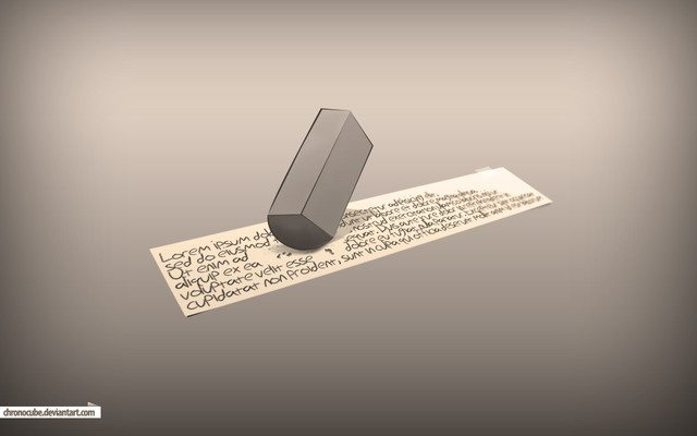
It is a simple logo but with a closer look to it, it's not hard to understand the concept behind it. Basically the logo derived and expand from the power icon. The logo is pointing out towards the top left direction with a half-arrow depicting away and up. The reason behind having the icon pointed to that direction and using half-arrow instead of a full arrow is to balance the icon and make it unique and easily recognized.


