HOME | DD
 ckc — SOMEONE COMMENT PLEASE!!!!!

Published: 2001-01-21 08:20:27 +0000 UTC; Views: 943; Favourites: 2; Downloads: 249
Redirect to original
Description
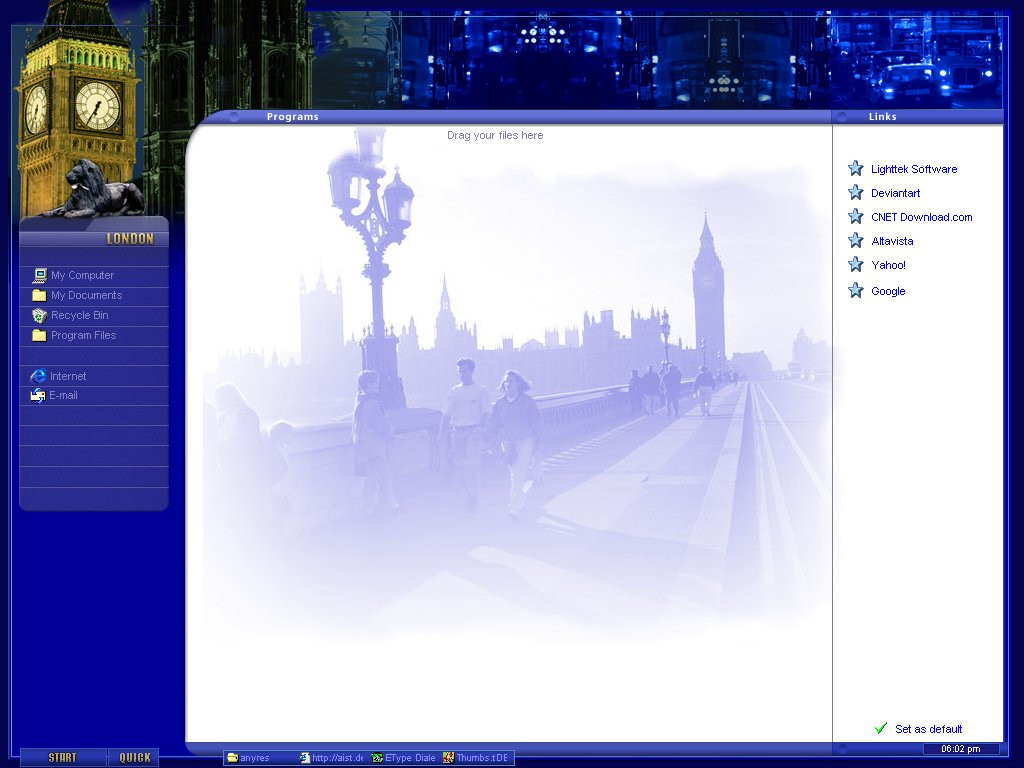
Design for an e-zine I'm making for my school.... Any suggestions, comments?Related content


Comments: 9

Tone down the background blue and freashen up the text some; centering this piece on the page would also help this out alot... the way its laid out; should be able to scale rather then having all the dead space on one side. May also look into some cascading style sheets for the links if your going to stick with text... the banner for the top of the page is slick; although alittle to much height. For what its worth.
👍: 0 ⏩: 0

I don't believe that the colors are that hard on the eyes. Personally I believe that a white background is harder on the eyes. Using white text on the blue background works very well. Enough Contrast to be easily readable. I particularly like the titlebar you've got goin on there. Although I don't see how it fits in with the theme and audience of the site?
As for the layout, it has been done several thousand times, but it works, people are used to it, and it is easy to use, make, and maintain. So I had to lower the originality grade.
Overall I think it is a good design, could be better, but good nonetheless.
PS - Pretty cheesy title!
👍: 0 ⏩: 0

I called it that so then people would comment. I tried it with a different name and practically no one looked at it or commented. So my idea worked
👍: 0 ⏩: 0

Slick looking, and I don't know if you really want to name it "SOMEONE COMMENT PLEASE!!!!!" it worked though
👍: 0 ⏩: 0


(attempt at getting attention)
..........SLiiK..........
........b*original.......
👍: 0 ⏩: 0
Very lame.
..........SLiiK..........
........b*original.......
👍: 0 ⏩: 0

looks nice but i ll have to agree with jark.. maybe use white instead of blue..
- aliensector
👍: 0 ⏩: 0

lame attempt at getting attention with the name of this...sorry to sound harsh, but that is how i feel.
other than that, i do believe the design is nice although i am not so sure that the chosen background color is logical for a site that needs to be easily readible. something softer on the eyes is definitely the preferred way of doing things.
--[ jark ]--
👍: 0 ⏩: 0