HOME | DD
 Clockwork-Conscience — An Introduction to Miss Clock
Published: 2009-02-25 00:21:41 +0000 UTC; Views: 396; Favourites: 1; Downloads: 0
Redirect to original
Description
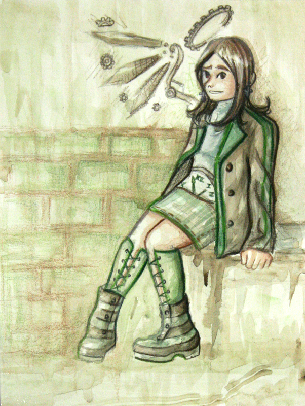
This is my "intro" assignment for DAcademy.....CLOCKPOSTEDSOMETHINGOTHERTHANAPCLASSWORKWHAT?!
Yeah, first not-school related something I've posted. So it's far less realistic. It's more like how I draw my "for fun" stuff and comics.
I wanted my intro to show one of my current goals as an artist- to blend my loose paintings, tight pencils, and comic-styles into something unique. Right now its still an experiment, like an awkward adolescence for my art. Hopefully the DAcademy assignments will help me grow into my weird art ideas.
The background is full of fail, but I learned to never put loose pencils under watered-down paint (it turns out...sloppy and childish looking...or at least it did here) so it wasn't a totally worthless endeavor.
Yes, that's supposed to be me, though I didn't model the face off of mine in the slightest. I just drew something vaguely human-looking. The body's from an actual picture of me, though, with modified clothes. There's another picture in my gallery taken on the same day (but drawn almost a year ago) where you can see what I was actually wearing. (if you can figure out which it is :b)
Sorry for massive comments. I tend to talk too much in these...^^'
Acrylic paint and prismacolor colored pencils
Related content


Comments: 5

Hello, my little art buddy!
I hope you don't mind my adding my two cents in on this lovely piece on DA and not in person. Overall it's a nice concept and I agree with a lot of what your group has said, however, I noticed something nooone has mentioned just yet. Miss Clock's coat has been lovingly detailed with folds and creases, where are these things for her shirt? (Maybe it's just me, but it seems lacking in folds and this causes me to interpret it as skin.)
Also, I want those boots.
👍: 0 ⏩: 0

Critique :
Well I am new to critiquing what I see from my limited view is the background needs work, even though she is sitting it seems flat. Like the others stated before me I can not tell if the wing is part of her or the background.
For the girl herself I like. I love what you did with the design of her clothes and she has personality in the picture.
👍: 0 ⏩: 0

I really can't think of a new way to say "We're in the same dAcadamy group"...but, yeah. We are.
Things to work on:
-First and foremost, confidence. Now, I can't judge entirely accurately, but it seems some confidence might be lacking, based on the self-defensive tone in the artists comments.
-The background needs to be defined a little bit more. You have already set the basis for it, but increase it next time.
-While you are adding more detail to the backgrounds, add more details to the face. You have many good things happening detail wise with the rest of the body, however the face seems rather bland. It is human nature (assuming we are all human here  (Wink)")
Good Things:
-You have a very interesting theme happening with the clock and cog motifs. It makes the character unique.
-You are brave enough to venture into the area of mixed media. This can prove to be very fruitful as your talents grow, as it will give your work a feel that is totally unique and stylistically your own.
-Finally, and most importantly, it appears you are smart enough to realize many of your own mistakes and weaknesses. This is a very positive trait to control as an artist, and must be played as more of a balancing act than anything else.
👍: 0 ⏩: 0

Hi! Here's my critique as we're in group 8 together.
You pointed out all of the flaws that I was about to say in your comment!
You should place more darker colors for the bg. It'll make the picture more realistic.
The only thing that gets me in her wing. Is that supposed to be her wing? Or is it part of the bg?
")

👍: 0 ⏩: 0

Hi there! This is my critique, we're in the same group! ^^
So..
You already pointed some of the things in your comment, so I don't have a lot to say.
The bg need work coz she looks like she's floating somehow and suddenly there's a wall (on her right side).
One more thing though are the mechanical thingies on her shoulder - I'm not sure if it's suppose to be part of her or the bg.
I like the the overall look of the character. The costume is also nice, Miss Clock! ^^
👍: 0 ⏩: 0