HOME | DD
 cloudsfall —
you write such pretty words
cloudsfall —
you write such pretty words

Published: 2004-09-11 03:39:41 +0000 UTC; Views: 7096; Favourites: 189; Downloads: 2807
Redirect to original
Description
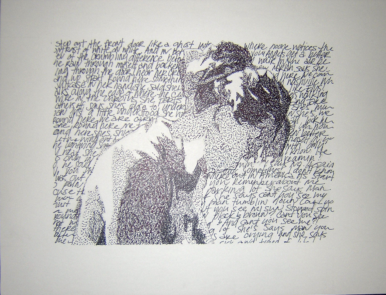
ink and colored pencilfull view for detail
you can read the words in the close-up version of it here: [link]
Related content


Comments: 157

Welllll, hate to add another to your already extant library of veritable kudos. . .
But I just wanted to say that this reminds me of a piece I created long ago, in which I cut out strips of hued magazine. ..you know, basic collage junk. .
But it turned out so haunting, in my opinion, because of the same expressive shading techniques you use in yours, here.
Thank you for reminding me. I am now negotiating the 1'5"x1'2" piece with my 8 1/2"x11" scanner.
This should be fun!
Well, check it out if you're interested, lol - nowhere as much order and detail as yours. I'll try and have it posted today.

for your dark poetic beauty.

for your perceptive gift, and detail in re-rendering what you see.

for your economy of shade and form, especially
your admirable understanding of grayscale tone expression.
I know you really have no need for my silly little poetic award system, but I love giving people shinies with meaning.
👍: 0 ⏩: 1

you don't appear to have posted it yet, but it sounds interesting. you'll have to let me know when it's up.
but thanks for the comment and sushi!
👍: 0 ⏩: 0

I love I love I love Conor so much. He was so kind to me at the last performance I went to.
Definate 
👍: 0 ⏩: 1
I've never seen him perform
thanks for the fav
")
👍: 0 ⏩: 0


you make conor look very beautiful. (no that he isn't already...heh.)
good work.
.heidi.
👍: 0 ⏩: 0

the first few song from the album "Lifted".
👍: 0 ⏩: 0

I'm lovin' it. ")
👍: 0 ⏩: 0

this is great.. i like the concept.. but i cant read the text well..
👍: 0 ⏩: 1
thank you
there is a closer version here.... [link]
👍: 0 ⏩: 0

Very well done! This kind of a portrait can be very difficult because of the text constraints. You've done an excellent job. Congratulations on your Daily Deviation.
👍: 0 ⏩: 0

very nice! bright eyes are great... i was listening to one of their songs when i looked at this.
well done, how long did this take you??? i can't imagine it could be done too quickly hehe.
👍: 0 ⏩: 1
it took maybe about 4 hours. it actually didn't take much longer than it would have to draw it the regular way, with the shading and such. it was worth the time, i think. thanks for the comment!
👍: 0 ⏩: 0

oh wow, cool... I have a bob marley poster like this, drawn with the lyrics from every song he's ever written
👍: 0 ⏩: 0

haha i know so many people have said it but seriously, its amazing everything about it, awsome idea.. i love it

👍: 0 ⏩: 0

i tried TRIED doing something like this for a class a couple of weeks ago..mine included diferent letter sizes and types, and diferent languages.but yours is so much neater and uniform! kudos, i love this. beautiful, quiet, neat. definitely worth redoing.
👍: 0 ⏩: 0

Dude that's AWESOME. Definately deserves the DD. Bravo.
👍: 0 ⏩: 0

awsome.
Congrats on daily deviation too.
You really should send this to Conor.
👍: 0 ⏩: 0

OMG i didn't see the lyrics at first. Now I am so impressed. He really shoulds see this. Maybe he could use it for a cdcover.
👍: 0 ⏩: 0
Weeeh is this Conor Oberst? It looks just like him,
👍: 0 ⏩: 0

This is an amazing concept and a beautiful work of art o_o
You have given me so much inspiration 
 (Smile)")
...I don't think I'd ever have the patience to do it on a canvas that big, though e_e
👍: 0 ⏩: 1
thank you! that's cool that I could inspire a few people. It actually isn't on a canvas, or very big. it is just on paper, a little over a foot long each way.
👍: 0 ⏩: 0


oh my god!!! that is amazing... i like the way conor is made... it's so different. i love it!
👍: 0 ⏩: 0

Creative idea--I knew who it was from the thumb.
I also like :devpresenstranger:'s idea of just doing more with the border . . . I think the background would get too busy.
👍: 0 ⏩: 0

wow!! amazing concept... I would leave the background plain and just do the border with more word/lyrics... darker though... how big is it... full view doesn't do it justice.. can't really make anything out though... words, i mean...
👍: 0 ⏩: 1
Thanks! Yes I think that I will leave the background as it is. Um, it isn't that big.... maybe about 12"x14". something like that. I uploaded a scanned (thus, more clear) picture where you can read most of the words, if you'd like to: [link]
👍: 0 ⏩: 0

i picked up on conor right away, excellent job on the sketch.
👍: 0 ⏩: 0

This is amazing! The most original idea I've seen in quite a while!
You should have entered the Inspirations contest with this.
👍: 0 ⏩: 1
thank you! I didn't realize that there was a contest or that anything I did could come close to winning it.
👍: 0 ⏩: 0


How da hell did you did that?!?! That's really good........I thought it was some kind of sketch and drawing and I did'nt realize the lyrics! That's really good.
👍: 0 ⏩: 0


Very cool! I like that idea... very different and interesting.
👍: 0 ⏩: 0

wow. it's conor oberst! it's a DotD! well done! lovelly work.
👍: 0 ⏩: 0

I really love this drawing, its really really good. You can clearly see the little things and the little expressions that make conor oberst 'the conor of bright eyes' on this drawing. i only glanced at the drawing and saw it was him, so i went back later to see it again. thank you for this beautiful drawing
👍: 0 ⏩: 0

holy crap! that is so cool! awesome awesome awesome!
👍: 0 ⏩: 0


but lifes no story book,
loves an excuse to get hurt
and to hurt

👍: 0 ⏩: 0

I have not seen anything like this before, so this is just amazing. Never heard about Conor, but this idea and realization just rocks.
👍: 0 ⏩: 0

great technique
beautiful congrats on the DD
👍: 0 ⏩: 0

This is gorgeous and brilliant. Very cool concept. I don't believe I'm ever really seen this style before. Excellent detail, considering the format. Great composition and very fitting.
👍: 0 ⏩: 0

that is such an awesome and creative ... I don't knwo what to call it. It's amazing you could get that much shading and detail in using letters.. o.o so cool!
👍: 0 ⏩: 1
<= Prev | | Next =>