HOME | DD
 coarse — kujon
Published: 2000-10-22 19:19:59 +0000 UTC; Views: 1351; Favourites: 18; Downloads: 566
Redirect to original
Description
noneRelated content


Comments: 13

 (Smile)")

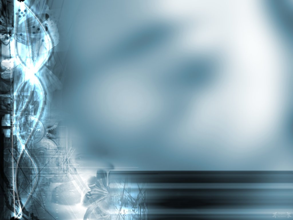
Ah well done!! So many have been set to so much detail. Instead, you keep anything interesting off to the side, preserving functionality. Well done!
👍: 0 ⏩: 0

if the whole paper was like the left side, it would just look like 'yet another vir2l_collab' clone.
the way it is composed now provides a nice contrast between 'busy and detailed' and 'clean and simple'.
👍: 0 ⏩: 0

Nice picture i mus say. I cant really decide if Jark and Matteo is right. I think too it would look phat if the hole picture was the way it is to the left. But still hard to say since we haven't seen a picture where the whole picture is "chaotic" as you expressed
FuZ
👍: 0 ⏩: 0

i will have to agree with matteo on this one in that you should do the right like the left. i love the colors that you have chosen - ones that are not used all too often. overall, wonderful work!
--[ jark ]--
👍: 0 ⏩: 0


why did you comment on this, doobybrain, if there´s nothing to say about it ?
👍: 0 ⏩: 0

I love everything about this. The colours, the design, the lil bit of photo manip. You'll probably have people telling you its too plain but screw that, its wonderful.
= arksaber/Life is its own punishment==
👍: 0 ⏩: 0

i downloaded it. i just like the colors. not much about the wallpaper to say though.
[doobybrain]
👍: 0 ⏩: 0
the whole paper ? i wanted the position of the graphics the way it is now, i like it that way, it would be much too chaotic if i would fill all the space with stuff, imo
btw, matteo, i would like to see your ratings ...
👍: 0 ⏩: 0


Like the colours. And you've left much space for icons and stuff, whereas many wallpapers are crammed with graphic you don't wan't to hide by Icons
Grit
👍: 0 ⏩: 0

Very nice... Great colors
--
Tom Sommer
http://www.tsn.dk
👍: 0 ⏩: 0