HOME | DD
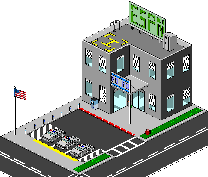
 coderebel — Pixel Cop Station
Published: 2002-08-12 21:18:46 +0000 UTC; Views: 1149; Favourites: 4; Downloads: 81
Redirect to original
Description
Worked on it for quite a while. Was grounded too long otherwise I woulda had it up sooner.Related content


Comments: 33


PO PO! Nice touch! Very well designed. Man, you pixel people astound me with your patience in owrking with this small of detail. I agree with the idea that a little more detail would be nice, but what you have here is very well done!
👍: 0 ⏩: 0


Dang that's freaking sweet. After trying to pixellate my bedroom I have massive respect for any pixel artist
👍: 0 ⏩: 0

great work. the cars are a wonderful addition to this.
👍: 0 ⏩: 0

Hahaha! Great job. I love "Po Po" sign. The cars are really cool too. Only thing I could add would be to put a box of donuts on the counter in one of the windows .
👍: 0 ⏩: 0


I believe you man, just be careful with this types of shit in the future.
👍: 0 ⏩: 0

Screw the negative comments pixel art is cool! Reminds me of Earthbound style stuff. Keep it up. Maybe do what that one guy said and connect them and build a city lol!
👍: 0 ⏩: 0


cars are cool, but too small, or the windows and doors in the building are too big
👍: 0 ⏩: 0

The shapes are good but you could've done better on the textures, the walls look like plastic and the grass looks like soup. oO
👍: 0 ⏩: 0

I'll just go back and edit it so it doesn't looks so "rippy"
👍: 0 ⏩: 0
Ah fuck it. It's coming down. I don't wanna get banned from deviantART for some fucked up shit like this...
👍: 0 ⏩: 0
NONONONONONONONO... that's bullshit! There was no copy pasting happening. I admit, I was a bit inspired by the flag. But I still made it... I never copied it.
Also the car.... I made that as a completely different file. Cause the whole thing started out as a car. At first it was gonna be a bunch of police cars leading the president into town. But I made it a police station cause.... Well, I don't know why. I figured it looked cool. None of this is rip.
It was pretty much inspired by eboy. And I like his style. But none of it was copy and pasted. Those blue posts... I did open his open and zoom in, and then make my own pretty identicle I guess. I shoulda fixed that.
👍: 0 ⏩: 0


That is really cool. I dunno if you actually did steal any of this stuff, and I don't feel like investigating. You couldn't have stolen it all though - GJ!
~Aken
👍: 0 ⏩: 0

Man don't post shit that ain't yours.
If you model your images on the eboy style, so be it, but none of this copy paste bullshit.
👍: 0 ⏩: 0

Sorry for the multiple posts, but now that I sink in more into the image, even the concrete posts are ripped from the eboy page...come on, how low can you sink?
👍: 0 ⏩: 0
And now that I look at it, the gas pump from the link I posted above became the trash bin in this image.
👍: 0 ⏩: 0
Too bad that the flag and the police car (even though a bit modified) is a rip from [link] though.
Could someone please make a rip report of this? I can't since my internet explorer crashes when I hit the rip reporting button.
Bad style dude!
👍: 0 ⏩: 0

I like it, but what's with the ESPN sign? I doubt a police station would have a billboard, especially next to a helicopter landing.
👍: 0 ⏩: 0

This looks like its going to be in the daily favs but im not a pixel art fan.
👍: 0 ⏩: 0
yeah, the thumbnail sucks. I shoulda tried to make it smaller, but it woulda been too hard to detail.
👍: 0 ⏩: 0


haha that is clean man, i love it! add more! add more! make this ultra detailed
The grass could use some work :/ the highlights are too bright. try working liek this on the grass have a mid color, then add a darker color not alot darker just a bit darker, then do the same thing again except use a bit lighter color than the mid color
👍: 0 ⏩: 0

nice details!! someone should use all the pixel arts and make a little city or something..
👍: 0 ⏩: 0


hehe wow thats pretty cool, the cars are awesome, the thumbnail doesnt do it justice
👍: 0 ⏩: 0