HOME | DD
 ColinPortfolio —
Noticed 2
ColinPortfolio —
Noticed 2

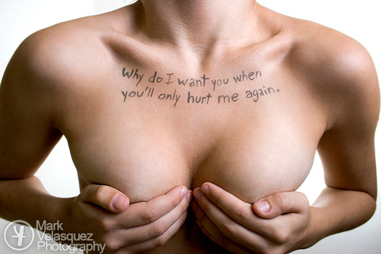
Published: 2007-03-21 10:49:46 +0000 UTC; Views: 74550; Favourites: 2054; Downloads: 1311
Redirect to original
Description
My commentaryRelated content


Comments: 946


nice photo, I can't help but notice its composition. actually i like how jarring the composition is, fabulous cleavage aside, the juxtaposed angles of the sign vs the stairs and the checkerboard floor, or is that a tromp l'oeil (which I can't spell) wall? maybe if that's the case the forced perspective that is slightly out of whack there is what messes with the viewer's brain. the soft and round model vs the straight lines is a nice contrast too, pruriency aside, and her three dimensionality only adds a level of surrealism to the composition. and none of that is even BS! I wonder how much thought was put into all that. or if it was just a quick concept idea thrown together.
👍: 0 ⏩: 1

Thank you... yes, I was going for jarring, off, and out of whack. So thank you
This idea was in my sketchbook for weeks if not months till I was happy with the words and look.
Thanks again
👍: 0 ⏩: 0

i've loved this photo or ages but i never noticed what a lovely bra she's wearing.
👍: 0 ⏩: 1
Thank you
It was more of a nightgown/nightie type thing. But yes still.
👍: 0 ⏩: 1
still lovely ")
👍: 0 ⏩: 0

Poor composition, maybe. It's clear that the artist didn't take the time to rough the words before shoehorning them onto the card. It the writer has written it thus;
"This Photo Will
Be Noticed For
Its Composition"
then it would be much more readable. Plus it looks like there is a pair of breasts...
... a pair of...
... errr. >_> <_< 

👍: 0 ⏩: 1
Thanks for the comment
Actually everything in the photo was done on purpose. Also, it took quite some time till I was happy with what the writing was going to say and how the writing was going to look. It was in my sketchbook for weeks if not months and what was written in the sketchbook would have been taken as too angry. I wasn't writing a Haiku, but I like the beat to the words the way they are laid out. Comic timing.
Thanks again.
👍: 0 ⏩: 0

Surprisingly enough it WAS the letters that made me notice it. I barely glanced at the rank until I was done reading.
👍: 0 ⏩: 1
No worries... it's not some kind of test.
 (Wink)")
👍: 0 ⏩: 0


Great picture! I love the message!! Very deserved DD!
👍: 0 ⏩: 1

Brilliant. And sad, but true.
*Scoffs at so many of the comments that don't get it*
👍: 0 ⏩: 1
Thank you and thank for getting it too
👍: 0 ⏩: 0

")

Oh dear this is pretty funny 
On the composition... are those steps in the background? I can't tell

👍: 0 ⏩: 1
Thanks!
Shhhhh... the steps are part of a wallpaper wall mural.
👍: 0 ⏩: 0

I first read the words, then I saw the chest, and then I understood 
👍: 0 ⏩: 1
Haha.... yes, all the above.
👍: 0 ⏩: 1


haha rofl this is funny xD
👍: 0 ⏩: 1


Actually, I would've zoomed out a bit more and centered the sign, plus there isn't that much cleavage (comparitively) lol
👍: 0 ⏩: 0


You are an absolute hero of mine 4twenty69, nuff said. *applauses and whistles*
Later,
👍: 0 ⏩: 1
Thank you  (Smile) - =)")
👍: 0 ⏩: 1
Hell anytime. ^_^
Later,
👍: 0 ⏩: 0


Haha! This is funny! But the banner is not workin
👍: 0 ⏩: 0

I like the lettering on that board, is that what you mean? lol
👍: 0 ⏩: 1
| Next =>