HOME | DD
 cottser — PC Game Central design sketch
Published: 2001-03-10 06:53:49 +0000 UTC; Views: 448; Favourites: 1; Downloads: 121
Redirect to original
Description
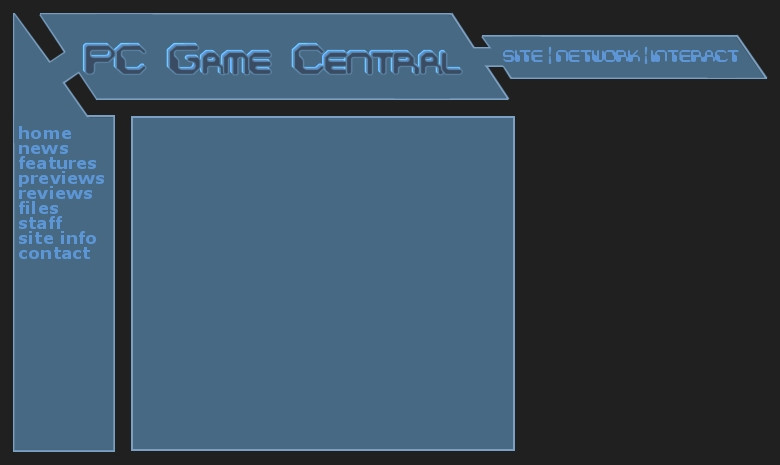
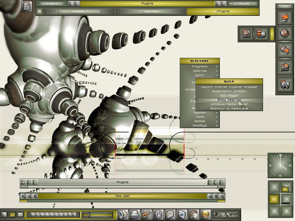
I'm almost done the sketch for this one, I just need to revise the logos and fonts a bit more... I'm just doing this as volunteer work for [link] . Comments would be appreciated.Related content


Comments: 4

That's one of the reasons I put it there, it's not a 100% necessary element, and I didn't want it clogging up the main area. Thanks though, I'll keep that in mind when I make changes.
Cottser
http://www.cottser.com
👍: 0 ⏩: 0

I think you should remove that network / interact thingy and place that text under the main title. Because it increases the demands for a bigger resolution.
-[EclipzE]- / .:Ecliptic Illusionz:. / .:Vortex Designs:.
http://www.vortex-designs.subnet.dk
👍: 0 ⏩: 0
Thanks for the comment. Actually the layout is kind of meant to be plain, that's been my style, and it cuts down on load time significantly, when I can make a lot of that stuff up just with tables. The colour scheme and fonts are far from final too, I just sent the... client... if you will... the sketch tonight.
Cottser
http://www.cottser.com
👍: 0 ⏩: 0

In my opinion, the layout seems a bit empty, too plain. Maybe add some textures to it, and give it a little color (unless you were going for the monotone look). Emphasize the title too with a drop shadow or fancy bevel.
👍: 0 ⏩: 0