HOME | DD
 crumbut — Diablo
Published: 2001-11-01 23:38:28 +0000 UTC; Views: 1822; Favourites: 0; Downloads: 1049
Redirect to original
Description
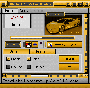
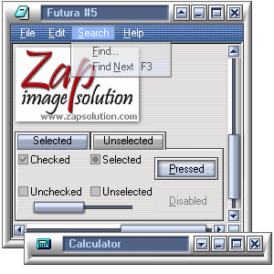
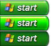
Just a lil something that Titan and I whipped up for ya! Wallpaper resolution is 1024x768. Fonts included.Enjoy!
Related content


Comments: 7

Hey nice skin and i realy want to use it but ummm...
it says its not on the server when I try to download it =/
re-post it maybe? for me ")
also, is there anywhere I can get all the diablo skins at the same time? {like a dev pack or something?}
thanks
👍: 0 ⏩: 0

Very Nice! I love the colors used here. I wouldn't be suprised to see this receive a daily skin. Great job!
Proffasee :: Seeing The Future
👍: 0 ⏩: 0

So what you go into hiding so you can come back and bring a most kickass suite! This is wonderful. Love the color choice.
You wanna sniff little piles of demon poop? You oughta know where the trail leads, right into the devils hiney!
👍: 0 ⏩: 0

Endosage had a lot of interesting things to say about this...and I agree with them all. The skin could use some curvature. That'd definitely add to the Diablo feel of it. Stay devious.
(¯`·.,¸¸,.·´¯`·.·• blueNINE
👍: 0 ⏩: 0

I really like the Diablo suite, it's very tight. Well done! (copied comment )
metadream.com - Sal Loria
deviantMAG.com - Senior Editor - Software Reviews
deviantART.com - Addict
👍: 0 ⏩: 0

.__..originality.._. = A++
I haven't actually seen this shade of yellow (may be orange) in a long time, and it's nice to have it reborn into a skin as nice as this.
.__..technique.._. = A
I wouldn't exactly say that this the best skin, but it is nice, and I'll give you that. You could have made some of the sides match the curves/slopes of the car, so that it looks like you're using a part of the car, or an accessory. Square skins are, fine but I do think that the subject matter that this is based on calls for some more shaping.
.__..overall.._. = A+
Well, besides the fact that A++ (+) A = A+, this skin definately has some potential for better design, but only in a few areas, like in the textback bitmap, you could have made the buttons, and the textback, connect somehow with a curve/angle/etc. Like there's 2 openings, and there's an extension in the middle making the buttons, and title 2 different sections, but still connected by a place that dosen't touch. I hope that this helps.
Have a nice day!
_e_s_|_e_n_d_o_s_a_g_e____ ___ __ _
.___..anti.form..___. .______________ 2001.____..
_______/_______/______/_____/____/___/__ /_/
👍: 0 ⏩: 0

very smooth color scheme at work here. i like the titlebar and the buttons. overall, nice work!
👍: 0 ⏩: 0