HOME | DD
 Crystal-for-ever — Mobium 4 Cover Chapter One
Published: 2006-03-19 18:50:57 +0000 UTC; Views: 2912; Favourites: 55; Downloads: 354
Redirect to original
Description
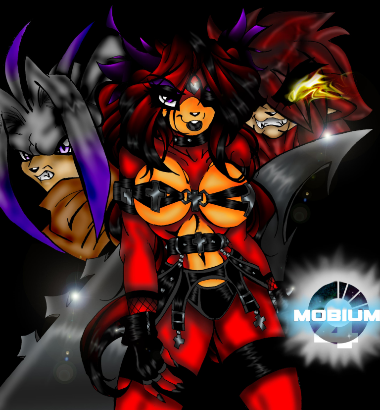
this is for and based on the comic Mobium 4, James ask me about like a week ago or two if he could put Natasha in the comic, i was like YES!! i mean yes please i have heard about the story of the comic and i won't give any of it out if James tells me to then i will but i won't^^ In this cover, you have Natasha, you all know her from all the drawings i have done of her. Ant character is Owaka, his new design, if i didn't have the help from James i wouldn't get this far on the cover like i do now^^ also Chaos Ryo which i always thinks he is SO AWSOME! this drawing took me three days to finish it because one i had family problems going on and people keeping me from the drawing. two i had that stupid OGT test to do last week and three sister kicking me off the pc so many times. the coloring took me three more days and this morning i thought i had to start over again, but then i found it so i'm happy about that^^ i'm very happy how this turn out and i hope that Ant gets better soon, i have heard he been sick lately. thank you for letting Natasha being in the comic^^
 (c) Chaos Ryo
(c) Owaka
(c) Natasha, drawing and coloring
Related content


Comments: 72

I love this picture! The scenery is gorgeus, the characters look very cool, and your style of darkness looks very cool!! Keep up the excellent work! *faves*
~*~matthewsgm~*~
👍: 0 ⏩: 0

Natasha reminds me of lara croft in this picture.
Man i love that game... so obvious too those around me I love this pic!
👍: 0 ⏩: 0


ooh, I am liking the costume. O.O
heheh, awesome work!
👍: 0 ⏩: 0

My one suggestion I really want to make... instead of using the burn tool for doing the shadows use the Air brush tool at 20% opacity with the mode set on multiply, then use a slightly different shade of the skin/fur colour you're already using for the shadows. This way Natasha's breasts/muzzle wont look so orange and the rest of the shading should look more natural...
Just experiment with different colours using this method, that's what I do.
Yes, I realize you have it on "Critique Discouraged" however you already know I'm not doing this to be mean. I have more I'd like to say about this image but I'll just leave it where it's at. It doesn't look bad but I know you can do better.
Keep at it girl! I know you'll keep getting better if you keep working hard at it.

👍: 0 ⏩: 1

it's your comments that help me with my coloring and telling me what i'm doing wrong and how i can improve^^ 

👍: 0 ⏩: 1
Sorry it took me so long to get back to you on this one... I've been rather tired lately. I think her hand looks pretty good, hands and feet are always hard for me to do personally. And I really like her muzzle.
Things I still think you should work on a bit more...
For starters you shouldn't use the liquefy tool for making the flames from Ryo's eye, the smudge tool would be much better suited for the flames. You should try sketching out the colour for it out first then use the smudge tool to pull the individual flames into shape. You shouldn't smudge the highlights on the sword, it makes it look to soft and silky like it were fabric or hair. You should do it the same way you'd do the lighting on the buckles and other metal bits you'd do on Natasha's clothes.
The shading on Ryo looks pretty good but your highlights on him need some work though I'm sure his hair's rather difficult to highlight, and you need to remember to add highlights to the red parts of Natasha's hair as well. I really think you could have done better on Owaka though, I mean, the shading looks alright until you get to his hair and then it just sorta falls apart. Like I said before, try to avoid using the burn tool to do the shading which you've already done in your more recent pic. 
Now, anatomy. It looks pretty good except for a few things. The biggest thing would be that in this outfit her breasts should actually be more squashed together because of the way the top is holding her breasts in. They should be toughing each other, you see what I'm saying? her elbow is also to pointed and it juts out a bit to far, try rounding it off a little bit more.
Now I personally feel you should lengthen her torso just a tiny bit and make her waist a bit wider because people aren't that narrow from the front and I still think her breasts are still to big to be a double D. ")
I think that's everything... giving real critiques are hard work.
👍: 0 ⏩: 0


Like many people before me, this cover looks amazing. And the coloring is top-notch. Surely one of the best pics you've cranked out thus far. Course....what would I know. :/
👍: 0 ⏩: 0

very good job hun i love how it came out ^_^ u rock my work ")
👍: 0 ⏩: 0

WOAH. Now THAT is BADASS. 
👍: 0 ⏩: 0

its a pretty awsom cover! you drew 'em all very well. all the charactres look great like that. and the coloring job is beautiful. wonderful job Crystal.
👍: 0 ⏩: 0

Nice, job. I know James will Love it! theres my comment for the day Peace!
👍: 0 ⏩: 0

it's a shame that you put critique discouraged ~~; critiques do help you improve if given the proper ones. Since i can express my concern to what needs to be touched up it feels like a half comment. it looks okay though it's one of your best works.
👍: 0 ⏩: 1
if some girl didn't keep putting bad comments on here then i wouldn't have put that there -_-;
👍: 0 ⏩: 2
I agree with =roxxy-chan . You just need to ignore those people because they do that because it pisses you off and the more you react the more they're gonna keep doing it.
👍: 0 ⏩: 1
thank you guys, you guys are the best ^^
👍: 0 ⏩: 0
well all yah have to do is ignore them really. reply and they will reply back.
👍: 0 ⏩: 0


awesome pose's there i'm ling the whole dark feeling here Natasha's outfit is an very interesting design
👍: 0 ⏩: 0


Becky should be keep silent a lil more often. on a side, she's right about the coloring: it's dark. but it's yur style, wha yu want? many people doesn't approve yur style, yu're classed as a dark artist (even in my friends list) but good.0 no one is better than another person. Lolable, yes, but completely stupid, dis Becky.
me, i find yur style all simply original. detailed and divine to wish. ")
👍: 0 ⏩: 1
thank you Will, if Becky something like you did then i would be more understanding but anyway thank you for your support^^
👍: 0 ⏩: 0

It would be a good drawing, I'm sure it is, but I'm a big color person, and I'm not gonna be biased here, but I'm just gonna say, your drawings seriously need some highlights 'cause I can barely see anything and the monitor is turned all the way up. ALso, her butt, which I'm guessing was accentuated under her leg, as sexy as it is to put some lines there, you put a bit too much, looks like it's sagging.
Do you put your line art on a layer then click multiply?
You should.
The white bits around the muzzle signify you did something way odd. I dunno, I can see it there.
The purple hues you're using are very nice, but I want to smack you for using burn and dodge and not airbrushing on most of this. I mean, not in a harsh way, it's just a common thing among artists, it's a cheap way to make things look good at first glance but try airbrushing! It does wonders for the colors, you'll have tons more control.
Also, when you ink things, go back to clean up the inking when you scan it in, it'll make your work looks very professional grade, even when you mess up!
Her costume is very uh, interesting, I like it, I do. But it needs more pink.
And as for that guys eyes, the ones that I'm guessing signify flames; Don't use liqify. Go in, and airbrush the flames then smudge, outer glow, inner glow, flatten and more smuging plus erasing. It does wonders~
")
👍: 0 ⏩: 1
i know what you mean.
👍: 0 ⏩: 1
one thing that a lot of people forget about me, i'm a dark artist, it says it on my front page. i'm not a gothic or anything like that but i do draw a lot of dark things and color dark.
👍: 0 ⏩: 1
Yeah, I can see that. But um, there's a difference between coloring dark and making it near impossible to see the actual picture. =x
👍: 0 ⏩: 0

Whoa 
👍: 0 ⏩: 0
Whoa
👍: 0 ⏩: 0

I don't care what others say, this is so darm awesome Crystal 


👍: 0 ⏩: 1
thank you for the comment, sis^^
👍: 0 ⏩: 0

Awsome cover page, i just love the colouring you did will fav!!!^^
👍: 0 ⏩: 0

really damn hot n sexy as always!.Keep up the awesome job at the colouring n shadowing style!
👍: 0 ⏩: 0

Your colouring really has taken a turn for the worst in my opinion.
👍: 0 ⏩: 2

I don't care who you are but leave the bitchy comments out! You've been on Crys' case too long....I mean wtf is your deal....
👍: 0 ⏩: 1
Babe.
Critique Welcome
This user has specified no particular preference in regards to the critique intensity of the comments received for this deviation. Both critical and non-critical comments are welcome equally.
If she doesnt want any crit she need to select 'Discourage Crit'. It's beuing personal for a reaosn. The colouring looks really really burnt and the Black back ground doesn't fit. Because line art is Balck it sticks to the BG And looks messy.
She gave me a fine reply with 'It's your opinion' oh and how right she was. You want to make a fuss over this, be my guest
 (Smile)")
👍: 0 ⏩: 1
you're doing this out of pure spite...you've been doing this for months.....all these little comments you've been leaving it's uncalled for...if you really mean what you say maybe you just MIGHT want to help.....MAYBE it MIGHT help if you tell her how to better it IF it's not done right ¬¬
👍: 0 ⏩: 1
Why bother telling her when I KNOW She wouldn't listen due tot he fact that she hates me?
Stop fucking getting involved for shits sake, I'm TALKING with HER, Not ARGUING with you.
👍: 0 ⏩: 2
hate you? you are the one that start this hate in the first place, i said my sorry for the last time me and you had a fight but you are the one that started this, not me.
👍: 0 ⏩: 0
you don't realise that when you fight her, you fight me...she ain't doing this alone anymore so get fuckin used to it ¬¬
👍: 0 ⏩: 0

👍: 0 ⏩: 1
You like that shrug emoticon dontt you?

👍: 0 ⏩: 1
you like the tongue one. it just want i do when you give me your comments.
👍: 0 ⏩: 1
You old coluring is better. The current style is really burnt to a crisp. I can do that sometimes myself I'll admit but really, it looks too dark and lost it's unf =o
👍: 0 ⏩: 2

look at your own crud.all your pix,that aren't SA or cell are burnt like hell.seriously,you should learn to draw,before teaching the master
👍: 0 ⏩: 1
Welcome to the Internet. Can I take your order? How about some Ripoff?
👍: 0 ⏩: 2
| Next =>