HOME | DD
 cynic —
Blockhead is Warm
Published: 2001-08-31 12:53:17 +0000 UTC; Views: 2908; Favourites: 16; Downloads: 859
Redirect to original
Description
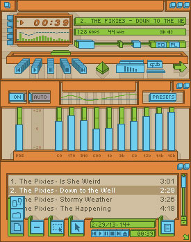
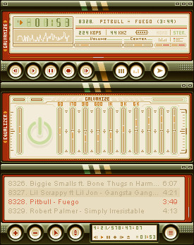
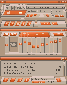
Like my previous skin, [link] this one has the psuedo-3D look, but it's more practical to use and not as zany. As for the strange name, the warm colors give this version of Blockhead the name "is Warm". Which implies that I have atleast one other version somewhere. So I guess I'll be back soon to post "Blockhead is Cold".BTW: Some colors are a tad bit off in the screenshot.
orange-haters: Blockhead is Cold [link]
Related content
Comments: 40

The animations in the posbar and the volume slider kick my ass.... It could also use a bit of detail in the eq, cause there's alot of blank space, but other than that, this rocks!
-----
« • http://www.visualdysfunction.com • »
What have I become? I am not mute, yet I speak with my fingers, I am not deaf,
yet I hear with my eyes, I am not paralyzed, yet I am bound to this chair...
👍: 0 ⏩: 0

Nice work I like the creativity in this skin..
:: An artist cannot fail it is a success to be one ::
www.sk8thispage.com ( Coming Soon... )
👍: 0 ⏩: 0

Very nice pixel pushing going on here! The color is not jumping out at me, but there's also the other version I'll check out in a sec...
Devpacks:
https://www.deviantart.com/packs/view.php ?id=705 October 2001
https://www.deviantart.com/packs/view.php ?id=734 November 2001
https://www.deviantart.com/packs/view.php ?id=854 December 2001
https://www.deviantart.com/packs/view.php ?id=926 My Personal Favorites
--------------------
https://sasso.deviantart.com/journal/ Deviant Spotlight
--------------------
Member Of:
http://www.metadream.com/ metadream
https://www.deviantart.com/ deviantART
http://www.deviantmag.com/ deviantMAG
http://crazysunart.narod.ru/ CrazysunART
👍: 0 ⏩: 0

forgot to vote
...
... ... ...
...
...
...
...
...
...
...
... ... ...
...
...
...
...
...
...
...
Head of OPTICO
From The Eye To The Brain
http://www.optico.f2s.com
👍: 0 ⏩: 0

orange!!! my color!! amazing skin, i love those type of 3d stuff
...
... ... ...
...
...
...
...
...
...
...
... ... ...
...
...
...
...
...
...
...
Head of OPTICO
From The Eye To The Brain
http://www.optico.f2s.com
👍: 0 ⏩: 0

anything orange is ok with me and this is one cool skin!
___________________________________
doobybrain loves with
👍: 0 ⏩: 0

No the biggest fan of orange (hope the cool one is blue!!) but I love it anyway. Very well done. I love the 3D look
👍: 0 ⏩: 0

It looks great! Two gripes: there are a few to many focal points for the perspective - however, I realise Winamps constraints very well so I can relate. Also, the gradient in the buttons, while flowing with the title area, kinda clashes with the harder edged, er, edges. Ignore me
When all is said and done, it is a great job - the numbers, options menu and the posbar slider being especially nice and as anxiety stated, the subtlety between versions is a nice touch indeed.
:: the future has already begun ::
http://groups.yahoo.com/group/flash_5
👍: 0 ⏩: 0

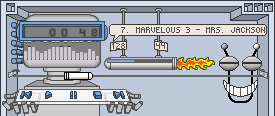
Nah the face is perfect. I love subtle changes between versions. In case nobody noticed, in this 'warm' version he is wearing sunglasses. in the 'cool' version he is wearing earmuffs and a scarf. great stuff.
👍: 0 ⏩: 0

great skin, the face seems out of place though, imo
👍: 0 ⏩: 0

Splat. Next time read the entire description before you comment. Go on, read it.
👍: 0 ⏩: 0

good colors and originality. like the style. thanks for this skin.
👍: 0 ⏩: 0

I think it's got a good design. Not so sure about the color. Thinking of making it in any other colors???? Blue or green perhaps?
👍: 0 ⏩: 0

nmamn dont like very much orange too,cos its rugh on the eyes,but god,i love this one
---JaY---
👍: 0 ⏩: 0

not the biggest fan of orange, but that's just a personal preference. for whatever reason, i do like the skewed buttons...
The problem with mankind is he is too intelligent to realise just how stupid he really is.... - Jafo
👍: 0 ⏩: 0

MmmMmMM!! I fell cozy now, sweet work!
*tsp*
Pull your skirt down girl, your fetish is showing!
👍: 0 ⏩: 0

How can anybody not like orange ? This makes my winamp happier ! I use the playlist A LOT and this one is one of the most clear designs on playlist buttons out there , with the 3 levels and all, waaaay nice thinking.
-( 2 ways out of the ghetto, with an AK or with a BA )-
http://bsskinner.cjb.net
👍: 0 ⏩: 0

i've been given it some thought and i think i'm gonna try to make a skin like this. hence the word try. heheh. love the skin man.
DawgPoop
[mmm, yummy]
👍: 0 ⏩: 0

damn good
_____ ____ ___ __ _
gc3 (aka Eric)
Lust is the cause of generation
Appetite is the support of life
Fear or timidity is the prolongation of life, and
Fraud the preservation of its instruments. --Leonardo Da Vinci
👍: 0 ⏩: 0

Just because I love blue doesn't mean that I hate orange. Hehe. This is very cool and inventive! I like it a lot.
(¯`·.,¸¸,.·´¯`·.·• blueNINE
👍: 0 ⏩: 0

certain parts of the skin have too much negative space, but the overall design and color scheme balance it out. nice job.
👍: 0 ⏩: 0

very original.. but not my taste much but very good work..
the 3D perspective if too much for me.. i prefer 2D solid looking skin but hey, this is a nice design and a new idea! i know it..
nice..
- life is short
👍: 0 ⏩: 0

nice job, the only thing I'd change is the you should remove the arrows on the eq sliders. They detract from the skin in my opinion.
Nice work!
Jstigma
👍: 0 ⏩: 0

The colours are nice and the 3d looks tight as well.. great job on this.
dmented
👍: 0 ⏩: 0

Love the colors and the graphics, truly
some original thought, ur website is great
too, you should put these graphics into
WB and NS to complete my desktop
👍: 0 ⏩: 0

This makes it, what, two Daily Skins in a month? Super. Though I still like the "zany" Citrus Glutton better, this is still a terrific skin.
👍: 0 ⏩: 0

I like the over all scheme but the little face icon on the eq is a bit dodgy. Other than that, it's slick.
Reminds me a lot of Wireframe's work.
fraxyl
👍: 0 ⏩: 0

great design man... i want to lick it.
very unique design. nice work.
👍: 0 ⏩: 0

wow.....very nice....i like the 3d style....but...."Citrus Glutton" is better that this submission
peace
👍: 0 ⏩: 0

look! it's sculptured concrete pillars decorated with orange peel!
mmm ... i like those diagonal cbuttons, nice of you to experiment with a shape even slightly different from the dreaded rectangle!
// biopfoten //
____________
didnt bring a gift? take a hostage
👍: 0 ⏩: 0

orange is cool. i like this a lot. very original. i woulda never thought of making a winamp skin like this. great job.
DawgPoop
[mmm, yummy]
👍: 0 ⏩: 0

I can safely say this is my new winamp skin of choice for a long time to come. I absolutely love the color (yes, orange is my favorite), and the design is great. Not only that, but it's very funtional at the same time. Great, great skin.
👍: 0 ⏩: 0

Love it!!!
::simple truth speaks like silent thunder::
S3K
👍: 0 ⏩: 0

Hehehehe This is great. Everything sarah said and more. That volume slider is just fucking amazing! The 3d look is great too.
But you are about a day too late. I dont think anyone could pry me from sumea with a crowbar! But this will be a top choice for my next skin rotation (whenever i get bored of sumea...might be a while though).
👍: 0 ⏩: 0

Great work, i love the area around the vis, and the volume slider is mad.
👍: 0 ⏩: 0
