HOME | DD
 DaGoldenTurtle — Into the Woods

Published: 2019-02-03 08:13:45 +0000 UTC; Views: 201; Favourites: 38; Downloads: 0
Redirect to original
Description
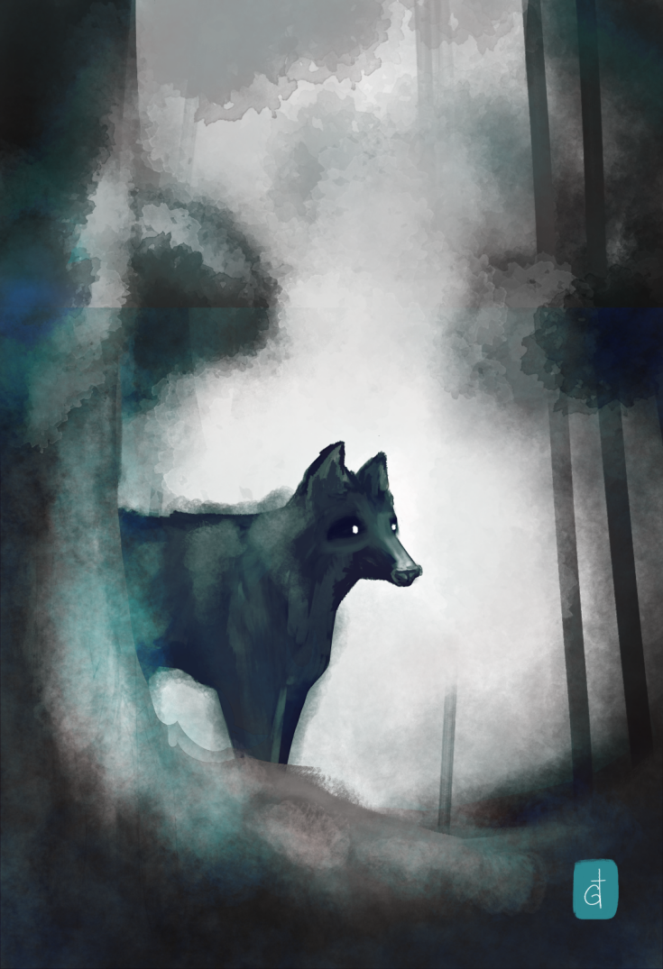
Testing out some new brushes... Also worked on a watermark thing.Related content
Comments: 3

Okay I was drawn to this because of the atmosphere 
I think it's a shame that the fog behind the animal looks super thick cause it would've been nice to see more dark bg detail 
Annd yea gotta say the animal's anatomy bothers me; if it's meant to be a wolf, the nose looks like it belongs on a cow or boar more than anything. Neck short, ears wrong :c?
Colors are a bit too all over the place, too. Stick to similar shades of color for one object
Maybe some solid lines, dashes, strokes for 'highlight' details would've given this more depth! Like for bark textures on the tree in the foreground or grass details. Could've even made zigzaggy lines for dead grass to emphasize the spookiness!
👍: 0 ⏩: 0

This looks pretty nice. I like the brush texture. I think the watermark thing stands out a bit too much. While the design itself is good, using such a bright turquoise draws too much attention to the watermark at the expense of the picture itself. The wolf's face looks a bit funny upon closer inspection because the round black shadow makes the nose look like the tip curves outwards like a baboon's nose. It also has unusual eyesockets. Adding branches to the upper part of the tree would help create oval flow instead of having an uninterrupted rectangle cause focus to drift away. Even though this is a test, the color palette and general idea are good enough that you could make a new version with a different composition. One thing that comes to mind would be to have a taller whitespace framed by branches at the top. I feel that the current size of the whitespace is out of balance and it should be either shorter or taller. It's a good idea to make some sort of a rough composition block-in without too many details or complex colors and try different options to see which one works out the best.
👍: 0 ⏩: 0

I love how you did the watermark thingy, very well done and all good around!
👍: 0 ⏩: 0


