HOME | DD
 dAKirby309 — Flat Colors Icon Set - PREVIEW #1
Published: 2013-07-28 20:23:06 +0000 UTC; Views: 51401; Favourites: 113; Downloads: 415
Redirect to original
Description
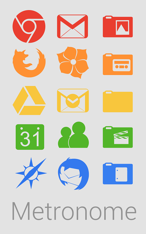
UPDATE: Icon Set IS FINALLY RELEASED AND READY FOR DOWNLOAD!This is NOT an icon set download! This is a picture of only just a few of the dozens of icons I have already developed for this coming set! And dozens more are planned!
Currently the icon set's .PNG resolution will be 256x256. This set will likely also be available as high quality .ICO images as well!
Preview #2 can be seen here: dakirby309.deviantart.com/art/…
Preview #3 can be seen here: dakirby309.deviantart.com/art/…
This set will be very large when completed, AT LEAST 300-350 ICONS WILL BE INCLUDED!! Possibly more! Hope you enjoy!
I'm really excited for the release of this set and I hope you are too, I'm quite proud of it so far!
The quality and look of this set's icons WILL be improved where needed!
What are your thoughts of the set so far based on this image? If you have any suggestions on what you think I should do with the set, feel free to let me know!
And by the way, I am STILL looking for a name for the set, I haven't decided on what to go with yet so if you have any ideas, feel free to let me know that too! Thanks!
Related content


Comments: 102


Probably the reason you saw this in your Deviations messages is because I recently updated the preview image.  (Wink)")
")
I'm trying my hardest to make this set extremely good quality, no pixelations, no blurs, etc. And I'm loving every second of it!
👍: 0 ⏩: 1

It looks extremely awesome man! As I said, I cant wait!
👍: 0 ⏩: 0

Awesome !
Waiting for release. how far have you got?
")
👍: 0 ⏩: 1
Just posted an update explaining my progress on the set yesterday, here: dakirby309.deviantart.com/jour…
👍: 0 ⏩: 0


Great..!!!! Superb work, mate...!!!
Waiting for final release...!!!
Keep it Up...!!!
👍: 0 ⏩: 1
Thanks, hope you'll like it!
👍: 0 ⏩: 0

I'm glad you feel that way!
👍: 0 ⏩: 0

it'd be cool for windows media player and some others to do flat but perspective, kind of like the windows store app
👍: 0 ⏩: 1
I may consider that, but probably not, good suggestion though!
👍: 0 ⏩: 0

ahan! that's coming out way more than expected, wonder what's next!
5 Star Rating: 
👍: 0 ⏩: 1
How aboot Flatron as a name?
Or Flexi flat?
No not flexiflat
Ummmmmmmm
Fletro?
👍: 0 ⏩: 1
Thanks for the suggestions, I may consider one, but I already thought of Fletro and there is already an icon pack out there named "Flatro" so people might get them confused or think I'm copying.
👍: 0 ⏩: 0
I know your not taking requests but can you please put a blackberry icon in this.
I checked in your Metro icons but it's not there.
I feel it considered as so called "TOP" company so yeah thanks.
n00b here
new to devianart
👍: 0 ⏩: 1
haha nice way to get your work done
👍: 0 ⏩: 0

Those will look great on my start screen using OblyTile, I am now patiently waiting for the completion of the set.
👍: 0 ⏩: 1
Glad to hear! It should hopefully be ready soon-ish, still lots of work and icons to make! I'm working very hard on the set to make it superb quality!
👍: 0 ⏩: 1
Thank you for your hard work and for making it available for download. I will feel bad using it for free though, I wish I could make it up to you somehow, but my student life sucks financially and it will keep on sucking for a couple more years
👍: 0 ⏩: 1
Yea, I understand how you feel, hard to earn money and keep it. But for this set it will likely be available for free but I may have it to where people have to download from Adf.ly, so you have to click an external link and wait 5 seconds then you can get it. That way I can make a little bit of money from people downloading it.
👍: 0 ⏩: 0


Very Nice Icon, I Will Waiting , Thank For Beautiful Icon (^^)
👍: 0 ⏩: 1
Thanks! I'm sure it will be worth the wait!
👍: 0 ⏩: 0

so far i am liking the set and hope to download it on its completion. well as soon as the .ico set comes out anyway
")
👍: 0 ⏩: 1
Thank you, I'm glad you like it, I'm looking forward to finishing!
👍: 0 ⏩: 0

Isn't that the old rockmelt logo
I personally think Rockmelt has went way low, from a full browser to a news reader How many news reader do we need?!
👍: 0 ⏩: 2
The preview has been updated to meet the new style! (and a few other icons on the preview now have an improved look, some icons weren't the best quality or color they could be.. now they are!)
👍: 0 ⏩: 0
lol oh snap, you're right! That tells you how long it's been since I've used it, I wasn't aware of the logo change or what it does. :I I'll fix that. And to be clear, it's not an internet browser anymore?
👍: 0 ⏩: 1
nope, it's an online news reader service now rockmelt.com
They told everyone they'll update their browser. Then they didn't say a word for months. And now finally, they said bye bye rockmelt browser...
Probably the worse move they could have made
👍: 0 ⏩: 1
Yea, RockMelt as a browser was pretty good, I used it for a while and I liked using it. But I'm glad I didn't get too attached to it.
👍: 0 ⏩: 1
looks like you won't be needing the rockmelt icon anymore because rockmelt has been acquired by yahoo. Yahoo is now shutting down rockmelt and has already remove all their apps from the play store, iOS appstore, and the windows 8 store
👍: 0 ⏩: 1
Wtf, dumb! Alright, thanks for the info.
👍: 0 ⏩: 1
Well yahoo has always been doing that for every company they buy
They only buy out companies to use their technology and then scrap their current apps, pretty terrible thing to do..
👍: 0 ⏩: 1
Yea, that sucks. Money money money.
👍: 0 ⏩: 0


need this icons !!!!!!!!!!!!!!!!!!!!!!!!!!!!!!!!
👍: 0 ⏩: 1
They should hopefully be released soon-ish!
👍: 0 ⏩: 0

Nice ! Flattening icons or Flatty. I'm not good at names
👍: 0 ⏩: 1
Hey that is very nice! Why not call it the 2Dimensional Icon set ... because I am sure that "Flat Icon Set" has been done before...
👍: 0 ⏩: 1
Thanks!  (Smile)")
👍: 0 ⏩: 0

Looks absolutely stunning! I think I actually like these better than your regular Metro icons (that's a compliment)! I can't think of any names ")
👍: 0 ⏩: 1
| Next =>