HOME | DD
 damnengine — Enola Grey - Cabal CD layout
Published: 2005-08-13 19:13:07 +0000 UTC; Views: 8004; Favourites: 41; Downloads: 1076
Redirect to original
Description
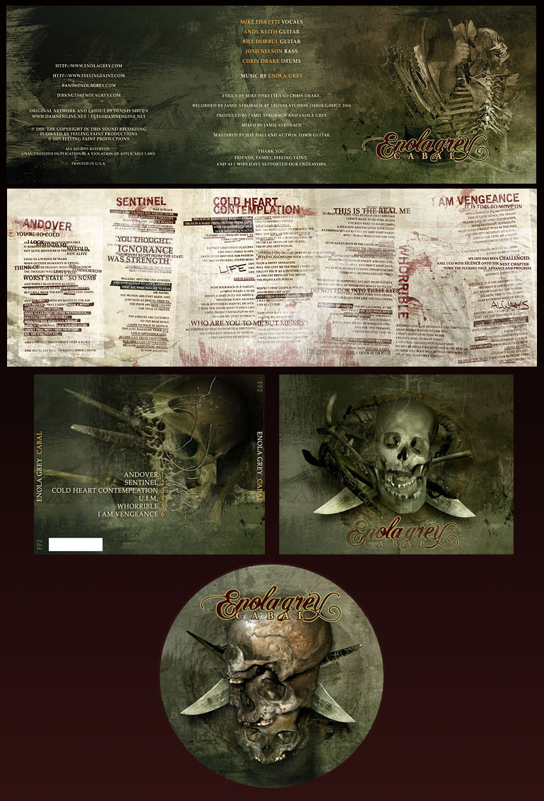
Enola Grey's [link] Cabal CD layoutAll images/photography/scans/3d by me - no stock used
Related content


Comments: 24


That's wicked, for lack of a better term.
P.s. When I grow up, I want your job.
👍: 0 ⏩: 0


How much do you charge for a commisioned piece such as this, I have many friends in bands who have horrible cd covers.
👍: 0 ⏩: 0

very morbid, but since i have the feeling that's what you were going for... nice work.
👍: 0 ⏩: 0


 (Wink)")

The text is as high quality as the imagery. Everything is really working in concert here; great job.
👍: 0 ⏩: 0


Simply outstanding....I like the way you layed this out in DA. I did a CD awhile back but wasnt sure how to lay it out here.
👍: 0 ⏩: 0

spritek [2005-08-14 09:09:31 +0000 UTC]
Awesome work ")

👍: 0 ⏩: 0

That is an amazing design. especially the use of type in the booklet. great work.
👍: 0 ⏩: 0


Good to see some returning elements,the wrap around object in middle right,thats a great element,and the liquid skull,what was that piece you did "peeling of the face" something like that,man how you do that liquid stuff,paint maybe.
👍: 0 ⏩: 0

It looks amazing. So profesional and high quality.
The style is really cool, and goes well together witht he bad. (i guess)
I like the work on the back of the cdcase, looks superb
👍: 0 ⏩: 0

exquisite!!! a beautiful lay-out and design! excelent color scheme too!
👍: 0 ⏩: 0

 (Smile)")

