HOME | DD
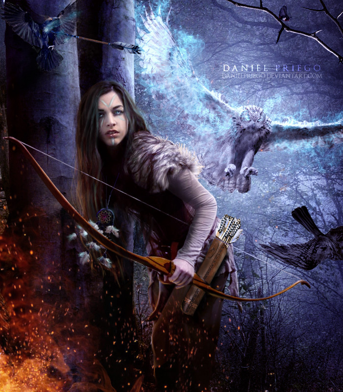
 DanielPriego — The Fire Arrow
Published: 2011-09-23 02:47:01 +0000 UTC; Views: 16248; Favourites: 875; Downloads: 558
Redirect to original
Description
MODEL: [link]RING DIAL: [link]
FIRE: [link] [link] [link]
BG: [link]
THE REST PAINTED
______________________LAST WORKS
Related content


Comments: 161

No hay de que te lo mereces 
De hecho aprendo mucho de ti!
👍: 0 ⏩: 1


 (Smile)")

👍: 0 ⏩: 0


wow thats so great!
I love the impression in her eyes.
👍: 0 ⏩: 1

thanks for comment and watch!!
👍: 0 ⏩: 0


fantastico, me encantaron los colores que usaste, ademas del fuego que colocaste alrededor del arco, muy hermosa pieza
👍: 0 ⏩: 1


")


When using stocks, it is vital to capture the attention correctly. People might do that using blur.
What you did was capture an area of attention by having a darker background surrounding that area.
However, just that wasn't enough.
The fire draws most of the attention but is fairly against the neutral. Combined with the lighter parts of the picture this draws the attention accross the fire instead of ON the fire. Since most of the fire is outside the attention area, the fire that does gets most attention. The eyes also help getting the attention on that place. This is just as it is supposed to be.
Also, the color balance is done exceptionally well.
I love this artwork. It is very interesting and a high level of detail.
If I am allowed to may such claim, but I do think the background color caused by the light effects (red and blue) is a bit off.
Might have been given some kind of new dimension so it doesn't appear to be background. This would however draw more attention. Well, I'd say give it a try and keep the attention as it is now.
Thanks for posting it. It is worth favouriting. Keep up the good work!
👍: 0 ⏩: 1
I liked your comment, help me to continue to improve. many thanks bro.
👍: 0 ⏩: 0


| Next =>