HOME | DD
 dansflash — EXPLOD3

Published: 2002-08-22 01:14:42 +0000 UTC; Views: 884; Favourites: 3; Downloads: 61
Redirect to original
Description
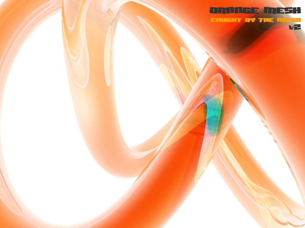
I worked on this all afternoon...I hope you all like it and comment and +fav and stuffRelated content


Comments: 15

Jebus this looks really trippy ... very very nice work ... I love it!
👍: 0 ⏩: 0

wow, you really are stupid, the only thing this and my "inescapable destiny" have in comon are the donut thing and the particles. you stupid shit, why don't you go around looking for eveyone else who uses particles and donut things and tell them you're the original creator of such things. also, the 3d in mine is yellow and red, and much more detailed. Plus my 2d is toally different. you really think you are the man, don't you? you think anyone who makes something remotely like any of your stuff is a total ripper, well let me open your eyes, for all i know, this itself may be a rip of someone elses work. some guy may come along and say "hey this looks kinda like what i did, you ripper! everyone look at my stuff and compare!" Well, you are not the source of any of my inspiration, and fact is fact, while you go around posting fiction. A while ago, i thought we could work together and share ideas and learn stuff about 3dsmax at the same time and stuff, but now you've gone off in your own direction, beliveing anything i do is pure imitaion of your own "brilliant ideas" remember i wanted to collab with you at one point? well, now i bet you'd say no beacuse you'd think i would steal your ideas and run wild with your concepts, which, by the way, have been used many times before, so don't think you're that original in the first place.
no hard feelings, really, i just was pissed off and felt like getting that out. for the fourth time i say "i am only defending my own work, not some suck-ass rip"
so, you wanna collab sometime???
👍: 0 ⏩: 0


Looks good... 3D Could be a bit more "alive" though.
👍: 0 ⏩: 0
mmm, quite nice, typo's okay, i like the 3, excellent coloring (i hafta play around with the airbrush some more...) overall it looks appealing, but it lacks a central focus point which is both good and bad...
👍: 0 ⏩: 0

nice
too many people are trying their hand at this and failing to grab me +fav
good work
👍: 0 ⏩: 0


WWWOOOOOOOOWWWWWW.... This.. is really... pretty... I am dually impressed by your good choice of color and your execution of it. Well done!
👍: 0 ⏩: 0

I like very much. Always like abstract things. You know that.
Nice typo. Maybe put more in the next one?
👍: 0 ⏩: 0

there's a certain simplicity to this thats lacking in the majority of work along these same lines that tend to be more of an obscuring mix of elements... nice.
👍: 0 ⏩: 0
