HOME | DD
 daskull — Back light
Published: 2007-09-04 03:15:15 +0000 UTC; Views: 11260; Favourites: 379; Downloads: 1417
Redirect to original
Description
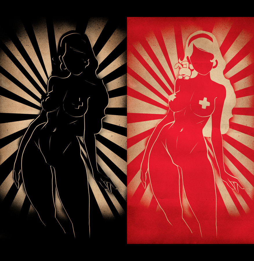
featured: [link] [link]I saw this amazing line sketch and just could not resist to vectorise it.
there's some version of this piece
and its realy hard to deside witch one is the best.
anyway i've decided to upload those two.
hope you'll like them


sketch by the amazing:
Related content


Comments: 81

")

Oohh, I liiike. I think I prefer the red one better, though it's a tough decision.
👍: 0 ⏩: 1


right one is nice ( i like the bunny) Left one has more contrast though.
👍: 0 ⏩: 1

yap, that's why i think they should go together
👍: 0 ⏩: 0

 (Smile)")


I like it! The combination of both is great!
Greets,
Tom
👍: 0 ⏩: 1


Legs look a big out of proportion, but I'd blame that on the sketch.
(I really want to make a stencil of this now)
👍: 0 ⏩: 1

yes... actually i think they go best together - and it would be less effective to just have one. they suit each other and bring out different aspects (black - the light; red - the form).
Pretty adaption
👍: 0 ⏩: 1
yes, i think so too.
the black one add contrast that the red one need.
thank you
👍: 0 ⏩: 0


<= Prev |