HOME | DD
 datoc — noName001

Published: 2002-03-11 10:35:43 +0000 UTC; Views: 423; Favourites: 1; Downloads: 21
Redirect to original
Description
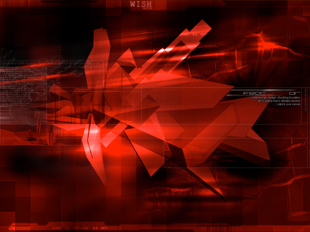
euhm...ok, here is sth in red from me (not blue!i worked on it for 3h, and used ps6 and 3dsm. hope u like it
comments?
edit: yes youre right, it looks better without of that foggy thinge, it took it out
Related content


Comments: 12

i like the typo stuff and the signs...
-----
-io
[link]
👍: 0 ⏩: 0


I like! Very cool, it keeps the eye moveing.
-----
Boogieboogie.
👍: 0 ⏩: 0

wow.. thats just awesome.. i can kinda see a site design laid on it now.. great work man
-----
::We do not see things as they are- we see them as we are::
-anais nin
👍: 0 ⏩: 0


awesome..i love the 'complexity meets minimalism' feel to this...
-----
chaos
👍: 0 ⏩: 0

the gfx is awe, mate. BUT: i dont really like the plain black at the bottom. i know, you can do better!!
rOck 0n
-----
-tHra N-
👍: 0 ⏩: 0

I like the window kinda thing going on at the top there. You might be able to emphasize that .
-----
_-_-_-_-_-_-_-_-_-_-_-_-_-_-_-_-_-
Writing is what I do inbetween breathing.
👍: 0 ⏩: 0

looks good but turn to opaciaty on the white fog down a little or something it draws to much attention
👍: 0 ⏩: 0

nice wp!
but maybe a little 'foggy' or somethin'..?
but wtf, i like it
-----
jez?
Love U bejbe!!
👍: 0 ⏩: 0
