HOME | DD
 datoc — organicBLUE2
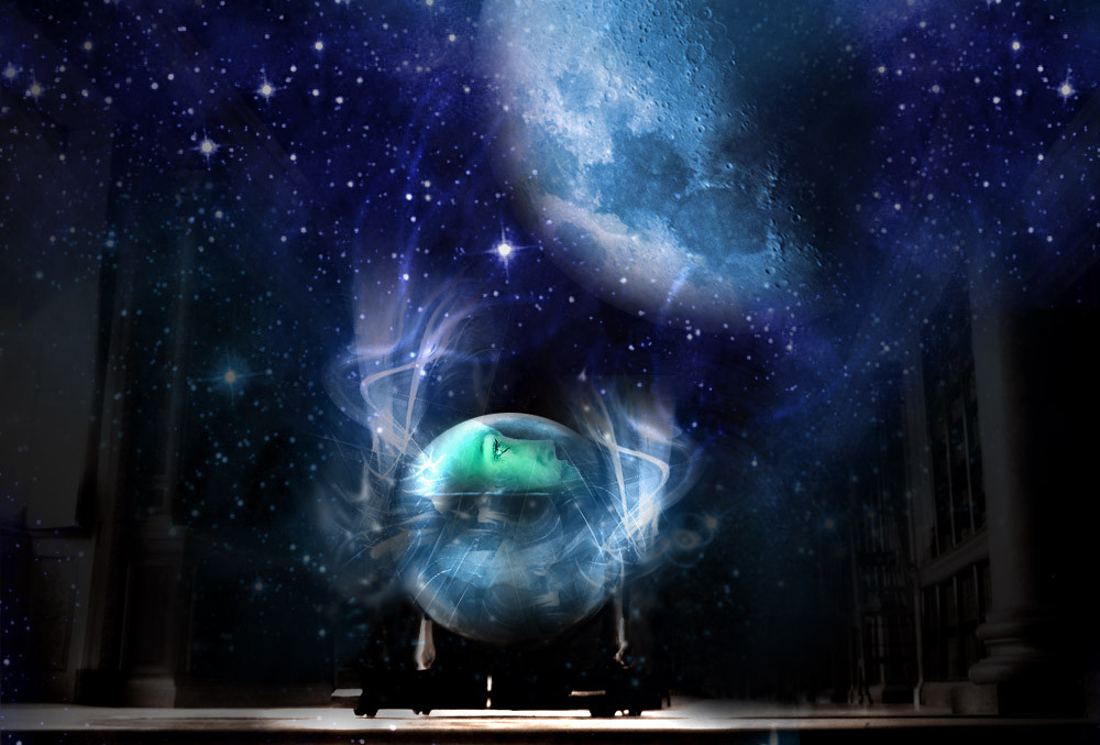

Published: 2002-02-12 16:55:53 +0000 UTC; Views: 1082; Favourites: 6; Downloads: 59
Redirect to original
Description
i added some contrast to it..in my opinion it looks better than the old one.check [link] if u want to see the old one..
hope u like it
done in photoshop6.0
Related content


Comments: 14

damn man kick ass iw sih i knew how to do that kinda shit
-----
-------------------------------------
up..
👍: 0 ⏩: 0


very nice for ps. the typography and 2d stuff is excellent. it seems as if you are really improving in that aspect. very nice!
-----
chaos
👍: 0 ⏩: 0

the soft blues, odd shapes and sweet lighting makes this kick ass!
-----
+Sometimes Its Story Time+
👍: 0 ⏩: 0


Wow that is really beautiful, i agree that u might need to rethink the text a little bit tho, i still think its great regardless.
👍: 0 ⏩: 0

Looks nice.
-----
A day will come when the artist will no longer be this bohemian, puffed-up anarchist, but a healthy man working in clarity within a collectivist society.
George Grosz, 1925
👍: 0 ⏩: 0

Wow...I really need to stop commenting on the blue wallpapers. Looks great. Nice job.
-----
--------------------------------
::PIXELeffect::
Hemadeyouapaintbrushwhatpictureareyou painting?
--------------------------------
👍: 0 ⏩: 0

Very nice. It's a little off balance. Personally, I would like to see the text pushed over farther to the right. Excellent work.
-----
Jeremy Sinon
{-- https://jsinon.deviantart.com --}{-- http://www.omnera.com --}{-- http://www.jeremysinon.com --}
👍: 0 ⏩: 0

my only suggestion would be to organize the text a little better.. other than that it kicks major ass
-----
i know not of the unknown but rather the unwanted for i am the unwanted and to those who want me the unknown
http://www.3ddrivers.com/ get all the drivers you need here
👍: 0 ⏩: 0

Very not bad.
-----
you dont need eyes to see
you need vision
👍: 0 ⏩: 0


oh woah! really cool! I like the details and the effects. it's so smooth and so...like...cool!.hehe. reminds me of final fantasy: the spirits within. Keep up the good work!
-----
-=-==-Chronn--Blue&White==-
👍: 0 ⏩: 0