HOME | DD
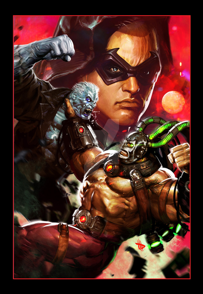
 Dave-Wilkins — BLADE

Published: 2010-05-19 18:28:15 +0000 UTC; Views: 43625; Favourites: 1270; Downloads: 1297
Redirect to original
Description
Blade, Blade, Blade, I love drawing this guy....I had a ton of fun with this one...Related content


Comments: 172

Hey Dave, love this. I saw the solicitation. This looks different though, far batter actually. The arm is far more representation in your dev here. Looks like you did some surgery since the version solicated. Is this going to be the print version, or did you take it further for fun.
Here's what I'm talking about... >>> [link]
👍: 0 ⏩: 1

OH yeah, initially he was turning to vampire smoke but it just didn't read well enough so I showed this to my editor and he agreed. We were too late to catch the solicitation but this one will be the actual printed cover. Good eye man
 (Wink)")
👍: 0 ⏩: 1
Aye, makes sense. Yeah, the original solicitation the arm really stuck out like a soar thumb to me. I was a tad boggled on the tworks of the anatomics in that. This looks beyond so much better man. Major props for the correction, looks sharp as hell now. Much better, accuracy on the arm etc, good correction, I salute. I'm also quite fancy on how the sharpness of the highlights and contrast were pushed. Love the bolt of chroma you added.
OY, I'm ranting. Yeah, it looks so much better, HOOPLAH to you I say!

👍: 0 ⏩: 1
Constantly trying to improve man, if it's not working DO IT AGAIN!!! lol
👍: 0 ⏩: 0


Nice work man! I really appreciate the composition!
👍: 0 ⏩: 1
Hey thanks man, it keep getting pushed from sketch to the final so I was afraid of losing the energy I had in the scribble
👍: 0 ⏩: 1
I think it works the same. The contrast, the way you set the figures in the image make them look strong. I also appreciate the cure for the detail, I don't have the same patience  (Smile)")
👍: 0 ⏩: 0


That's a mad style you're using here. Every bit of space is filled with something epic. I think the fun you had with this one definitely shows.
👍: 0 ⏩: 0

LOL I know I should put a Team Jacob shirt on Blade
👍: 0 ⏩: 2

whoa..excuse me..you mean team edward right?...RIGHTT? like omg as if.
anyways, your one of the best painters on DA and your veins rule all.
👍: 0 ⏩: 0

AHhahahaahahahhah
HECK YEAH!!!!!!
AHhahahah good work mate!
👍: 0 ⏩: 0

Awesome man. I love the gritty style you used. Everything about this is bad ass. Well done.
👍: 0 ⏩: 0


wow, that hatch/painting technique is awesome man!
👍: 0 ⏩: 1
Thanks man!! I'm trying to integrate new stuff I want to get my paintings that much closer to my drawings
👍: 0 ⏩: 0
<= Prev |