HOME | DD
 davidfoxfire — Introduction Scene background.
by-nc-nd
davidfoxfire — Introduction Scene background.
by-nc-nd
Published: 2012-10-22 01:25:13 +0000 UTC; Views: 2166; Favourites: 2; Downloads: 9
Redirect to original
Description
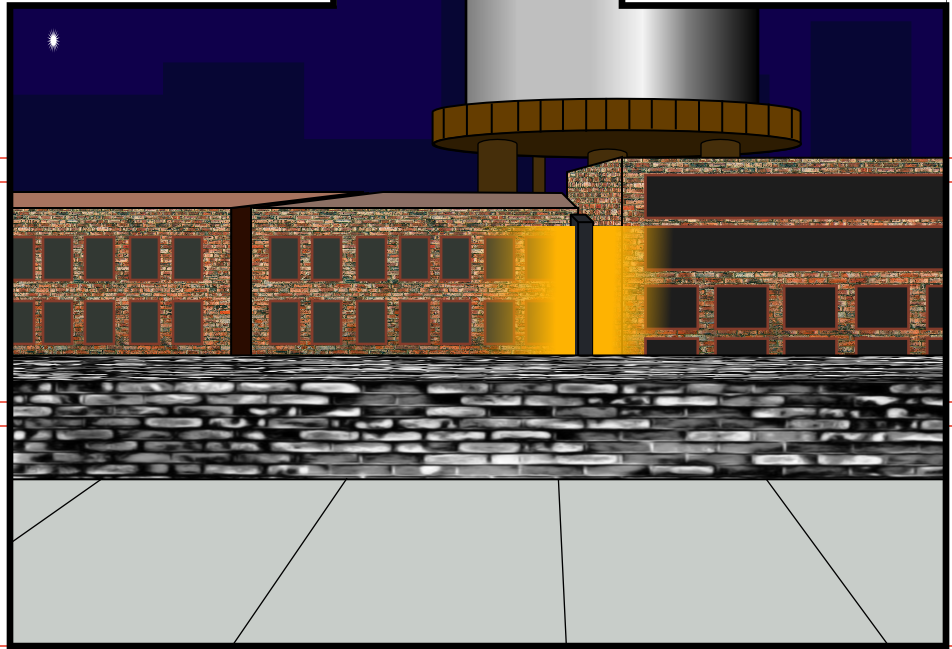
I know that two panels are in the way, but this is my first background attempt for the web comic. I opted for a Chromatown background here, and played with a couple textures at first. I'm sure I'll get better over time, but then again, I'm trying not to self-sabotage myself at this time.While the characters are hand-drawn, I found the need to make the backgrounds in Draw Plus because I can't seem to draw a straight line to save my life. It's also easier to put in all those needed details that good backgrounds need.
EDIT 01: Made the suggested edits on the background. And I've already got some feedback form a local group when I showed them my panel work. One is that my process of choice is similar to animation cell work. Take that for what you will. The other point is that I need to redo a panel with better perspective. I'll be sure to do that tonight.
At this time, I'll mention the tools I'll use: I start with a pre-lined 11X17 board designed for comic books (Strathmore, Cannon Fanboy, Blue Line, and others) with blank Bristol boards for redoing panels. Any kind of pencil will do at first, either wood-based or mechanical (Pentel EZ#2 is a favorite). At inking, I'll use a fountain pen. This'll give me a benefits of a nib without the mess of a dip pen. I have a Zebra v301, a cheapo pen from Walgreens, and a couple Varsities that I've saved from earlier. (Feel Free to donate a better pen for a donation) When I'm in Pinch Mode, A Pilot Percise V7 works fine for me. Once I got the panels done, they get photocopied down to 67% so I can scan them into my computer.
Related content


Comments: 3


Not a bad first attempt here. The perspective.provides a good view of your setting, and the use of the textures on the building faces help immerse them into the background.
For things to improve upon, address the windows on the buildings; they appear to be walled off with concrete as a solid grey color; a dark grey, almost black (but not) might help the windows blend into the buildings better.
For the foreground building, I would suggest reusing the texture for the other buildings in a gray scaled, more subtle manner for the inside wall. For the floor, you can reuse the above texturing idea or you can reuse the perspective points from the buildings to draw out lined divisions in the space to give the impression of adjoining concrete slabs. Either method will help make that space more visually appealing.
👍: 0 ⏩: 0