HOME | DD
 davidfoxfire — Introp02Demo
by-nc-sa

Published: 2012-11-01 02:38:52 +0000 UTC; Views: 1468; Favourites: 3; Downloads: 10
Redirect to original
Description
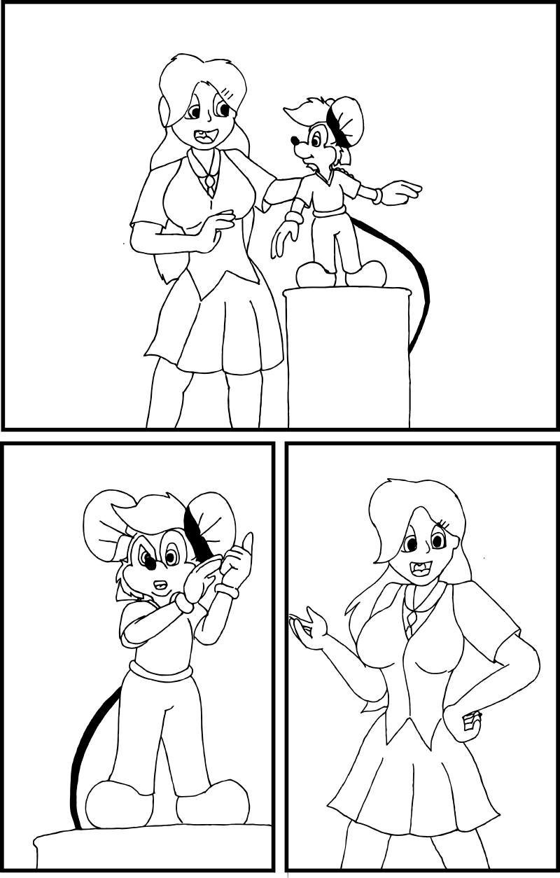
I thought a little preview of what I'm going to do with my collaborators group on the web comic. I'm releasing the Introduction pages here, so that the collaborators will haggle over it so I can find what needs improving. With the feedback, I can take these pics to my paint programs to put in the corrections before I color and shade them.For these three pages, anyone else who wants to help me out with the constructive criticism as well. If you're good enough, and are willing to sign up on a message board off DA [link] , you might get invited to be in that inner circle.
The finalized strips will appear sometime 3-4 weeks in the future (which is why I'm going to move this to a private group) fully colored and hopefully shaded well to boot. (I'll probably learn how to do that as I go through the strip, like I said.)
Related content
Comments: 1


Round two, starting from the top panel.
At first glance, Johnny looks visually smaller than he did on the last page. Conversely, Amber's face is more rounded and her head seems bigger than normal. Her fingers appear a lot like JB's gloves, where they should be more slender and longer. Also, her right leg (on our left) is positioned outward awkwardly.
Bottom left panel: Aside from the lack of detail in JB's clothes, it's pretty well constructed. If I had to recommend something to fix, his left hand (on our right) needs to appear straight on with the camera, hiding the majority of the curled fingers behind the pinky like the other hand does.
Bottom right panel: Amber's pose and expression is good for what I'm guessing is the "If you build it" line. I just don't like the way her left arm (on our right) appears. It seems a bit disconnected from the shoulder by how far it appears from the torso in comparison to the other shoulder. Her hands are small and chunky again, like Johnny's gloves, where they need to be a bit longer and more slender. Lastly, it would appear she's missing the hip area where her legs hook in. You did fine with Johnny in the previous panel, you would want to revisit this to make the figure more natural.
Overall, this one is probably the weakest of the three submitted for critique. Anatomical differences between frames should be addressed going forward.
👍: 0 ⏩: 0


