HOME | DD
 DavidStrife —
Divine Justice
by-nc-nd
DavidStrife —
Divine Justice
by-nc-nd

Published: 2007-12-06 00:42:33 +0000 UTC; Views: 21441; Favourites: 573; Downloads: 444
Redirect to original
Description
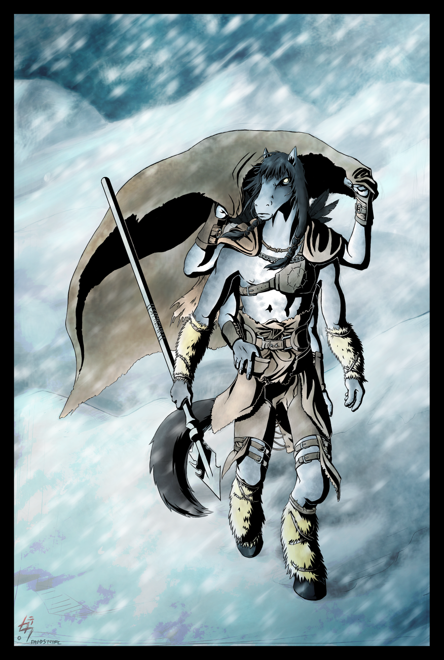
ENGLISHThis drawing doesn't look very worked, but my intentions were to express some ideas... I always wanted to draw wings like that, a freedom symbol from my point of view. But the wings start in a character that represents the justice, with some balances in the engraves. However, you can see the wing looks trapped in the armor. This mean the justice holds the freedom, and the swords are the punishment for everyone who wants to destroy this "balance". Or something like that.
I just kept the clouds of the last drawing with this character, but more darker.
By the way, this drawing have got some uses:
- Entry for ~Theyain contest, where people must design wallpapers with popular anthro animals. I changed the look of this character, now looks like a lion (he was supposed to be a lion in the last drawing, but...). Take a look at the contest, ot looks really interesting, and with nice prizes. I tried my best since I'm really on need of money, hehe!
- Entry for Anthro Weekly Challenge, "hero" theme. A new rule has been added, you can entry in the challenge with any anthro work you've done. Info of AWC at *anthrochallenge .
- And after a few request, I was taking screenshots for to make a tutorial of my style with this drawing. That's the cause of the delays.
- I'm writing a script with a short story of this character. Yeah, I'm planning to draw a short comic, just for fill my portfolio with various experiences.
---
ESPAÑOL
Este dibujo no parece muy trabajado, pero mis intenciones fueron expresar algunas ideas... siempre quise dibujar unas alas como éstas, un símbolo de libertad desde mi punto de vista. Pero las alas comienzan en un personaje que representa la justicia, con algunas balanzas en los grabados. Sin embargo, podéis ver las alas atadas en la armadura. Significa que la justicia sostiene la libertad, y las espadas son el castigo de todo aquél que quiere destruir este equilibrio. O algo así.
Conservé las nubes del anterior dibujo con este personaje, pero más oscuras.
Por cierto, este dibujo tiene varios usos:
- Mi entrada para el concurso de ~Theyain , donde la gente tiene que diseñar fondos de escritorio con animales anthro populares. Cambié el aspecto de este personaje, ahora parece un león (se supone que en el anterior también lo era, pero...). Echa un vistazo al concurso, parece interesante, y con buenos premios. Intenté lo mejor de mí mismo, ya que realmente necesito dinero, jeje!
- Entrada para Anthro Weekly Challenge, tema "hero". Una nueva regla se ha añadido, puedes participar con cualquier obra anthro que hayas hecho. Información sobre AWC en *anthrochallenge .
- Y después de unos pocos pedidos, he estado haciendo screenshots para hacer un tutorial sobre mi estilo con este dibujo. Es la causa de los retrasos.
- Estoy escribiendo un guión con una historia corta de este personaje. Sí, estoy planeando hacer un cómic corto, sólo para rellenar mi portfolio con varias experiencias.
Related content


Comments: 225

You're one of my fav anthro artists, not only because your anthro works. Your words are very appreciated! ^^
👍: 0 ⏩: 1

Wow, thank you. That's such a tremendous honor, believe me. You're an amazing artist yourself!
👍: 0 ⏩: 0

Muchísimas gracias! (perdón por tardar en contestar, los primeros comments son los que antes desaparecen).
👍: 0 ⏩: 0


")

Dios mío, este está mucho mejor que todos los demás con diferencia, se nota que te lo has currado mucho

👍: 0 ⏩: 1
Fue un poco aburrido, eso baja la calidad... pero thanks!
👍: 0 ⏩: 0

Impresionante trabajo!
Muy bueno el nivel de detalle y el uso de colores, que gran calidad!!

👍: 0 ⏩: 1
 (Wink)")

wow...this character is very well designed. I love the details. Congratulations for the DD. Go fav now!
👍: 0 ⏩: 1
I see you've drawn some angels. You can try the concept of the wings!
👍: 0 ⏩: 1
yeah, i like the wings....
i am working on story about it
👍: 0 ⏩: 0

omS! that must have taken a long time, Bravo...
👍: 0 ⏩: 1
An entire week ^^
Very thanks!
👍: 0 ⏩: 1

so much detail! Im astonished!!!! *bows down* I need to learn to have the pateince to do things like these. Keep up the great work!
")
👍: 0 ⏩: 1
Hehe, to detail drawings is more easy than you think... very thanks!
👍: 0 ⏩: 0

Excelente en todo aspecto.
Agregar más palabras sería inútil.
Genial man, congrats!
👍: 0 ⏩: 1

What wonderful detail.
It's a great idea! Well done!
👍: 0 ⏩: 1

congratulations on the DD, truly deserved
love the composition, his expression, and hair, and armour... love it all!
I must admit though that if I didn't read your description I wouldn't have understood that those where wings... I thought about it as a sky background of strange shape and with strange pendants
Lucky that I always read the comments

👍: 0 ⏩: 1
Hehe, very thanks! I knew it would be a good idea to write about the wing's concept XD
👍: 0 ⏩: 0

el nivel de detalle es bien impresionante.
buen trabajo!
👍: 0 ⏩: 1
Sí, trato de convertir los detalles en mi especialidad. Muchísimas gracias!
👍: 0 ⏩: 1

Good concept and great attention to detail. Love the character's design and expression, too. If I had one critique, it's that he's a little long in the torso area. Nevertheless, you should be proud of this.
👍: 0 ⏩: 1
The real problem is the position of the armor in the waist. Because the weight of the armor, it's very low. If you see the sketch, it's correct:
[link]
Well, very thanks!
👍: 0 ⏩: 1
Ah, yes, I see. I've had things like that happen before. Frustrating, isn't it?
👍: 0 ⏩: 1
Yeah, now it looks a bit weird, hehe...
👍: 0 ⏩: 0
your awsomeness sickens me..
the complexity of the armour is breath-taking,


👍: 0 ⏩: 1

Madre mia a mi personalmente me parece que esta curradisimo, todo me gusta MUCHO pero mucho, mucho, en serio.
Los detalles no son detalles, son detallazos, y se nota que has mejorado muchisimo con la cara de los antrhos, ahora te quedan muchisimo mas expresivas y definidas.
La armadura en fin, me deja sin comentario posible porque es una pasada! ^^ sigue asi, que da gusto pasarse por tu gallery!

👍: 0 ⏩: 1
Me alegra que te guste tanto... lo cierto es que no le caben más detalles, y realmente trabajé la cara, porque su expresión era muy importante para el significado de la obra. Very thanks!
👍: 0 ⏩: 0

Y dices que este dibujo "no perece muy trabajado"??? pues a mi me parece todo lo contrario, tiene muchos detalles, la cota de malla debajo de la armadura está genial por ejemplo, me gusta la sensación de movimiento en el personaje y el gesto de su cara, buen trabajo.
👍: 0 ⏩: 1
Digo que no está muy trabajado porque las líneas son bastante irregulares, no lo veo muy "profesional"... pero bueno, thanks!
👍: 0 ⏩: 0

no veia el ala al principio xDDDD
me gustan mucho todos los detallitos de la armadura y demás :333
👍: 0 ⏩: 1
El ala es parte del concepto, o una forma de ahorrarse las tortuosas plumas, ustedes eligen XD
Thanks!
👍: 0 ⏩: 1
ya, si simplemente no la veia xD
👍: 0 ⏩: 0

I think the concept is awsome...
I also love the expression on his face..
👍: 0 ⏩: 1
It's true, the expression of the face was very important... he must look really serious, like thinking about his hard responsabilities or something. Thanks!
👍: 0 ⏩: 1
Then you totally succeeded.. It's exactly what we think when we see him..
👍: 0 ⏩: 0

Waoh,está diosil el personaje y el dibujo en si!!Me he tirado un buen rato viendo los detalles,menos mal k tenia "pocos2 como tu dices...jajajaja!

(se me olidaba k tenia k ponerte las 3 best features,voy a ello...jajaja)
👍: 0 ⏩: 1
Pocos detalles... si por mí fuera, pondría más, pero es que puedes ver que no caben XD
No me envidies, la gente no pone tantos detalles porque no lo intentan... mis dibujos estan casi enteramente dedicados a ello, si en algo destacan es por eso (yo y mis trucos baratos para llamar la atención... XD)
Bueno, thanks!
👍: 0 ⏩: 0

wow you did it again you gave us something really cool
👍: 0 ⏩: 1
<= Prev | | Next =>