HOME | DD
 DavidStrife — Link Design
by-nc-nd
DavidStrife — Link Design
by-nc-nd

Published: 2008-02-15 23:24:24 +0000 UTC; Views: 18052; Favourites: 603; Downloads: 0
Redirect to original
Description
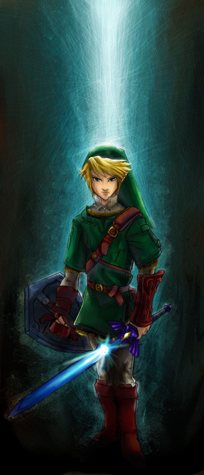
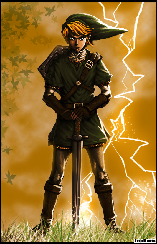
A design of Link (The Legend of Zelda) for a contest.This time, I've focused in the lineart, repeating and cleaning it a lot of times.
I've also focused in the design. After all, the contest is about design the aspect that Link could have in a hypothetical new game.
I hope you like it!
---
Un diseño de Link (The Legend of Zelda) para un concurso.
Esta vez, me he concentrado en el lineart, repitiéndolo y limpiándolo un montón de veces.
También me he centrado en el diseño. Después de todo, el concurso trataba de diseñar el aspecto que Link podría tener en un hipotético nuevo juego.
Espero que os guste!
Related content


Comments: 194

Yeah! Thanks for your fav, I'm glad you like it

👍: 0 ⏩: 0

Aw sorry faved with the wrong account >_> This pic is epic WIN it can be faver here
👍: 0 ⏩: 0

 (Smile)")

It's a beautiful picture. I didn't like the contest winners, they seemed a little TOO original...
👍: 0 ⏩: 0

hey man .. muy buen trabajo .. los colores .. estan bien aunq un poco saturados te quedaba mejor .. pero sin quemarlos claro
👍: 0 ⏩: 0

Such a beautiful artwork!!! ")
👍: 0 ⏩: 0

Wow ! Oo
My fuck*** god ! Oo
So... wonderfull, so... beautifull ! XD !
👍: 0 ⏩: 2
(By the way, i'm a very lover fan of Link ^p^' !)
👍: 0 ⏩: 0


I really love this design, it's modern but it just screams out that it's not! 
👍: 0 ⏩: 1
I see you're a TLoZ fan, so I'm glad you like it!
👍: 0 ⏩: 1
Oh, absolutley! It's the best game series ever!! Not to mention I love doing a few redesigns of my own, too.
👍: 0 ⏩: 0

Pretty cool design for Link, I wonder what the next Zelda game will be like.
👍: 0 ⏩: 1
Yeah! Those were winners of the contest (mine wasn't)
[link]
[link]
👍: 0 ⏩: 1
Yours is still cool though.
👍: 0 ⏩: 0

¿Era para el concurso de la NA? Porque si es así... jow, creo que este dibujo está mucho mejor que la mayoría de los que ganamos >____<
El diseño es espectacular, las lineas geniales (me gusta la perspectiva de lado), y el coloreado ya ni mencionarlo, con todas las arruguitas del vestido, la espada, la funda, los guantes...
Lo unico que no me gusta demasiado es que es muy oscuro. Pero por lo demás... *___*
👍: 0 ⏩: 1
Vaya, así que tú ganaste! Congrats! También ganaron ~SueKeruna y ~Esala . La verdad es que estuve bastante contento con los resultados del concurso, aunque no ganara... en otros concursos se suelen colar obras chapuceras, pero esta vez los ganadores fuisteis todos muy buenos.
En fin, gracias por encontrarme! XD
👍: 0 ⏩: 1
Sí, ya les eché un vistazo también ^^ El dibujo de ~SueKeruna era el que más me gustaba de los que ganaron ^0^ Era muy muy original (a parte de que estaba super bien hecho 
¡ Pues yo sigo pensando que tu dibujo merecía ganar! ò_ó
¡De nada! Gracias a ti por molestarte en responder y por watchearme

👍: 0 ⏩: 1
Es que ~SueKeruna está a otro nivel!
👍: 0 ⏩: 0

Beautiful, simply awesome. Nice improvement from the tunic and I can imagine that this would be much more convienent for movement.
👍: 0 ⏩: 0


me encanta como manipulas tus dibus

👍: 0 ⏩: 1


Very nice, I think when there is another game this design would be perfect for it!
👍: 0 ⏩: 1
The judges are the spanish staff of Nintendo, would be cool XD
👍: 0 ⏩: 1
the judges are the Spanish staff of Nintendo?
you have just given Nintendo their next design, I almost guarantee it

👍: 0 ⏩: 1
Haha, I doubt it... there's a lot of great entries, I know it because I told about it to some deviants, who made great works like this: [link]
Let's see who are the winners in one or two months... there can be 13 winners, so we have some chances.
👍: 0 ⏩: 1
no, I think your design is better. . .unless the next game takes place in a modern-day city after Link has somehow been pulled out of his game and now he must save both his world which he finds out isn't real here and our world which is being taken over by the usual villains, all while coping with the fact that according to our world he doesn't even exist. . . I think I just posted one of the best video game ideas EVER o.O
👍: 0 ⏩: 0

oh dios link!!! ays se me han kaido las bragas mirando komo pintas!! ô_ô <(Oh my god!)
👍: 0 ⏩: 1
Jaja, qué exageración... en fin, thanks!
👍: 0 ⏩: 1
no, eske nose, me ha gustado ese rollo que le has puesto en cuanto a iluminaciones i tal! -^_^- (era una forma de hablar, eso de las bragas, jajajajaja. Muy burra pero bueno XD)
👍: 0 ⏩: 1
Ya, si es que por la noche, la mente se distorsiona... XD
Bueno, thanks otra vez!
👍: 0 ⏩: 0

Wow...that redesign is so subtle, but cool! You need to make a clothes fold tutorial!!!
👍: 0 ⏩: 1
Haha! I only observe the folds of real clothes.
👍: 0 ⏩: 1
Everyone says that!!! I just wanna draw from my head! DX
XD I guess some things are just meant to be observed...
👍: 0 ⏩: 1
Hey... I've observed it long time ago, now I know how to do it "from my head" XD
👍: 0 ⏩: 1
Hm...then that is one of the things I must learn!
👍: 0 ⏩: 0


El dibujo está muy bién, no se si es que has cambiado un poco el estilo, pero parece diferente a lo que normalmente dibujas, y aunque Link no me cae demasiado bién, si su diseño original fuera como el que tu has hecho mi opinión sobre el sería otra, este mola mucho más. La línea parece que resalta demasido (quizá esa era la intención), el sombreado y la iluminación de la ropa son muyyy buenos, te lo has currado, por último, el fondo no encaja mucho.
👍: 0 ⏩: 1
Sí que no parece mi estilo, sobre todo en la cara... y por las líneas tan gruesas y regulares que nunca he hecho hasta ahora. De todos modos, este estilo no me parece muy malo.
Y el fondo... en principio sólo dibujé el personaje, porque lo que contaba era el diseño. Le puse el suelo por darle un poco más de vida, pero no me preocupé mucho por él.
👍: 0 ⏩: 0

Las líneas de la cara no parecen tuyas, pero el brazo y los pliegues sí tienen tu toque
Lo único que no me pega en que tiene...ligas? Diox, debo de tener una mente perversa.
Mucha suerte en el concurso!

👍: 0 ⏩: 1
No parecen líneas mías, pero... quedan bien? Es algo que me gustaría saber, para hacerlo con este estilo más a menudo, o pasar a otra cosa.
Y... ligas?
")
👍: 0 ⏩: 1
Sí, la verdad es que es un dibujo bastante bueno.Son unas líneas más limpias y constantes, más profesionales si quieres.
Lo de las ligas lo digo por la forma de la parte verde del pantalón, ha sido una impresión inesperada. Si nadie más te dice nada es que soy yo la que se imagina cosas T_T
👍: 0 ⏩: 1
Profesionales? Perfecto! Mis lineart no me suelen convencer porque parecen chapuceros.
Y las "ligas"... no sé exactamente qué representan, pero eres la única que lo ha mencionado...
👍: 0 ⏩: 0

Esta genial! El diseño de Link es asombroso, aunque flojea mucho en el fondo, sobretodo porque Link no parece formar parte de el...no se si me explico...no se, la perspectiva del personaje no me cuadra con la del suelo.
👍: 0 ⏩: 1
| Next =>