HOME | DD

deadspirit6 — DOMINION-getDevoured02

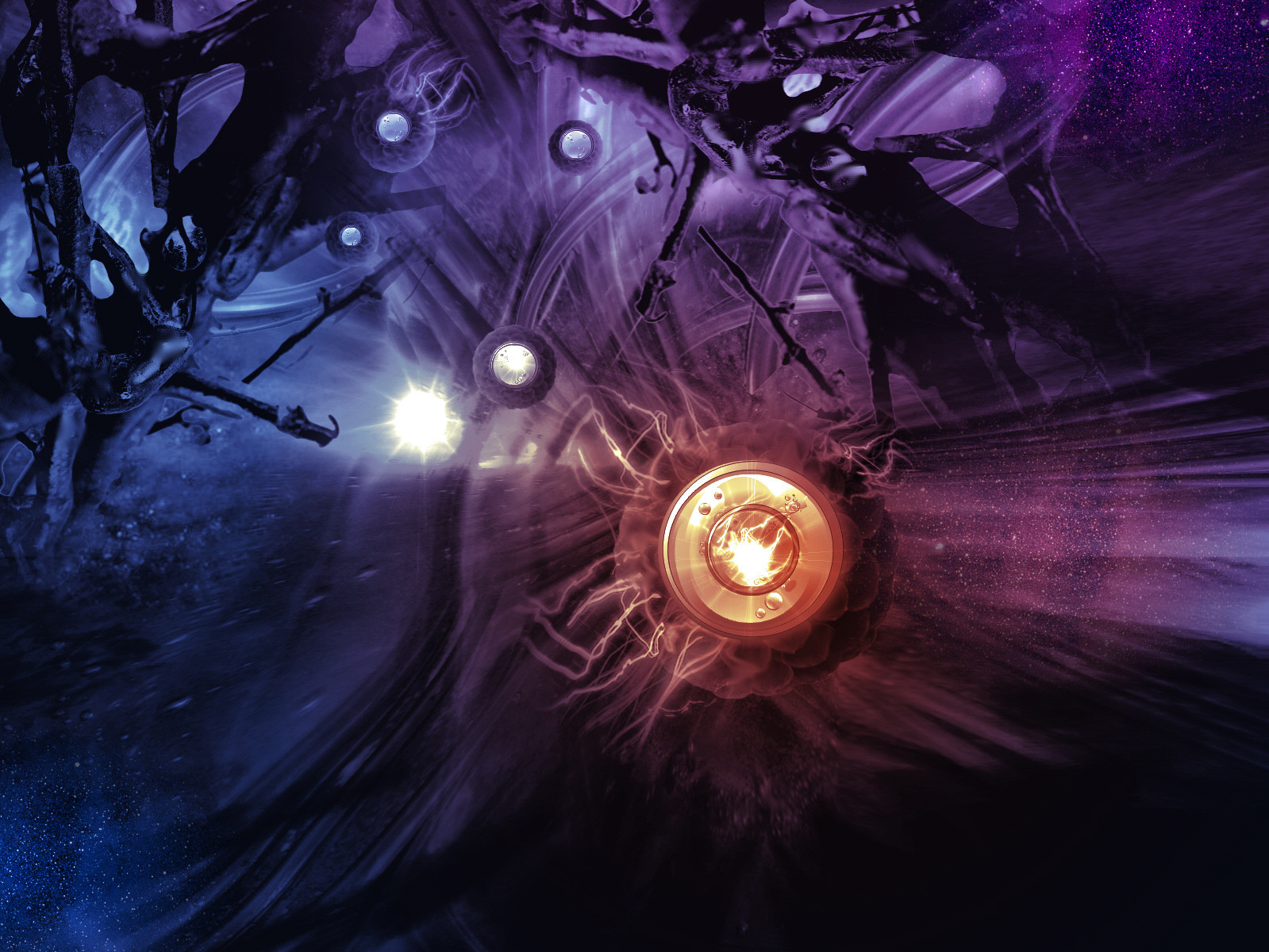
Published: 2004-04-15 11:29:46 +0000 UTC; Views: 1766; Favourites: 36; Downloads: 1221
Redirect to original
Description Version 2 of DOMINION-getDevoured ...version 1, the green version is at [link]
Related content
Comments: 101

deadspirit6 In reply to ??? [2004-04-16 10:17:39 +0000 UTC]

I dont have words to thank U enuff for loving this......

👍: 0 ⏩: 1

Drift150 In reply to deadspirit6 [2004-04-16 12:11:20 +0000 UTC]

no prob. i always look forward to seeing your new work

👍: 0 ⏩: 1

deadspirit6 In reply to Drift150 [2004-04-16 12:16:04 +0000 UTC]

thankeeeeez bro!

👍: 0 ⏩: 0

Bunnygirl- [2004-04-15 18:02:55 +0000 UTC]

love the shading and the blending of colour...very nice sharp detail as well....as always wonderful job....

clarice

👍: 0 ⏩: 1

deadspirit6 In reply to Bunnygirl- [2004-04-16 04:38:25 +0000 UTC]

Thanks a lot Clarice...your support is like food to my art...develops more with each morsel of motivation... thanks

👍: 0 ⏩: 0

TheHeat4x20 [2004-04-15 17:52:50 +0000 UTC]

like the colors in this one better, but i think you could have blended the disk-like parts of the particles in a little better. great concept

👍: 0 ⏩: 1

deadspirit6 In reply to TheHeat4x20 [2004-04-16 05:12:56 +0000 UTC]

yeah I agree,..lazy me..thanks bro

👍: 0 ⏩: 0

pillargraphicdesign [2004-04-15 17:17:02 +0000 UTC]

WOW, i think is one of your best yet, I love the organic feel it has, I also like the other elements that add to it, instead of just all 2d & 3d graphic. GJ as usual, I always like these pieces.

👍: 0 ⏩: 1

deadspirit6 In reply to pillargraphicdesign [2004-04-16 09:43:24 +0000 UTC]

thankkkks

👍: 0 ⏩: 0

b-c [2004-04-15 16:36:00 +0000 UTC]

great work, I think this version is better, like those disks you putt on those balls, great work and

👍: 0 ⏩: 1

deadspirit6 In reply to b-c [2004-04-16 04:54:00 +0000 UTC]

...100 s

👍: 0 ⏩: 0

Carrie-Kube [2004-04-15 16:35:58 +0000 UTC]

The blues and purples are so nice.
Love,
Yaoi Huntress Earth

👍: 0 ⏩: 1

deadspirit6 In reply to Carrie-Kube [2004-04-16 09:48:02 +0000 UTC]

thanks for loving this

👍: 0 ⏩: 0

Ciele [2004-04-15 15:51:04 +0000 UTC]

Got that cel-shaded look, very cool. Wonderful colors as well.

👍: 0 ⏩: 1

deadspirit6 In reply to Ciele [2004-04-16 05:37:46 +0000 UTC]

glad U enjoy my art thanks

👍: 0 ⏩: 0

bonnita [2004-04-15 15:44:52 +0000 UTC]

oh oh i like this one , tha peice in the middle reminds me of the norg, wicked work

👍: 0 ⏩: 1

deadspirit6 In reply to bonnita [2004-04-16 05:16:56 +0000 UTC]

thankkkks bonnita

👍: 0 ⏩: 0

Bloodredsangre [2004-04-15 15:07:49 +0000 UTC]

Beautiful! It's so intense and rich.

👍: 0 ⏩: 1

deadspirit6 In reply to Bloodredsangre [2004-04-16 05:19:12 +0000 UTC]

thankkkks

👍: 0 ⏩: 1

Bloodredsangre In reply to deadspirit6 [2004-04-16 14:46:24 +0000 UTC]

yw!

👍: 0 ⏩: 1

deadspirit6 In reply to Bloodredsangre [2004-04-19 04:40:22 +0000 UTC]

👍: 0 ⏩: 0

angelbabygurl [2004-04-15 14:26:41 +0000 UTC]

This one is tighter! I like the blues and purples!
~Angel~

👍: 0 ⏩: 1

deadspirit6 In reply to angelbabygurl [2004-04-16 05:19:36 +0000 UTC]

I am honored

👍: 0 ⏩: 0

zyma [2004-04-15 13:41:36 +0000 UTC]

I love both, but this one it's better. Really nice colors and textures...Good Design as always

👍: 0 ⏩: 1

deadspirit6 In reply to zyma [2004-04-16 05:28:01 +0000 UTC]

* T H A N K S *

👍: 0 ⏩: 0

ansarwasif [2004-04-15 13:37:55 +0000 UTC]

the colors here are better from the previous. but i loved the organic objects in that one. still its nice.
alot of stuff together. space and other stuff.

👍: 0 ⏩: 1

deadspirit6 In reply to ansarwasif [2004-04-16 05:27:05 +0000 UTC]

bro thankkkks once again

👍: 0 ⏩: 0

Yukai-Meerkat [2004-04-15 13:23:29 +0000 UTC]

For sure this is more visually interesting than your green one.
You always come up with such a brilliant piece of work!
I think you may need to vary your colour scheme a little.
Still brilliant work though!

👍: 0 ⏩: 1

deadspirit6 In reply to Yukai-Meerkat [2004-04-16 09:49:18 +0000 UTC]

geee yes I totally agree with you

👍: 0 ⏩: 0

xgod-0 [2004-04-15 12:49:19 +0000 UTC]

oo0o Nice, this verson is alot better then the green imo, Crazy job dude.

👍: 0 ⏩: 1

deadspirit6 In reply to xgod-0 [2004-04-15 12:57:54 +0000 UTC]

THANKKKKKS

👍: 0 ⏩: 1

xgod-0 In reply to deadspirit6 [2004-04-15 13:02:24 +0000 UTC]

Its all good dude.

👍: 0 ⏩: 1

deadspirit6 In reply to xgod-0 [2004-04-16 05:48:13 +0000 UTC]

thanks bro....S

👍: 0 ⏩: 0

Echylon [2004-04-15 12:36:47 +0000 UTC]

i like this version better than the first, love the colors and nice design

👍: 0 ⏩: 1

deadspirit6 In reply to Echylon [2004-04-15 12:44:15 +0000 UTC]

thanks

👍: 0 ⏩: 0

pluggedinbaby [2004-04-15 12:16:54 +0000 UTC]

I'm such a sucker to those amazing colours.... All the detail in this is totally stunning I like the wave things coming off of the main focus.

Also a sucker for that dotted/starry bit in the bottom left corner

👍: 0 ⏩: 1

deadspirit6 In reply to pluggedinbaby [2004-04-15 12:21:07 +0000 UTC]

thanks a ton once again

👍: 0 ⏩: 0

neoheaven [2004-04-15 12:13:13 +0000 UTC]

Much much better than the green version , with less blur and a more focused and more interresting part in the middle.

Can you juste explain me a bit , how you did this?

👍: 0 ⏩: 1

deadspirit6 In reply to neoheaven [2004-04-15 12:20:04 +0000 UTC]

Made this in Photoshop and Micrografx Picture Publisher and also used Corel Draw, used mimimal 3d..thankkkks for the

👍: 0 ⏩: 0

maggi [2004-04-15 11:49:44 +0000 UTC]

Arent these ur patent shades They sure look GOOD.... Love this one !!

👍: 0 ⏩: 2

maggi In reply to maggi [2004-04-15 11:56:06 +0000 UTC]

Again that prefix !!!!!

👍: 0 ⏩: 0

deadspirit6 In reply to maggi [2004-04-15 11:51:23 +0000 UTC]

yeah patent and I am repeating myself...damn me...must experiment with new stuff...thanks for your continued support sweet Meghna

👍: 0 ⏩: 0

Digital-soul- In reply to ??? [2004-04-15 11:43:41 +0000 UTC]

i like this one great colors and nice object m8 !!

::: DS

👍: 0 ⏩: 1

deadspirit6 In reply to Digital-soul- [2004-04-15 11:53:17 +0000 UTC]

thank you m8...

👍: 0 ⏩: 0

Firehead65 In reply to ??? [2004-04-15 11:40:12 +0000 UTC]

wow, great! i like the green version, but this one is even better

great work again

👍: 0 ⏩: 1

deadspirit6 In reply to Firehead65 [2004-04-15 11:51:56 +0000 UTC]

thankkkks a TON

👍: 0 ⏩: 0

jbrosque In reply to ??? [2004-04-15 11:38:26 +0000 UTC]

This one is better

👍: 0 ⏩: 1

deadspirit6 In reply to jbrosque [2004-04-15 11:54:20 +0000 UTC]

yeah...I know... has more colors and hence the focus goes on the off-center circular stuff.

👍: 0 ⏩: 0

DivineError In reply to ??? [2004-04-15 11:31:15 +0000 UTC]

i dont know how you do it, but ill say it again. every single peice of yours im interested in seeing, they never get old to me. I like the colors of this one too, red+blue creates the best color tones

👍: 0 ⏩: 1

deadspirit6 In reply to DivineError [2004-04-15 11:32:23 +0000 UTC]

thankkkks bro

👍: 0 ⏩: 0


<= Prev |