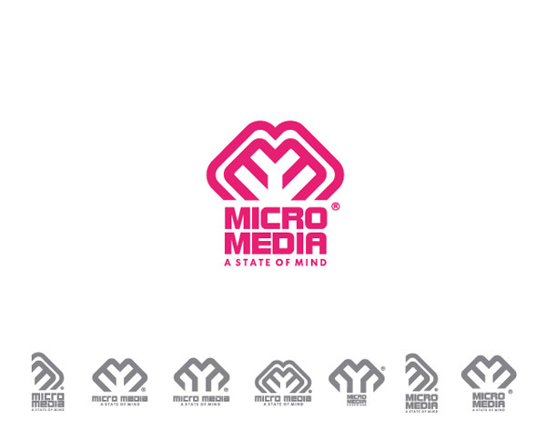
HOME | DD

Delicious-Daim β€” micro media

Published: 2006-10-27 22:35:35 +0000 UTC; Views: 11652; Favourites: 108; Downloads: 163
Redirect to original
Related content
Comments: 31

GrabIndonesia [2016-08-01 04:17:33 +0000 UTC]

Lovin it!


---------------------
Grab Indonesia.Β Website design Jakarta

πŸ‘: 0 ⏩: 0

GraphicDesign00 [2015-12-18 00:29:48 +0000 UTC]

WOW, I LIKE IT...
-
also you can find free PSD Logo Templates at: FreeLogoPSD.blogspot.com

πŸ‘: 0 ⏩: 0

mr-nightstone [2007-03-28 16:35:01 +0000 UTC]

These are realy something! I kinda like the one on the far left the best

πŸ‘: 0 ⏩: 0

elhashmie [2007-03-20 14:18:14 +0000 UTC]

WOw~~

πŸ‘: 0 ⏩: 0

schakalwal [2007-03-13 23:24:11 +0000 UTC]

absolutely fantastic man!

check out my gallery [link]

πŸ‘: 0 ⏩: 0

schakalwal [2007-03-13 23:23:38 +0000 UTC]

absolutely fantastic man!

check out my gallery [link]

πŸ‘: 0 ⏩: 0

inde-blokcrew [2007-03-02 12:49:58 +0000 UTC]

realy nice, so many variations, well done!

πŸ‘: 0 ⏩: 0

neghab [2007-01-16 13:55:54 +0000 UTC]

wow.....fantastic

πŸ‘: 0 ⏩: 0

dirrrtysouth [2006-11-18 02:46:20 +0000 UTC]

dobre logosy... jak bedziesz miaΕ‚ czas to napisz do mnie. miaΕ‚bym dla ciebie 2 tematy.

πŸ‘: 0 ⏩: 0

CReatiVe4w3 [2006-10-29 15:06:21 +0000 UTC]

Your logo work is the best I've ever seen. Thx so much. Will be seeing you soon.

πŸ‘: 0 ⏩: 0

Mash11 [2006-10-29 13:52:54 +0000 UTC]

thats rock

πŸ‘: 0 ⏩: 0

Gordon404 [2006-10-29 11:21:49 +0000 UTC]

very cool

πŸ‘: 0 ⏩: 0

excelcius [2006-10-29 05:11:55 +0000 UTC]

lovely logo, I've seen others and would love to find out how to make them also I've seen most of your work and it's astounding.

πŸ‘: 0 ⏩: 0

mD-06 [2006-10-28 19:12:21 +0000 UTC]

lovely work

πŸ‘: 0 ⏩: 0

NG25Lab [2006-10-28 16:58:42 +0000 UTC]

very neat logo.. nice work

πŸ‘: 0 ⏩: 0

oxycreations [2006-10-28 13:45:29 +0000 UTC]

nice logo...

πŸ‘: 0 ⏩: 0

pixelbudah [2006-10-28 12:58:09 +0000 UTC]

your work is great lovely mate very very nice

πŸ‘: 0 ⏩: 0

gregbike [2006-10-28 12:32:59 +0000 UTC]

CaΕ‚kiem najs!

πŸ‘: 0 ⏩: 0

russoturisto [2006-10-28 12:03:10 +0000 UTC]

uh! i did something like that for metal man - (dopepope)
and plan to submit it after hollidays

πŸ‘: 0 ⏩: 0

zepone [2006-10-28 08:02:39 +0000 UTC]

rozowe drzewko dla mnie best

πŸ‘: 0 ⏩: 0

theory-x [2006-10-28 07:21:07 +0000 UTC]

i got the impression to read two "E" and not the"m" for the first look after you understand that's a "e" but not in the first time

πŸ‘: 0 ⏩: 0

obrobkareczna [2006-10-28 07:03:35 +0000 UTC]

swietne

font "micromedia" wΕ‚asnej roboty czy gotowy?

πŸ‘: 0 ⏩: 0

caspercreations [2006-10-28 06:34:08 +0000 UTC]

baaardzo mnie sie to podoba

πŸ‘: 0 ⏩: 0

GoPurifyYourself [2006-10-28 06:30:41 +0000 UTC]

i'd choose the 5th

πŸ‘: 0 ⏩: 0

PrimaryVIVID [2006-10-28 03:56:15 +0000 UTC]

I'm pretty fond of the 5th and 6th ones from the left.

πŸ‘: 0 ⏩: 0

lefthand-design [2006-10-28 02:11:10 +0000 UTC]

Great looking logo.

πŸ‘: 0 ⏩: 0

attackforce [2006-10-28 01:38:07 +0000 UTC]

looks good to me man maybe try a reverse for fun

πŸ‘: 0 ⏩: 0

jonrod [2006-10-27 23:00:06 +0000 UTC]

I agree your decission. But why that color, what is it about?

πŸ‘: 0 ⏩: 0

3khc [2006-10-27 22:59:32 +0000 UTC]

i had the same cilent as you but they didnt like mine
i had lots of trouble make a logo w/ "MM"
but you got it perfectly

genius

πŸ‘: 0 ⏩: 0

uAe-Designer [2006-10-27 22:46:43 +0000 UTC]

awesome

luv it

πŸ‘: 0 ⏩: 0

smashmethod [2006-10-27 22:38:32 +0000 UTC]

I think I like the blown up one best.

πŸ‘: 0 ⏩: 0