HOME | DD
 Demedesign — Sins OF The Father
Published: 2011-09-09 03:56:06 +0000 UTC; Views: 428; Favourites: 7; Downloads: 7
Redirect to original
Description
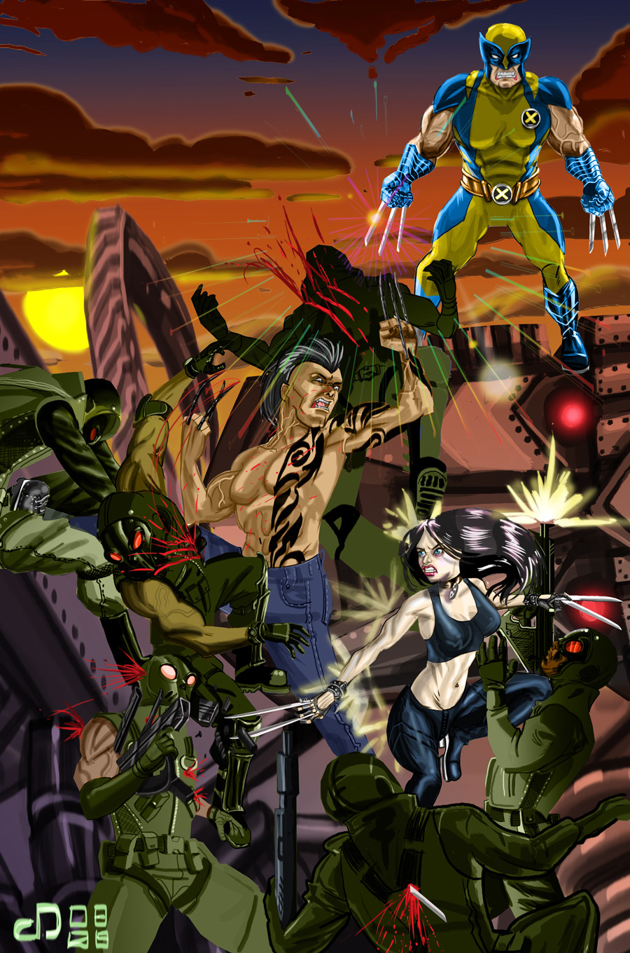
This is the first full illo' I have done in a while so I want to come out with arms swing.The idea behind the art was to try and make an illo' that was hellha Kool, period.
Related content


Comments: 4

Oh man thanx so much for the critic bro. I really appreciated it.
I agree I feel the over all comp' is not pull together I designed all the elements separately and stuck them together and unfortunately it shows.
👍: 0 ⏩: 0

Sorry I'm so late to the party.
I've gotta agree with JKnox on most of this.
Wolvie seems out of place, as if he were plopped up there from another illo altogether, but he does look good, so awesome gravy. He doesn't really interact with it in any way, so that' the neg along the same lines JKnox mentioned as far as posing.
The junior's don't really match up with the soldiers lighting wise, which is a shame because the grad-n-modeled lighting on them is fucking dope. So so dope. Her face is so badass too. I like their poses and body language a lot. Fun stuff going on here.
Like the colors in the sunset, but they don't color treat the foreground so they kind of fight with it. Then there's the bright yellow and blue of OG Logan, so it's a bit crazy color-wise. I'd love to see them being lit by the sunset and the sky, but you know I'm greedy when it comes to color design.
Between this being your first full-scale digital painting, where you've gotta juggle the rendering, the comp and the medium I'd say you did fantastic. Nothing to sweat. I'm definitely watching yer DA account so I can see more.
👍: 0 ⏩: 0
Thank you so much for the great feed back Jknox!!
I agree with a lot of what you said, you confirmed what I felt all along, but I have a a bad habit to net pick my work to death and never finish it. So in the interest of finishing I moved.
👍: 0 ⏩: 0

I really love this illustration, the shading and shadows are really fantastic as well as the movement.
Wolverine looks really great i love the texture of his gloves and the shine which makes them look almost metal.
The soldiers are also really done well although i understand the choice to make them masked I kind of wish we could have seen their faces to get more reaction from them.
I think Daken and X-23 are the weakest parts of the image.
Daken's chest, face, and legs look awesome, however his arms are ill-proportioned i think.
Laura's left hand is very muddy i think and the right leg seems static and still, although it's I'm assuming kicking that soldier.
Those are my only two pieces of criticism.
The third while not a criticism more of a personal choice would be to put Wolverine into a more dynamic posture.
This is a really wonderful piece Dem and I'm really glad to see you working again!
-J
👍: 0 ⏩: 0