HOME | DD
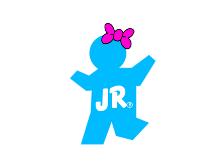
 derektion — Derektion Logo

Published: 2001-07-20 08:32:37 +0000 UTC; Views: 228; Favourites: 6; Downloads: 29
Redirect to original
Description
Well, this is my first post here at Deviant, and it's basically a larger version of my profile icon. I hope to design more professional-looking images in the near future.Related content
Comments: 3

eh. The colors are not quite "vibing" with eachother.
There are starts to art. I didn't star off well. It took me many shots to get a feel for what things need to look like.
Keep trying.
--m00
👍: 0 ⏩: 0

The green swish-looking part is decent, but it seems like the colored bands are frivolous...and detract from the whole. The white grid-thingy suffers from the same problem too.
It looks like you're going in the right direction with the text, however.
Logos should be clean and simple, perhaps you want to just stick to the swish/text combo.
-------
..::[apathy is healthy]::..
👍: 0 ⏩: 0
