HOME | DD
 DestinySpider — Spider-Man (DS design) version alpha
#marvel #redesign #spiderman #fandesign
Published: 2018-10-29 22:52:10 +0000 UTC; Views: 3680; Favourites: 46; Downloads: 0
Redirect to original
Description
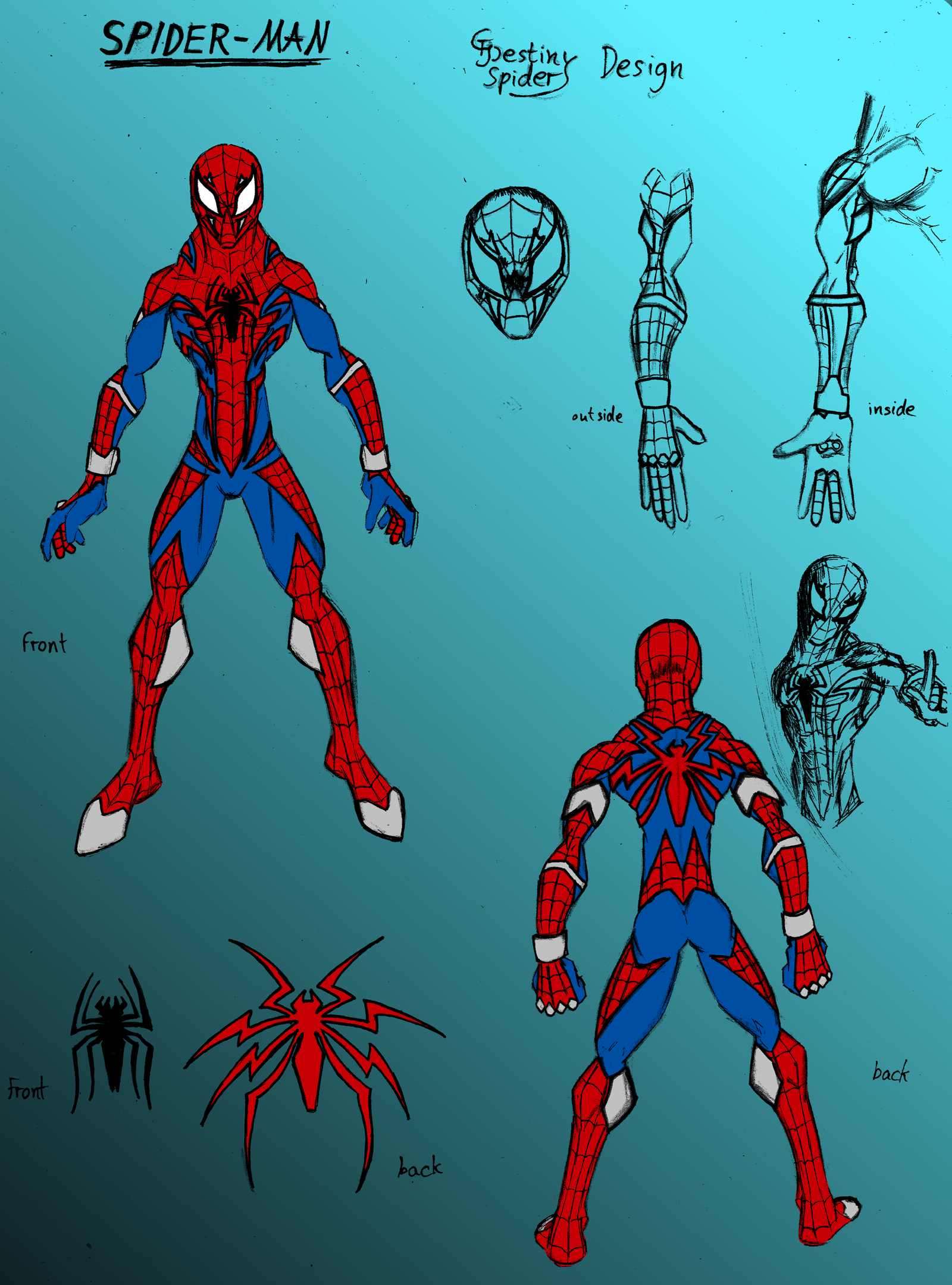
Forgot that I had this ready to upload lol.
Eh... I mean... I kinda like it... But it still needs a lot of work to really be cool.
I like my idea of the spider wrapping around his back, as I already said. But the rest looks a bit too generic, and these lousy metal bits don't look as cool as intended. I wanted to add them to break some monotony, but it didn't help. I will definitely go back to this at some point and try make it look cooler.
Hope so far you like it I guess. Still saw it before in a drawing anyways
Related content


Comments: 2

 (Cool)")

I actually really like this design! I really like the way you added in a lot more of the red/web pattern, it really makes it look a lot more dynamic.
I love the way you did both the spider emblem on both the front and back. I also really like how you added the extra eyes on the mask! It really makes him look a lot more spider-themed!
Despite what you said about the metal pieces, I think they really add a lot more to the look. I'd say it makes the overall suit look a lot more unique and different!
I think the proportions are very good, however I do think the neck is a tiny bit too wide (at least from the front view). Overall, very nice work!
👍: 0 ⏩: 0